
PGX.UI: Visual Construction and Exploration of Large Property Graphs
Julia Kindelsberger
1,2,3,4
, Daniel Langerenken
1,2,3,4
, Malte Husmann
1
,
Korbinian Schmid
1
and Hassan Chafi
1
1
Oracle Labs, 501 Island Parkway, 94002, Belmont, California, U.S.A.
2
Technische Universit
¨
at M
¨
unchen, Munich, Germany
3
Ludwig-Maximilians-Universit
¨
at M
¨
unchen, Munich, Germany
4
Universit
¨
at Augsburg, Augsburg, Germany
Keywords:
Information Visualization, Graph Construction, Graph Drawing, Graph Exploration, Large Graph
Visualization, Property Graph, Summary Visualization, Graph Construction Time Line.
Abstract:
Transforming existing data into graph formats and visualizing large graphs in a comprehensible way are two
key areas of interest of information visualization. Addressing these issues requires new visualization ap-
proaches for large graphs that support users with graph construction and exploration. In addition, graph
visualization is becoming more important for existing graph processing systems, which are often based on the
property graph model. Therefore this paper presents concepts for visually constructing property graphs from
data sources and a summary visualization for large property graphs. Furthermore, we introduce the concept of
a graph construction time line that keeps track of changes and provides branching and merging, in a version
control like fashion. Finally, we present a tool that visually guides users through the graph construction and
exploration process.
1 INTRODUCTION AND
RELATED WORK
Graphs are a convenient and effective way for visu-
alizing relationships between data entities. By repre-
senting data entities as vertices and their fine-grained
interconnections as edges, the graph visualization al-
lows users a quick and intuitive understanding of a
dataset. Graph processing systems such as graph
databases and graph analytic frameworks are gaining
popularity due to graph data from complex networks
(Newman, 2003) such as social networks (Hanne-
man and Riddle, 2005), biological networks (Olken,
2003), information networks (Kumar et al., 2000) and
technological networks (Shekhar et al., 1997). There
are several ways to model graphs as explained in pre-
vious research (Angles and Gutierrez, 2008). Our ap-
proach is based on the property graph model (Tinker-
pop, 2016) which recently has been used by multi-
ple popular graph databases (Kaliyar, 2015; Sevenich
et al., 2016; Neo4j, 2016; InfiniteGraph, 2016; Titan,
2016). A property graph contains connected entities
(vertices) which can hold any number of properties
(key-value-pairs). Vertices are additionally tagged
with labels, representing different roles. Formally, a
property graph is a directed, binary, attributed multi-
graph. For example the vertex with the label Person
could have the properties Age and First Name.
Traditional large graph visualization techniques
include fish eye views (Sarkar and Brown, 1992),
clustering (Itoh and Klein, 2015) and highlights
(Liang and Huang, 2010). A more recent approach
is StructMatrix (Gualdron et al., 2015), which is a
methodology aimed at high-scalable visual inspec-
tion of graph structures with the goal of revealing
macro patterns of interest. Another work presents a
general-purpose framework for creating high-quality
edge bundlings from very large graphs (van der Zwan
et al., 2016). Yang et al. (2011) propose a summary
graph for summarizing relational database schemas.
Furthermore, research suggests 3D instead of 2D
graph visualization (Kwon et al., 2016). Moreover,
motion highlighting is suggested to support users in
comprehending large graph visualizations (Ware and
Bobrow, 2004).
At some point occlusion and data density are
too high for an effective visualization, the vertices
and edges overlap extensively and the user is over-
whelmed by the volume of information (Ware and
Bobrow, 2004). Therefore, it is commonly acknowl-
Kindelsberger J., Langerenken D., Husmann M., Schmid K. and Chafi H.
PGX.UI: Visual Construction and Exploration of Large Property Graphs.
DOI: 10.5220/0006231603050310
In Proceedings of the 12th International Joint Conference on Computer Vision, Imaging and Computer Graphics Theory and Applications (VISIGRAPP 2017), pages 305-310
ISBN: 978-989-758-228-8
Copyright
c
2017 by SCITEPRESS – Science and Technology Publications, Lda. All rights reserved
305

edged that graph visualizations with more than fifty
vertices (hereinafter referred to as threshold) are un-
likely to be readily comprehended by the user with-
out interaction techniques (Ware and Bobrow, 2004).
Hence, previous work addresses various interaction
techniques (Herman et al., 2000) and visualization
concepts such as highlighting (Liang and Huang,
2010) and clustering (Itoh and Klein, 2015). Con-
sequently, tools were proposed that implement these
concepts. Jian Zhao et al. (2016) present a visualiza-
tion for meta-analysis based on user-authored annota-
tions. GraphVizdb (Bikakis et al., 2016) is a platform
that allows the user to interact with graphs on multiple
layers where the dataset can be explored at different
levels of granularity.
Finally, there is research that deals with graph
construction (Lequay et al., 2015) and research that
includes time aspects to graphs that change over time
(Valdivia et al., 2015).
However, none of these solutions combines vi-
sual graph construction, a graph summary visualiza-
tion and a time line. Therefore, this paper presents
a visualization approach for constructing a summary
visualization of large property graphs with property
previews and a tool that implements these concepts.
In contrast to other proposed summary visualizations,
our summary visualization is based on the property
graph model and focuses on property previews and
filtering. Previews are based on the data type or the
number of occurrences. With this summary visualiza-
tion and the previews, the graph information is sum-
marized and shown to the user in a comprehensive
way. Filters can be applied to properties to create a
subgraph and the time line helps to navigate back and
forth in the graph construction process.
The contributions of our work are:
• A visualization concept to construct property
graphs from data sources.
• A summary visualization concept for large prop-
erty graphs.
• A concept for a property graph construction time
line.
• A tool for the graph construction and exploration
process.
The remainder of this paper is structured as fol-
lows: The proposed visualization approach is de-
scribed in section 2, which consists of the data flow
of our proposal, the visual property graph construc-
tion, the summary visualization and the construction
time line. Section 3 concludes this paper by giving a
short summary and providing topics for future work.
2 PROPOSED VISUALIZATION
The aim of the proposed visualization is to provide
an intuitive way to visually construct property graphs
from data sources and help the user to discover large
graphs and hide unnecessary data. The result is a
summary visualization for large property graphs. Pre-
views of properties provide an overview of the infor-
mation contained in the graph. After applying fil-
ters to reduce the number of vertices and edges, the
subgraph is visualized and can be further explored.
A time line keeps track of changes and provides ad-
vanced concepts such as branching and merging.
2.1 Dataflow
This section briefly explains the dataflow of the visual
construction and exploration of large property graphs.
The first step is to import the data sources. We refer
to data sources as any type of input data (e.g. CSV
files or databases). The second step is to show a pre-
view of the data sources to help the user to understand
the data. In addition, the tool provides a way to select
only specific data. Columns can be excluded and the
values can be filtered. As a third step the data sources
are loaded visually, represented by table-like entities
that show the name of the data source and the asso-
ciate properties with their data type. The fourth step
is to connect the entities by dragging an entity onto
another entity. After establishing all connections, the
fifth step is to apply filters to properties and gener-
ate the summary visualization. The sixth step is to
further filter the properties until the subgraph is small
enough to be displayed. Finally, this subgraph can be
explored by expanding vertices. I.e. users can click
on the vertex and all vertices connected to that vertex
appear. If the number of connected vertices is higher
than the threshold a single bundled vertex appears that
indicates the number of connected vertices. The prop-
erties of the bundled vertex can then be filtered again.
2.2 Visual Property Graph
Construction
Traditionally, the graph construction has to be done
manually by the user with a code-based approach.
Our tool supports the user in the graph construction
process by visualizing the content of the data sources
and suggesting connections based on the data. Real-
world data is often not suited for visualizing graphs
without prior processing. Therefore, the first step is to
transform data sources into a graph accepted format.
Often, data sources come from relational databases.
Before visualizing the data sources a preview of the
IVAPP 2017 - International Conference on Information Visualization Theory and Applications
306
content is shown to the user and data can be excluded.
An example would be to deselect specific columns
in table-like data sources. Furthermore, properties
can be filtered initially (e.g. specifying property Age
> 18). After the initial filtering of values the data
sources are loaded visually and the user can create
connections via drag and drop. An example for visu-
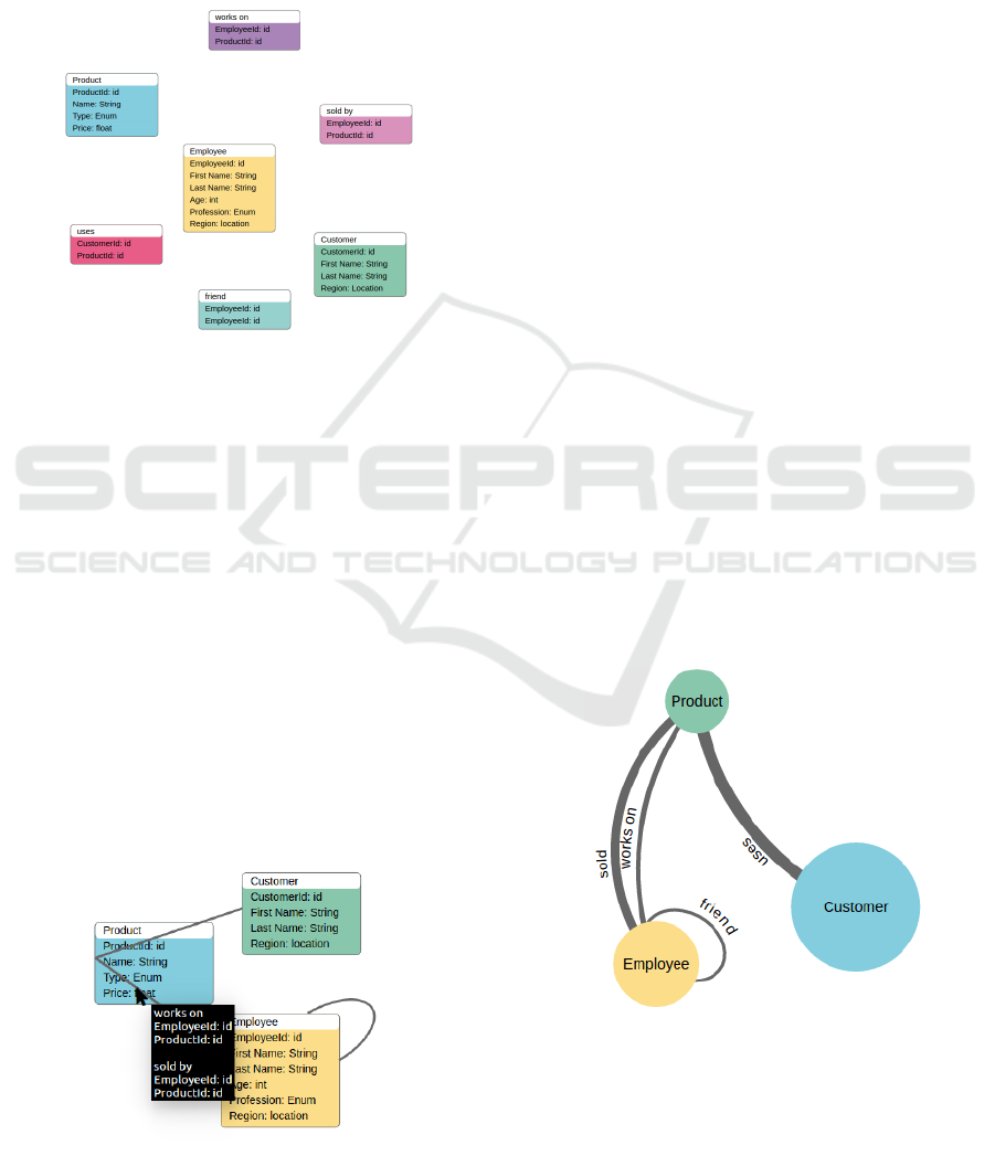
ally loaded entities is shown in Figure 1.
Figure 1: User Interface of Loaded Entities.
In this way, connections between the same data
type or other matches are constructed. The user
can choose from the matches that the tool proposes
based on the data type and the number of occurrences.
These connections are represented as an edge in the
resulting summarization graph. Another type of con-
nection results from entities that contain information
on how other data sources are connected. This is
prominent in the area of relational databases and is
often referred to as junction tables. For instance, the
entity uses contains the ids of Customer and Product.
When connecting Customer via uses with Product the
uses entity visually collapses and is shown when hov-
ering over the edge between Customer and Product.
The thickness of the edge indicates that there are col-
lapsed entities. Similarly, the entity collapses into a
self-connection if two properties of the same entity
are connected. An example for the connected entities
is illustrated in Figure 2.
Figure 2: User Interface of Connected Entities.
2.3 Summary Visualization and
Exploration of Large Property
Graphs
Graphs often consist of thousands of vertices and
edges. Traditionally, large graph visualization meth-
ods focus on visualizing each vertex and edge and
may offer interaction techniques to hide parts of the
graph or summarize communities. We propose a sum-
mary visualization and exploration concept for large
property graphs that approaches the challenge from a
different angle. We visualize the summarization and
provide property previews to support the user in un-
derstanding the data.
2.3.1 Summary Visualization
The goal of our method is to visualize a large prop-
erty graph in an understandable way. For this reason,
we present a summary visualization that bundles ver-
tices and edges by labels. The size of the vertices and
the thickness of the edges correspond to the number
of edges and vertices with that label. Hence, the dif-
ferent roles of vertices and the connections are visu-
alized in a compact way. In addition, the properties
of each vertex role can be further explored. The pre-
views of the properties show the distribution of prop-
erties from all vertices with the same label. When the
number of vertices after applying the filters is below
a certain threshold the subgraph is visualized and can
be further explored. Figure 3 shows the summary
visualization of vertices with the labels Product, Em-
ployee and Customer and the edges with the labels
uses, works on, friend and sold.
Figure 3: User Interface of Summary Visualization for
Large Property Graphs.
2.3.2 Property Previews
A preview of the distribution of the properties is
shown for every vertex and edge. There are differ-
PGX.UI: Visual Construction and Exploration of Large Property Graphs
307
ent types of previews, depending on the data type of
the property and the number of occurrences. In this
section we propose a non-exhaustive list of previews
for different data types and give an example each. The
distribution of an integers property can be shown in a
bar chart. An example for this use case is the prop-
erty Age for the vertex with the label Employee. The
x-axis represents the age and the y-axis the number of
employees with a certain age. String properties can
also be shown in a bar chart. Another type of pre-
view displays a drop-down with common values with
their number of occurrences. Location properties (e.g.
property names lat and long) can be displayed on a
map. As an example, the colors of a specific state
indicates how many employees live in that specific
state. Pie charts can be used for properties with enum
characteristics. For instance, the vertex with the label
Product with the property Type is visualized as a pie
chart. Similarly, float, boolean and id data types can
be visualized as line charts, switches and lists, respec-
tively. In this way the most fitting preview is chosen
based on the data type and the number of occurrences.
This preview is chosen automatically, but the preview
can be changed by users manually. All previews sup-
port selections in an intuitive way. Hence, specific
values as well as ranges can be selected in order to fil-
ter the properties of the summary visualization. Fig-
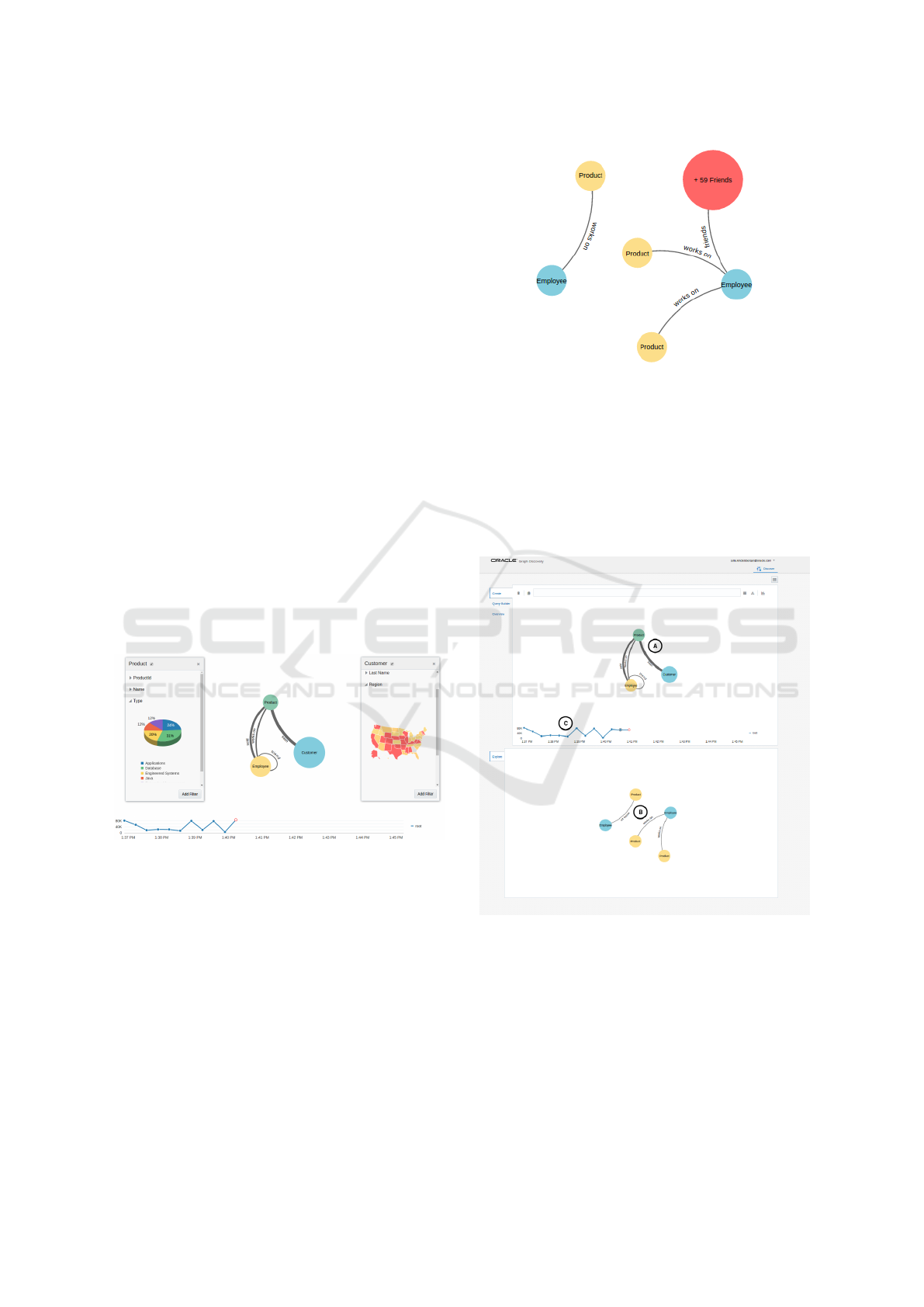
ure 4 illustrates examples for property previews.
Figure 4: User Interface of Property Previews.
2.3.3 Exploration
If the number of vertices, after applying filters on the
properties, is below the threshold the resulting sub-
graph is shown in addition to the summary graph. The
vertices of the subgraph now represent one specific
entity (e.g. an employee with a specific name and
age). The neighbours of each vertex can be expanded.
If the number of neighbours is above a certain thresh-
old a bundled vertex is visualized that indicates the
number of neighbours (e.g. a bundled vertex with the
label + 59 Friends if this employee has 59 edges with
the label friend to other employees). The subgraph
with a bundled vertex is shown in Figure 5.
Figure 5: User Interface of the Subgraph with a Bundled
Vertex.
The properties of this bundled vertex can be fil-
tered in the same way as the properties of the vertices
of the summary visualization. If the number of fil-
tered vertices is below the threshold the bundled ver-
tex disappears and the connected vertices appear. Fig-
ure 6 shows an overview of our tool, i.e. the summary
visualization, the subgraph and the time line.
Figure 6: Visualization Tool Overview: Showing (A) the
summary visualization, (B) the subgraph and (C) the time
line.
2.4 Property Graph Construction Time
Line
A time line keeps track of all changes in the graph
creation and exploration process visually. The x-axis
represents the time and the y-axis represents the cur-
rent number of vertices. Changes include, loading
IVAPP 2017 - International Conference on Information Visualization Theory and Applications
308

data sources visually, making connections, filtering
the data source, generating the summary graph, fil-
tering the properties and generating and exploring the
subgraph. Various possibilities can be explored by
introducing the concepts of branching and merging
of time lines. An example of a time line with three
branches and one merging step is shown in Figure 7.
2.4.1 Branching
Branching a time line at a specific point copies the
applied filters and creates a new branch. All changes
made on that branch do not affect the original branch.
One branch is visualized at the time and the visualiza-
tion updates when the user switches to another point
of time or another branch. A branch can be created
from any point, and can be used to apply different fil-
ters to the same starting point to explore the resulting
subgraph or the resulting number of vertices. In this
way, different paths of exploration can help the user
to compare changes. For instance, in one branch <18
is selected for the Age property of the vertex with the
label Employee and >18 in the other branch. In this
way, the graph can be compared between minors and
adults. Moreover, branches can be used for further
concepts such as copying branches for collaboration
and jumping back and forth to certain time points eas-
ily i. e. reverting or adding changes. The branch can
be switched at any time to jump back and forth to get
the corresponding visualization.
Figure 7: User Interface of the Time Line.
2.4.2 Merging
After exploring different branches, the filters of two
branches can be merged again. The semantics of the
merge can be specified manually as union, intersec-
tion or set difference. Union includes all applied fil-
ters that are in the first branch or the second branch.
Intersection includes all applied filters that are in both
branches and set difference includes all applied filters
that are in the first but not in the second branch.
3 CONCLUSION AND FUTURE
WORK
In this paper we present the approach to visually con-
struct graphs based on data sources. We introduce
the summary visualization for large property graphs
and discuss ways to explore corresponding subgraphs.
The time line concept creates a link between the graph
construction and exploration phase.
Future work includes a user study to evaluate our
graph construction concept by comparing it to exist-
ing approaches. Moreover, we are going to evaluate
our summary visualization by applying it to graphs
with different structures such as graphs with different
numbers of vertex and edge labels. The goal is to un-
derstand the advantages and disadvantages of our con-
cepts for users with and without background in com-
puter science and/or graph visualization. We would
also like to understand how comprehensible our ap-
proach is in comparison to the clustering approach.
The goal is to let users explore graphs in both ways
and understand the differences and advantages of our
approach. The performance in completing tasks and
multiple choice questions about the comprehensibil-
ity are going to support our evaluation.
Furthermore, we are going to research Knowledge
Graphs such as DBpedia (Auer et al., 2007) and the
Google Knowledge Graph (Google, 2012) in the con-
text of our proposal. These are multi-relational, dense
graphs rich on meta data which consist of hundreds of
different labels and properties. Future work for dense
graphs could include machine learning to filter labels
for the user and making predictions based on property
names and values.
REFERENCES
Abello, J., Ham, F. V., and Krishnan, N. (2006). Ask-
graphview: A large scale graph visualization system.
IEEE Transactions on Visualization and Computer
Graphics, 12(5):669–676.
Angles, R. and Gutierrez, C. (2008). Survey of graph
database models. ACM Comput. Surv., 40(1):1:1–
1:39.
Auer, S., Bizer, C., Kobilarov, G., Lehmann, J., Cyga-
niak, R., and Ives, Z. (2007). Dbpedia: A nu-
cleus for a web of open data. In Proceedings of
the 6th International The Semantic Web and 2Nd
Asian Conference on Asian Semantic Web Conference,
ISWC’07/ASWC’07, pages 722–735, Berlin, Heidel-
berg. Springer-Verlag.
Bikakis, N., Liagouris, J., Krommyda, M., Papastefanatos,
G., and Sellis, T. (2016). graphvizdb: A scalable plat-
form for interactive large graph visualization. In 2016
PGX.UI: Visual Construction and Exploration of Large Property Graphs
309

IEEE 32nd International Conference on Data Engi-
neering (ICDE), pages 1342–1345.
Bollacker, K., Evans, C., Paritosh, P., Sturge, T., and Tay-
lor, J. (2008). Freebase: A collaboratively created
graph database for structuring human knowledge. In
Proceedings of the 2008 ACM SIGMOD International
Conference on Management of Data, SIGMOD ’08,
pages 1247–1250, New York, NY, USA. ACM.
Google (2012). Introducing the knowledge graph: things,
not strings. https://googleblog.blogspot.com/2012/05/
introducing-knowledge-graph-things-not.html. Ac-
cessed: 2016-11-15.
Gualdron, H., Cordeiro, R. L. F., and Rodrigues, J. F.
(2015). Structmatrix: Large-scale visualization of
graphs by means of structure detection and dense ma-
trices. In Proceedings of the 2015 IEEE International
Conference on Data Mining Workshop (ICDMW),
ICDMW ’15, pages 493–500, Washington, DC, USA.
IEEE Computer Society.
Hanneman, R. A. and Riddle, M. (2005). Introduction to
social network methods.
Herman, I., Melancon, G., and Marshall, M. S. (2000).
Graph visualization and navigation in information vi-
sualization: A survey. IEEE Transactions on Visual-
ization and Computer Graphics, 6(1):24–43.
InfiniteGraph (2016). Infinitegraph. http://www.objectivity.
com/products/infinitegraph/. Accessed: 2016-11-10.
Itoh, T. and Klein, K. (2015). Key-node-separated graph
clustering and layouts for human relationship graph
visualization. IEEE Computer Graphics and Applica-
tions, 35(6):30–40.
Kaliyar, K. R. (2015). Graph databases: A survey. In Com-
puting, Communication Automation (ICCCA), 2015
International Conference on, pages 785–790.
Kumar, R., Raghavan, P., Rajagopalan, S., Sivakumar, D.,
Tompkins, A., and Upfal, E. (2000). The web as
a graph. In Proceedings of the Nineteenth ACM
SIGMOD-SIGACT-SIGART Symposium on Principles
of Database Systems, PODS ’00, pages 1–10, New
York, NY, USA. ACM.
Kwon, O. H., Muelder, C., Lee, K., and Ma, K. L. (2016). A
study of layout, rendering, and interaction methods for
immersive graph visualization. IEEE Transactions on
Visualization and Computer Graphics, 22(7):1802–
1815.
Lequay, V., Ringot, A., Haddad, M., Effantin, B., and Khed-
douci, H. (2015). Graphexploiter: Creation, visual-
ization and algorithms on graphs. In Proceedings of
the 2015 IEEE/ACM International Conference on Ad-
vances in Social Networks Analysis and Mining 2015,
ASONAM ’15, pages 765–767, New York, NY, USA.
ACM.
Liang, J. and Huang, M. L. (2010). Highlighting in infor-
mation visualization: A survey. In 2010 14th Inter-
national Conference Information Visualisation, pages
79–85.
Neo4j (2016). Neo4j graph database. https://neo4j.com/.
Accessed: 2016-11-10.
Newman, M. E. (2003). The structure and function of com-
plex networks. SIAM review, 45(2):167–256.
Olken, F. (2003). Tutorial on graph data management for
biology. In IEEE Computer Society Bioinformatics
Conference (CSB), volume 3.
Sarkar, M. and Brown, M. H. (1992). Graphical fish-
eye views of graphs. In Proceedings of the SIGCHI
Conference on Human Factors in Computing Systems,
CHI ’92, pages 83–91, New York, NY, USA. ACM.
Sevenich, M., Hong, S., van Rest, O., Wu, Z., Banerjee,
J., and Chafi, H. (2016). Using domain-specific lan-
guages for analytic graph databases. Proc. VLDB En-
dow., 9(13):1257–1268.
Shekhar, S., Coyle, M., Goyal, B., Liu, D.-R., and Sarkar,
S. (1997). Data models in geographic information sys-
tems. Commun. ACM, 40(4):103–111.
Suchanek, F. M., Kasneci, G., and Weikum, G. (2007).
Yago: A core of semantic knowledge. In Proceed-
ings of the 16th International Conference on World
Wide Web, WWW ’07, pages 697–706, New York,
NY, USA. ACM.
Tinkerpop (2016). Defining the property graph model.
http://tinkerpop.apache.org/docs/current/reference/.
Accessed: 2016-11-10.
Titan (2016). Titan distributed graph database. http://titan.
thinkaurelius.com/. Accessed: 2016-11-10.
Valdivia, P., Dias, F., Petronetto, F., Silva, C. T., and
Nonato, L. G. (2015). Wavelet-based visualization of
time-varying data on graphs. In Visual Analytics Sci-
ence and Technology (VAST), 2015 IEEE Conference
on, pages 1–8.
van der Zwan, M., Codreanu, V., and Telea, A. (2016).
Cubu: Universal real-time bundling for large graphs.
IEEE Transactions on Visualization and Computer
Graphics, 22(12):2550–2563.
Ware, C. and Bobrow, R. (2004). Motion to support
rapid interactive queries on node–link diagrams. ACM
Trans. Appl. Percept., 1(1):3–18.
Yang, X., Procopiuc, C. M., and Srivastava, D. (2011).
Summary graphs for relational database schemas.
Zhao, J., Glueck, M., Breslav, S., Chevalier, F., and Khan,
A. (2016). Annotation graphs: A graph-based vi-
sualization for meta-analysis of data based on user-
authored annotations. IEEE Transactions on Visual-
ization and Computer Graphics, PP(99):1–1.
IVAPP 2017 - International Conference on Information Visualization Theory and Applications
310
