
A Review on Visualization Recommendation Strategies
Pawandeep Kaur
and Michael Owonibi
Heinz-Nixdorf Chair for Distributed Information Systems, Friedrich-Schiller-University, Jena, Germany
Keywords: Data Visualization, Visualization Recommendation, Visual Mapping, Review, Survey, Graphic Selection.
Abstract: Choosing the best visualization of a given dataset becomes more and more complex as not only the amount
of data, but also the number of visualization types and the number of potential uses of visualizations grow
tremendously. This challenge has spurred on the research into visualization recommendation systems. The
ultimate aim of such a system is the suggestion of visualizations which provide interesting insights into the
data. It should ideally consider data characteristics, domain knowledge and individual preferences to produce
aesthetically appealing and easy to understand charts. Based on the mentioned factors, we have reviewed in
this paper the state-of-the-art in visualization recommendation systems starting from the earliest attempt made
on this subject. We identify challenges to visualization and visualization recommendation to guide future
research directions.
1
INTRODUCTION
In this big data era, there has been an increase in the
use
of data visualization tools and techniques as a
means to gain insight in the data. It is a lot easier
to
understand images than words or numbers because
of
the ability of human cognition
to detect,
analyze and
interpret patterns, anomalies, texture, distance etc. in
graphics. This makes data visualization an important
tool in exploring, analyzing,
and presenting both the
obvious and less obvious features of data. Visualiza-
tion summarizes
data and presents the most relevant
information in a simple and easy-to-understand
way.
The increasing awareness of the importance of vis-
ualization and the vast diversity in types of data vis-
ualized have led
to the generation of a plethora of
visualization classes. For instance, as of the time
of this
writing, more than 300 different visualiza-
tions are listed on the D3.js site. Given this
plethora
of visualization classes, and the various ways
each
class can be used to show a certain aspect of the
data, and ever increasing visualization (analytics) re-
quirements (e.g. presentation, data quality manage-
ment, trend analysis etc.), individuals are
increas-
ingly faced with the difficulty of deciding which vis-
ualization is most appropriate for their task.
This has
led to the development of visualization recommenda-
tion systems.
According to Vartak et al., (2015), a system
providing visualization recommendation should con
sider factors such as data characteristics, intended
goal of the representation, semantics and domain
knowledge represented in the data, ease of under-
standing and aesthetics, and user preference. In this
paper, we use these factors to review the state-of-the-
art in visualization recommendation. The structure of
this paper is as follows: In Section 2, we introduce
and define some visualization terms and concepts. In
Section 3 we present and categorize visualization rec-
ommendation studies based on the area of their con-
tribution. We identify remaining challenges in Sec-
tion 4 before concluding our paper (Section 5).
2 IMPORTANT CONCEPTS
We would like to introduce some concepts related to
the data visualization creation process, which are used
several times in this paper.
Data attributes are associated with variables and
describe their measurement scales, e.g., quantitative,
categorical, ordinal, nominal etc.
Each data attribute is mapped via a process called
visual mapping to some visual
mark. The visual
marks of scatterplot, e.g., include points, X and
Y
axis etc.
Each visualization consists of different visual
marks with different properties. Points in a scatter-
plot, e.g., have some size, shape or color. Bertin
(1983)
names them visual variables.
266
Kaur P. and Owonibi M.
A Review on Visualization Recommendation Strategies.
DOI: 10.5220/0006175002660273
In Proceedings of the 12th International Joint Conference on Computer Vision, Imaging and Computer Graphics Theory and Applications (VISIGRAPP 2017), pages 266-273
ISBN: 978-989-758-228-8
Copyright
c
2017 by SCITEPRESS – Science and Technology Publications, Lda. All rights reserved
Visualizations can be classified by their
representa-
tional goals or tasks. Scatterplots, e.g., are relevant
for representing ’correlation’ and ’distribution’.
These goals can be achieved by low-level tasks.
Consider, e.g., a bar chart. To achieve the goal "Com-
parison, one needs to identify the sizes of at least two
bars. Here, “identify” is a low-level task and “size” is
a visual variable.
3 VISUALIZATION
RECOMMENDATION
STRATEGIES
Based on the most distinguishing of the factors identified by
Vartak et al. (2015), we classify approaches to visu-
alization recommendation into four distinct catego-
ries.
These categories are defined according to the
main contribution of their research in providing
techniques,
guidelines or directions that assist in rec-
ommending
visualization.
1.
Data Characteristics Oriented: Studies which fall
in this category recommend visualizations based
on data characteristics.
2.
Task Oriented: Studies that fall under this cate-
gory use the representational goals along with the
data characteristics to recommend visualizations.
3.
Domain Knowledge Oriented: Studies which fall
under this category improve the visualization rec-
ommendation process with domain knowledge.
4.
User Preferences Oriented: Studies which fall un-
der this category gather the information about the
user presentation goals and preferences explicitly
through user interaction with the visualization
system.
3.1 Data Characteristics Oriented
Visualization recommendation research studies in this
category have tried to improve the understanding
of
the data, of different relationships that exist within the
data and of procedures to represent them. The choice
of variables to represent different
aspects of the same
information can greatly influence
the perception and
understanding of the presented information. There-
fore, the research under this category focuses
on: the
definition of new data dimensions or attributes, the
formalization of the process of visual mapping from
data attributes
to visual marks, and the introduction of
new techniques for visual mapping.
The earliest known study that proposes an automa-
tion of graphical designs was that of Gnanamgari’s
Bharat in
1981. As cited by Bouali et al. ( 2015), Bha-
rat proposed some rules for determining which type
of visualization is appropriate for certain data attrib-
utes. However, their work is based on the limited set
of visualizations available in 1981.
Mackinlay’s APT system (Mackinlay, 1986) pro-
poses to formalize and codify the graphical design
specification to automate the graphics generation
process. This is based on composition algebra, which
consists of basis set and composition operators. Be-
fore applying this algebra, data attributes
need to be
encoded with the respective visual mark
which
should be consistent with the rules
presented in Table
1.
Table 1: Data attributes to visual marks mapping
(Mackinlay, 1986).
Nominal Ordinal Quantitative
Size ─ ● ●
Saturation ─ ● ●
Texture ● ● ●
Color ● ●
Orientation ●
Shape ●
In Composition
Algebra, the basis set encodes data
attributes to visual variables (as in Table 1). Compo-
sitional operators generate different presentations by
composing different basis sets from different data at-
tributes. They compose visualizations by
merging
parts which encode the same information. For exam-
ple, two single axis plots with the dot
visual mark
can be composed to a 2D scatterplot.
Later, the specifications based on Mackinlay’s heu-
ristics were used to develop
a research system called
Polaris (Stolte et al., 2002). These specifications were
then revised into a formal declarative visual language
known as VizQL
(Hanrahan, 2006). The visualiza-
tion software Tableau’s (https://public.tab-
leau.com/s/) “Show Me” module (Mackinlay et al.,
2007) uses
VizQL specifications to automatically
recommend visualizations. When the user selects the
data attributes
of his interest, Show Me uses Tab-
leau’s Visual Mapping
rules (Table 2) to define the
visualization types.
In order to enhance the understandability of the data
and the process of visual encoding, Roth and Mattis
(1990) argued that more structural and semantic infor-
mation about the data which is relevant to the presenta-
tion design should be provided. Therefore, they pro-
posed a richer set of data characterizations, divided into
A Review on Visualization Recommendation Strategies
267
different data domains, to be used by humans or ma-
chines for designing visualizations. It includes original
data measurement scales as by (Mackinlay, 1986),
along with new data descriptors: Spatial (coordinates,
name of the city, etc.), Amount (count and discrete
data), Range (duration). They have identified and
grouped the data domains into coverage, cardinality
and uniqueness. Coverage conveys whether every ele-
ment of a set can be mapped to at least one element of
another set. Cardinality expresses the dependency and
‘within’ relationship between two or more attributes of
the same dataset: one to one, one to many, many to
many. Uniqueness refers to the uniqueness of values
within a set or data column. Their proposed character-
istics are used in SAGE, which is a System for Auto-
matic and Graphical Explanation.
Table 2: Tableau Visual Mapping Rule (Mackinlay et al.
2007).
Pane Type
Field 1
Pane Type
Field 2
Mark Type View Type
C C Text Cross-tab
Qd C Bar Bar view
Qd Cdate Line Line view
Qd Qd Shape Scatterplot
Qi C Gantt Gantt view
Qi Qd Line Line view
Qi Qi Shape Scatter plot
Unlike previous work where researchers seek
knowledge from within the relationship between the
variables of the dataset. Shneiderman’s theory (Shnei-
derman, 1996) has emphasized considering the dataset
as a whole collection and understanding the overall re-
lationship between a single collection (like hierarchical
data) or within different data collections. He has cate-
gorized the data into seven dimensions: 1-dimensional,
2-dimensional, 3-dimensional, multi-dimensional, tem-
poral, tree and network data. This proposal serves as
the basis of the implementation of the TIBCO Spotfire
(Shneiderman, 1999).
In the previously mentioned studies and tools,
visualizations were generated offline by specialists.
‘Many Eyes’ changes this trend and provides a first
known public web site where users may upload data
and
create interactive visualizations collaboratively
(Viegas et al., 2007). In Many Eyes, a visualization
is created by matching a dataset with a visualization
component (or visualization techniques). The list of
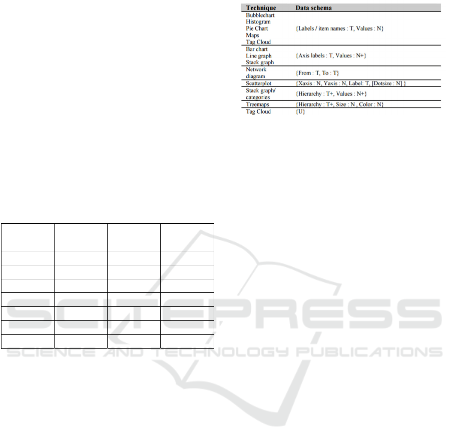
visualization components is provided in Figure 1.
Figure 1: Many Eyes Visual Mapping Scheme (Viegas
et al., 2007).
Visualization components are separated by horizontal
lines. Each component consists of some visualiza-
tions which share a
common data schema. When the
user selects some data columns, they are mapped with
the data schema which
is associated to some data vis-
ualization. A data schema is a set of
named, typed
slots. For example: ’T’ in the above table is single col-
umn textual data and ’T+’ means that the dataset has
more than one textual data column. Thus, a treemap
(as in Figure 1) can be
expressed as an ordered set of
textual columns, where
each row in the set describes
the path from the top
of the hierarchy to the leaf
item. The dataset and produced visualization then can
be shared with other users for comments, feedback
and future improvement, thus providing a collabora-
tive workbench for visualization creation.
The popularity of Many Eyes has proved the usa-
bility and ease of access of deploying visualization
software as a web application. Along with that, the
dashboard environment provided by Tableau also be-
came a standard for visualization creation interfaces.
Voyager (Wongsuphasawat et al., 2016) is a recent
visualization recommendation web application based
on the dashboard type environment. Voyager uses
the Compass Recommendation Engine, which sug-
gests visualizations based on the statistical properties
of the
data. The suggestions are produced in the form
of Vega-lite specifications (Satyanarayan et al.,
2017). A Vega-lite specification is a JSON object (see
Figure 2)
that describes a single data source, a mark
type, visual encodings of data variables, key-value,
and data transformations including
filters and aggre-
gate functions. The Compass Recommendation En-
gine first suggests a list of visualizations based on the
univariate summary of each variable in the dataset.
Then the user can exclude or include variables from
the list to focus on a particular variable set of interest.
Similar to the study by (Wongsuphasawat et al.,
2016), recent studies have tried to exploit the statistcal
IVAPP 2017 - International Conference on Information Visualization Theory and Applications
268
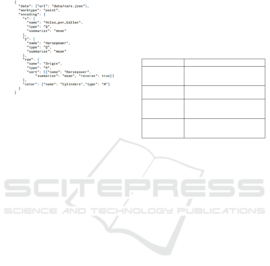
Figure 2: Vega-lite JSON Object (Wongsuphasawat et al.,
2016).
characteristics of data as an assistance to visualization
recommendation. VizDeck
(Key et al., 2012) is an-
other such initiative. It automatically recommends
ranked and coordinated visualizations (vizlets) based
on the statistical properties of the data. They adopts
a card game metaphor to organ-ize multiple visuali-
zations into interactive visual dashboard applications.
When user selects the data the system initially pre-
sents the small multiple views of the XY Charts (scat-
terplot or line chart based on the data attributes). Us-
ers interacts with these vizlets while keeping the good
one and discarding the unwanted vizlets. User inter-
action makes a system to learn that which vizlets are
more likely to be effective for a dataset with particular
features. The learned information enhances the sys-
tem’s ability to recommend more suitable visualiza-
tions when provided with similar data in the future.
Vartak et al., (2015) uses statistical methods of
probability distribution, distance matrices and devia-
tions to suggest different views of bar chart and line
chart. Their prototype SEEDB computes a deviation
of the subset of the data in comparison to the whole
dataset. It then recommends those visualizations for
which the underlying data (subset of data) has a high
deviation from the current and normal trends reflected
in the whole dataset. They argue that users find visu-
alizations with high deviations more interesting and
expressive.
As summarized in Table 3, the contributions pro-
vided by the studies in this section can be classified
into four broad areas on the basis of their contribution
towards better visualization recommendation:
Data properties definition: by providing richer
sets of data dimensions and characterization
Rule definition: by providing rules, specifications
and schemas to manipulate the data and perform
visual mapping
Language formalization: by defining the specifi-
cation in system understandable language to auto-
mate the process of visual mapping
Statistics based: by using statistical and explora-
tory data analytics procedures to recommend vis-
ualization
Table 3: Classification Table.
Categories Studies
Data Properties
SAGE (Roth and Mattis, 1990),
TIBCO Spotfire (Shneiderman,
1996)
Rule Definition
APT (Mackinlay, 1986),
Many Eyes (Viegas et al., 2007)
Language
Formalization
VizQL (Hanrahan, 2006)
Vega-Lite (Satyanarayan et al.,
2017)
Statistics
Voyager (Wongsuphasawat et al.,
2016), VizDeck (Key et al., 2012),
SeeDB (Vartak et al., 2015)
3.2 Task Oriented
Visualization recommendation research studies in this
category have designed different techniques to infer
the representational goal or user’s intentions behind
visualizing the data. Differences in goals can greatly
alter the effectiveness of graphical designs.
Roth and Mattis (1990) were the first to contribute
to
the idea of instigating the user’s information seek-
ing
goal in the visualization design. In their study
they identified different domain-independent infor-
mation seeking goals, e.g. comparison, distribution,
correlation etc.
Based on some sets of representational goals, a
classification scheme for visualization recommenda-
tion was proposed by Wehrend and Lewis (1990) in
the form of a 2D matrix of “objects” vs “operations”.
In this matrix, “objects” are data attributes, “opera-
tions” are representation goal and cells contain visu-
alization techniques.
According to Kerpedjiev et. al. (1997), visualiza-
tion recommendation can be further enhanced by the
use of domain level tasks. Hence, they proposed a
model (Figure 3) to hierarchically decompose do-
main-specific user’s goals (for the “transportation
scheduling” domain) into common domain independ-
ent goals or representation goals which are further as-
sociated with some graphical actions or operations.
For example, in Figure 3, domain-specific goals like
“know-shortfalls” (which means to know the daily
shortfalls in the goods transported) was decomposed
to tasks which include “know-difference”. In turn,
“know-difference” is associated with “differentiate”
A Review on Visualization Recommendation Strategies
269
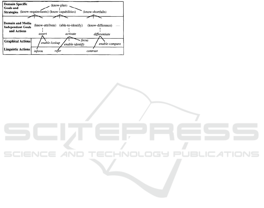
which is a high level domain independent task or goal
which acts on data. Actions associated with “differ-
entiate” include “enable-lookup” on value of individ-
ual days and “enable-comparison” on those values.
This approach was applied in the development of Au-
toBrief (Kerpedjiev et. al. 1997) which is a multime-
dia presentation system that assists in data analysis.
Figure 3: Goals and Actions (Kerpedjiev et al., 1997).
In all the previous studies, the user task list was man-
ually created. By introducing advanced linguistic
techniques in the visualization creation process, re-
searchers seek an opportunity to automate the deriva-
tion of the user task from a natural language query.
One such study (Zhou and Feiner, 1998) introduced
visual task taxonomy to automate the process of gain-
ing a high level of presentation intents from the text.
This taxonomy interfaces between high level tasks
(presentation intent) that can be accomplished by low
level visualization techniques (visual action). For ex-
ample, the visual task Focus<?x> implies that visual
techniques such as Enlarge<?x> or Highlight<?x>
could be used to focus attention on ?x. Their taxon-
omy and techniques are implemented in IMPROVISE
(Illustrative Metaphor Production in Reactive Object-
oriented Visual Environments)
3.3 Domain Knowledge Oriented
In the visualization development process, it is im-
portant to first characterize the task and data in the
vocabulary of the problem domain, so that a visual-
ization can fulfill the
requirements of users in any
particular target domain (Munzner, 2009). The ob-
jectives of domain knowledge oriented approaches in-
clude sharing such knowledge among different design-
ers and
end users, and reducing the burden upon us-
ers to acquire knowledge about complex visualiza-
tion techniques. Such approaches are not core tech-
niques
to produce visualization, but they provide as-
sistance
to other techniques for improving the perfor-
mance while
recommending visualizations. The
studies falling into this category deal
with gaining
the domain knowledge from existing
knowledge
sources or creating a new one which further assists
in the visualization recommendation process.
The earliest known domain knowledge oriented
visualization recommendation study is RAVE
(Klumpar et al., 1994). RAVE has been used for the
visualization of in-situ
measurement data captured by
the NASA spacecraft. The user needs to select either
a visualization type or a representational goal from a
provided list. On user selection, RAVE triggers the
visualization technique associated with the entries in
a list and provides the resultant graphics. RAVE’s
knowledge-base contains: (1) a set of
visualization
objects that corresponds the technique that can
create a
specific visualization, (2) a set of rules that corre-
sponds to the selection of one particular visualization
technique, (3) the high level task that visualization
can perform like correlation for scatterplot, (4) the
refinements
that a visualization can accept and (5)
the domain(s) in
which it can be used. For example,
the visualization
object that corresponds to the 2D
scatterplot can satisfy the rule “attribute x is related
to
attribute y”, can accept zooming and color as
refinements, and can be applied in any domain
where
numeric-valued attributes are compared.
To include semantic abilities in the process of rec-
ommendations, Gilson et al., ( 2008) propose a prag-
matic
approach for automatic generation of visuali-
zations
from domain-specific data available on the
web in the
form of ontologies. They have described
a pipeline
that combines ontology mapping from
three different ontologies. In this approach, a web
page is
first mapped to a “domain ontology”, which
stores the
semantics of the specific subject domain.
The “domain ontology” is then mapped to one
or
more “ visual representation ontologies”, each of
which captures the semantics of a visualization style
(e.g., treemaps). A “ Semantic bridging ontology”
bridges the information from the two ontologies and
holds
key knowledge about the relationships between
data
entities of the source, the subject domain and
the visual
artifacts of the target visualizations. They
have implemented the visualization pipeline in
a pro-
totype, SemViz which functions end-to-end from
source web page to target visualization.
Building upon somewhat similar grounds, Voigt
et al., (2012) propose a novel approach for
knowledge-assisted, context-aware visualization rec-
ommendation for semantic web data. VISO is a mod-
ular visualization ontology composed of seven differ-
ent modules that provides a vocabulary to annotate
both data sources and visualization components.
GRAPHIC module formalizes knowledge in the do-
main of visualization. DATA module characterizes
the data variables and structure. ACTIVITY module
is concerned with the human aspects of visualization
IVAPP 2017 - International Conference on Information Visualization Theory and Applications
270

i.e. tasks, actions and operations. SYSTEM, USER
and DOMAIN module describes the data and visual-
ization context and the domain information. Based on
the shared knowledge from the different modules, a
recommendation algorithm covers both discovery
and context-aware ranking of suitable graphic repre-
sentations.
3.4 User Preferences Oriented
Here, those visualization recommendation strategies
are grouped which gather users’ intentions explicitly
from their behavior and interactional records while
they communicate with the visualization system.
They are also known as behavior driven studies.
Some studies also use probabilistic and machine
learning techniques to predict the patterns of user
choice from these interactional records.
The first known behavior driven study is from
Gotz and Wen (2009). BDVR (Behaviour Driven
Visualization Recommendation) consists of two dis-
tinct phases: Pattern Detection and Visualization Rec-
ommendation. In the first phase, user behavior while
interacting with the visualization system is analyzed
to find meaningful interaction patterns. These pat-
terns are, e.g., scan, flip, swap and drill-down. In the
second phase, a recommendation engine infers a
user’s intent from these detected patterns. In case of
“scan pattern”, e.g., the user interactively ‘inspects’
values over a series of data. Then he ‘compares’ those
series within themselves or over time. From these in-
tents, visual tasks are inferred which later suggest an
alternative visualization to the user which suits more
accurately than their current visualization selection.
A similar study conducted by Steichen et al.,
(2013), has provided results on accumulating infor-
mation from user eye gaze patterns. They recorded
the interaction of the user with a given visualization
to predict the users' visual tasks, as well as user cog-
nitive abilities, including perceptual speed (a measure
of speed when performing simple tasks), verbal work-
ing memory (a measure of storage and manipulation
capacity of verbal information), and visual working
memory (a measure of storage and manipulation ca-
pacity of visual and spatial information). They have
shown that such characteristics have a significant ef-
fect on task efficiency, user preference and ease of use
with visualization systems. These findings are pre-
sented in view of designing visualization systems that
can adapt to each individual user in real-time.
Growing towards the recommendation of more
user-centric and user adaptive visualization, many
systems have applied machine and probabilistic
learning approaches from the user interactions while
browsing through the recommended visualization as
in the case of VizDeck (Key et al., 2012) as discussed
in section 3.1. A study from Mutlu et al. (2016) used
techniques like collaborative and content based filter-
ing to suggest charts by deriving similarity matrix ac-
cording to the information needs of the user and chart
characteristics. First they have designed a crowd-
source study to obtain personalized scores and tags on
each visualization. Then a multi-dimensional scale is
used to estimate aspects of quality of charts for col-
laborative filtering and a tag vector is used to recom-
mend potentially interesting chart based on content.
4 CHALLENGES AND
RESEARCH DIRECTION
The ultimate aim of all visualization recommendation
systems is the suggestion of visualizations which au-
tomatically provide interesting insights in data. Over
the years, researchers have continually expanded the
set of requirements addressed by their systems to de-
velop more aesthetically appealing and user adaptive
visualizations. One such requirement is to apply an
appropriate technique to score and rank the suggested
visualization according to the data domain and the
user preference. Along with this requirement Vartak
et al. (2015) opined to include factors such as rele-
vance, surprise, non-obviousness, diversity, etc. in the
visualization recommendation process.
The challenges of other visualization domains
such as information visualization, scientific visualiza-
tion etc. also affect the visualization recommendation
process. As investigated by Chen (2005) some of
these include usability of a recommendation, scalabil-
ity, visual thinking and analytics, etc.
Looking at the trends in the visualization studies,
we can see that researchers have acknowledged the
need of more user and domain centric visualization
by providing domain specific knowledge based ap-
proaches. However, at the same time the research in
generic recommender systems (e.g. data character-
stics and statistics oriented) is rapidly developing. As
a result, there is also a challenge of keeping pace with
this in the visualization recommender systems com-
munity. Overall, there is the question of which con-
cepts in these generic recommender systems can be
re-used and how can they be effectively implemented
in visualization recommendation.
Moreover, there is an ongoing investigation into
use of formal languages, standards or ontologies to
describe the structure, and specifications of classes of
visualization, and the different tasks that can be asso-
A Review on Visualization Recommendation Strategies
271

ciated with the classes.
Another challenge is the efficiency of visualiza-
tion recommendation given the growing space of
combinational possibilities of ever increasing data
sizes (rows and column), classes of visualization, and
intended tasks. In addition, there is also the challenge
of effectively incorporating human computer interac-
tions into visualization systems.
Furthermore, some other research studies are in-
vestigating the use of visualization recommendation
in data-driven science, and visual analytics. The list
of research directions/challenges are not exhaustive,
but they are interesting examples of the current and
future research activities.
5 CONCLUSIONS
Visualization is becoming an increasingly more im-
portant tool for getting insights into the ever bigger
and more complex data being generated in this era.
As a result, different kinds of visualizations with dif-
ferent characteristics are constantly being developed.
Consequently, deciding which visualization best suits
a user’s data and intention becomes more and more
complex. Visualization recommendation systems at-
tempt to support the user in the decision making. In
this paper, we have discussed research on this topic
has gone through several phases beginning from only
considering the data and chart characteristics to now
where several other factors such as individual prefer-
ences, insight tasks, and domain knowledge are con-
sidered in varying degrees. Still, there is strong need
for additional research in particular to keep the visu-
alization, visualization recommendation and recom-
mender system communities synchronized.
ACKNOWLEDGEMENTS
The work has been funded by the DFG Priority Pro-
gram 1374 "Infrastructure-Biodiversity-Explorato-
ries" (KO 2209 / 12-2).
REFERENCES
Bertin, J., 1983. Semiology of graphics: diagrams, net-
works, maps. University of
Wisconsin Press.
Bouali, F., Guettala, A. and Venturini, G., 2015. VizAssist:
an interactive user assistant for visual data mining. The
Visual Computer.(pp.1-17).
Chen, C., 2005. Top 10 unsolved information visualization
problems. IEEE computer graphics and applications,
25(4).(pp.12-16).
Gilson, O., Silva, N., Grant, P.W. and Chen, M., 2008, May.
From web data to visualization via ontology mapping.
In Computer Graphics Forum, 27(3).(pp. 959-966).
Blackwell Publishing Ltd.
Gotz, D. and Wen, Z., 2009, February. Behavior-driven vis-
ualization recommendation. In Proceedings of the 14th
international conference on Intelligent user interfaces
(pp. 315-324). ACM.
Hanrahan, P., 2006, June. Vizql: a language for query, anal-
ysis and visualization. In Proceedings of the 2006 ACM
SIGMOD international conference on Management of
data (pp. 721-721). ACM.
Kerpedjiev, S., Carenini, G., Roth, S.F. and Moore, J.D.,
1997. AutoBrief: a multimedia presentation system for
assisting data analysis. Computer Standards & Inter-
faces, 18(6).(pp.583-593).
Key, A., Howe, B., Perry, D. and Aragon, C., 2012, May.
VizDeck: self-organizing dashboards for visual analytics. In
Proceedings of the 2012 ACM SIGMOD International Con-
ference on Management of Data.(pp. 681-684). ACM.
Klumpar, D.M, Anderson, K., and Simoudis, A. (1994).
Rave:
Rapid visualization environment. The 1994 God-
dard Conference on Space Applications of Artificial In-
telligence.(pp 29-38).
Mackinlay, J., 1986. Automating the design of graphical
presentations of relational information. ACM Transac-
tions On Graphics (Tog), 5(2).(pp.110-141).
Mackinlay, J., Hanrahan, P. and Stolte, C., 2007. Show me:
Automatic presentation for visual analysis. IEEE Trans-
actions on Visualization and Computer Graphics,
13(6).(pp.1137-1144).
Munzner, T., 2009. A nested model for visualization design
and validation. IEEE transactions on visualization and
computer graphics, 15(6).(pp.921-928).
Mutlu, B., Veas, E. and Trattner, C., 2016. VizRec: Recom-
mending Personalized Visualizations. ACM Transac-
tions on Interactive Intelligent Systems (TiiS),
6(4).(pp.31).
Roth, S.F. and Mattis, J., 1990. Data characterization for
intelligent graphics presentation. In Proceedings of the
SIGCHI Conference on Human Factors in Computing
Systems. (pp. 193-200). ACM.
Satyanarayan, A., Moritz, D., Wongsuphasawat, K. and
Heer, J., 2017. Vega-lite: A grammar of interactive
graphics. IEEE Transactions on Visualization & Com-
puter Graphics, (1).(pp.341-350).
Steichen, B., Carenini, G. and Conati, C., 2013, User-adap-
tive information visualization: using eye gaze data to
infer visualization tasks and user cognitive abilities. In
Proceedings of the 2013 international conference on
Intelligent user interfaces (pp. 317-328). ACM.
Shneiderman, B., 1996, September. The eyes have it: A task
by data type taxonomy for information visualizations.
In Visual Languages, 1996. Proceedings., IEEE Sym-
posium (pp. 336-343). IEEE.
Shneiderman, B., 1999. Dynamic queries, starfield dis-
plays, and the path to Spotfire.
Stolte, C., Tang, D. and Hanrahan, P., 2002. Polaris: A sys-
IVAPP 2017 - International Conference on Information Visualization Theory and Applications
272

tem for query, analysis, and visualization of multidi-
mensional relational databases. IEEE Transactions on
Visualization and Computer Graphics, 8(1).(pp.52-65).
Vartak, M., Huang, S., Siddiqui, T., Madden, S. and
Parameswaran, A., 2015 Towards Visualization Recom-
mendation Systems.Workshop on Data Systems.
for Interactive Analytics (DSIA).
Viegas, F.B., Wattenberg, M., Van Ham, F., Kriss, J. and
McKeon, M., 2007. Manyeyes: a site for visualization at
internet scale. IEEE transactions on visualization and
computer graphics, 13(6),(pp.1121-1128).
Voigt, M., Pietschmann, S. and Meißner, K., 2012,
February. Towards a semantics-based, end-user-cen-
tered information visualization process. In Proc. of the
3rd international workshop on semantic models for
adaptive interactive systems (SEMAIS 2012).
Wehrend, S. and Lewis, C., 1990,. A problem-oriented clas-
sification of visualization techniques. In Proceedings of
the 1st Conference on Visualization'90. (pp. 139-143).
IEEE Computer Society Press.
Wongsuphasawat, K., Moritz, D., Anand, A., Mackinlay, J.,
Howe, B. and Heer, J., 2016. Voyager: Exploratory
analysis via faceted browsing of visualization recom-
mendations. IEEE transactions on visualization and
computer graphics, 22(1), (pp.649-658).
Zhou, M.X. and Feiner, S.K., 1998, January. Visual task
characterization for automated visual discourse syn-
thesis. In Proceedings of the SIGCHI conference on
Human factors in computing systems. (pp. 392-399).
ACM Press/Addison-Wesley Publishing Co.
A Review on Visualization Recommendation Strategies
273
