
Influence of Mental Models on the Design of Cyber Security Dashboards
Janosch Maier
1
, Arne Padmos
2
, Mortaza S. Bargh
3
and Wolfgang W
¨
orndl
1
1
Technical University of Munich, Munich, Germany
2
Creating 010, Rotterdam University of Applied Sciences, Rotterdam, The Netherlands
3
Research and Documentation Centre, Ministry of Security and Justice, The Hague, The Netherlands
Keywords:
Cyber Security, Dashboard Design, Mental Models, Policymaking.
Abstract:
Governments make cyber security related policies to protect citizens’ interests and national infrastructures
against cyber attacks. Cyber security related data can enable evidence based policymaking. Data visualisation
via dashboards can help understanding of these cyber security data. Designing such dashboards, however,
is not straightforward due to difficulty for potential dashboard users to correctly interpret the displayed in-
formation. In this contribution we investigate the use of mental models for correct interpretation of displayed
information. Our research question is: How useful are mental models for designing cyber security dashboards?
We qualitatively investigate the mental models of seven cyber security experts from a typical governmental
organisation. This research shows how operators, analysts and managers have different cyber security mental
models. Based on the insight gained on these mental models, we develop a cyber security dashboard to assess
the impact of mental models on dashboard design. An experience evaluation shows that the realised dashboard
is easy to understand and does not obstruct users. We, however, do not see any meaningful difference in how
the experts perceive the dashboard, despite their different cyber security mental models. We propose some
directions for future research on using mental models for cyber security dashboard design.
1 INTRODUCTION
Governments are not autotelic organisations. Indeed,
they are supposed to give security to their citizens
by laws and law enforcement. An important area
where governments’ increasing involvement, supervi-
sion and intervention are needed is the cyber security
and safety domain. Laws and policy decisions that
are based on wrong assumptions may have unforesee-
able effects. Governments can use the data available
on cyber security attacks and threats for making cy-
ber security related policies so that citizens’ interests
and vital infrastructures can be protected against pos-
sible cyber attacks (National Cyber Security Center,
2014), (Trend Micro Incorporated, 2015). Analysing
cyber security related data can help elucidating reli-
able evidence-based assumptions for policy develop-
ment. Visualising of this data is an important step of
data understanding and analysis. If nobody can see or
understand the data, they cannot be used as a sound
basis for decision-making and policymaking.
One way of displaying this kind of data can be to
use a cyber security dashboard. Originally, a dash-
board is a piece of wood on a carriage or other horse-
pulled vehicles that should protect the driver’s feet
from mud thrown up by horse feet (Hinckley et al.,
2005). Later, within cars, they were developed from
design elements to plain and functional parts contain-
ing the instruments for measuring the state of the car.
This includes showing the measurements of speed,
fuel level or motor rotation. With this information,
one can operate a car easily. He can, for example,
make sure that he is not over-speeding and fill the tank
before running out of fuel. Dashboards in IT world
try to mimic these characteristics. Stephen Few (Few,
2006, p. 26) defined a dashboard as follows:
A dashboard is a visual display of the most
important information needed to achieve one
or more objectives; consolidated and arranged
on a single screen so the information can be
monitored at a glance.
We will use this definition for dashboards in this
work. The main reason for a dashboard is monitor-
ing. Data visualisation via dashboards enables a user
to easily notice what is most important. For exam-
ple, a traffic light coded system can show whether a
certain part of the monitored system needs a special
focus. Dashboards cannot provide deep analyses that
rely on the comparison of many different kinds of data
128
Maier J., Padmos A., S. Bargh M. and WÃ˝urndl W.
Influence of Mental Models on the Design of Cyber Security Dashboards.
DOI: 10.5220/0006170901280139
In Proceedings of the 12th International Joint Conference on Computer Vision, Imaging and Computer Graphics Theory and Applications (VISIGRAPP 2017), pages 128-139
ISBN: 978-989-758-228-8
Copyright
c
2017 by SCITEPRESS – Science and Technology Publications, Lda. All rights reserved

or the possibility to have specific data query displays.
For those tasks, one needs a fully-fledged analytical
tool. In (Few, 2007) some hints are given on how such
tools – so-called faceted analytical displays – provide
insight using proper visualisation techniques.
Our objective is to design cyber security dash-
boards that provide a suitable way of data visuali-
sation in the domain of cyber security policymaking.
If cyber security policymakers have the most impor-
tant information visible on one screen, they can easily
monitor the cyber security status and make informed
decisions. In addition to guiding cyber security pol-
icymakers, cyber security dashboards can help other
user groups, such as system operators or data analysts,
in the field of cyber security in their daily practices.
Designing cyber security dashboards for policy-
making purposes is not straightforward. A major
challenge hereto is to correctly interpret the infor-
mation provided in the dashboard, i.e., the users of
the dashboard need to fully understand the displayed
data. Our approach for enabling this understanding
is based on mental models (Craig, 1943)(Doyle and
Ford, 1998). Mental models are basically the inter-
nal representations of external processes. As the main
contribution of the paper, therefore, we pose this re-
search question: How useful are mental models for
the design of cyber security dashboards for policy-
making purposes? To this end, we investigate the cy-
ber security mental models of cyber security experts
within a typical governmental organisation. Based on
the insight gained on these mental models, we de-
velop a dashboard prototype and assess the results.
For our research first we did a literature study
on mental models and (the design of) cyber security
dashboards. Subsequently, we carried out a number
of expert interviews in a semi-structured way (D
¨
oring
and Bortz, 2015), where each interviewee carried out
also a drawing exercise. The objective of this quali-
tative study was to understand the cyber security re-
lated mental models of the users – who will poten-
tially use the cyber security dashboard – and to learn
about the data relevant for these users. We grouped
the experts into operators, analysts and managers to
see how mental models differ per function/role. For
the analysis of the interviews we used the qualitative
content analysis (Mayring, 2010)(Mayring, 2015). In
order to examine the impact of mental models on cy-
ber security dashboards we carried out a follow up
study through design, realisation and evaluation of a
prototype. The realised prototype was evaluated for
user experience as well as for functionality. To as-
sess the user experience, we used the User Experience
Questionnaire (Laugwitz et al., 2008). Both studies
were carried out in a typical governmental organisa-
tion involved in cyber security policymaking.
The rest of the paper is organised as follows. In
Section 2 we present the background information on
mental models and the related work. Then in Section
3 we describe in detail how we conducted our initial
study to elucidate the mental models of the potential
users and present the results obtained. Subsequently
in Section 4 we describe how we developed and eval-
uated the prototype to examine the impact of men-
tal models on designing a cyber security dashboard.
In Section 5 we draw some conclusions and sketch a
number of directions for future work.
2 BACKGROUND
2.1 Mental Models
The term mental model was first used by Craig in
his book ”The Nature of Explanation” (Craig, 1943).
There he discusses that humans translate external pro-
cesses into internal representations. Subsequently,
they reason based on this representation. The results
of the reasoning can be retranslated by applying them
to the external world. The internal representation is
the person’s mental model. This term was picked up
later by other scholars and it is now a widely used
term in cognitive psychology. However, different re-
searchers have used different terms to describe the
same concept, or have used the same term with differ-
ent meanings. For this work, the mental model refers
to the cognitive model that a person has in mind on a
certain domain. We will use the following definition:
A mental model of a dynamic system is a
relatively enduring and accessible but limited
internal conceptual representation of an ex-
ternal system whose structure maintains the
perceived structure of that system (Doyle and
Ford, 1998, p. 17ff.).
Even though this definition describes a mental
model as a relatively enduring representation of an
external system, this does not mean that there are
no changes possible. McNeil shows how the mental
models of industrial design students change whilst do-
ing a collaborative project (McNeil, 2015). A learn-
ing experience might also be the use of software in a
certain domain. Based on the constructivists’ view,
learning leads to building a mental model (Knorr-
Cetina, 1981). This is also the case in learning of
computer science related topics (Ben-Ari, 1998).
Influence of Mental Models on the Design of Cyber Security Dashboards
129

2.2 Related Work
Recently, several companies have started creating in-
teractive cyber attack maps that visualise cyber at-
tacks in real-time (CTF365 Blog, 2014). Media com-
panies are also trying to visualise such attacks (Wired
UK, 2015). These maps mainly show attacks on hon-
eypots. All traffic going there is treated as an attack,
as honeypots do not host any real services. Some of
these visualisation pages use a community approach
to distribute the data collection process (Deutsche
Telekom AG Honeypot Project, 2015). Some of these
maps show, for example, the number of attacks orig-
inating from certain countries, which might be a use-
ful indicator in a cyber security dashboard. However,
these cyber attack maps do not aggregate the data suf-
ficiently to monitor (the trends of cyber attacks on) a
system properly. It may be nice to watch attacks in
real-time on such a map, but it is difficult to base any
strategic cyber security related decisions (i.e., cyber
security related policymaking) solely on such maps.
Asgharpour, Liu and Camp (Asgharpour et al.,
2007) compared the mental models of computer se-
curity risks between novices and experts. The au-
thors use two card sorting experiments in which 71
respectively 38 participants were asked to choose the
category that a certain word belonged to. The cate-
gories were Medical Infection, Physical Safety, Crim-
inal, Economical, Warfare or Can’t Decide. These
categories represent those domains where the analo-
gies for computer science incidents are taken from.
Such an analogy is the one of a computer virus. The
words to be ordered were words of the single domains
(e.g. Fever, Fence, Theft) as well as IT security re-
lated words (e.g. Phishing, Trojan, Exploit). Their
experiments showed that novices and experts chose
different domains for some of the words. For exam-
ple, experts were the only ones who attached any of
the computer security words to the category warfare.
The authors argue that talking about computer secu-
rity risks, one should align its statements or recom-
mendations to the mental models of the novice users.
Using metaphors from the areas of criminal and phys-
ical safety are most promising to be understood by
large parts of computer users.
Wash and Rader studied mental models of com-
puter owners in order to identify how and why they
secure their computer in a certain way (Wash and
Rader, 2011). Depending on users’ mental model
about hackers, they secured their computers differ-
ently. People who perceived hackers as teenagers try-
ing to show off, were more likely to install firewalls
than people who perceived hackers as criminals try-
ing to make money. The authors argue that ”[e]ven
if the mental models are wrong, they can still lead
to good security behaviours and more secure comput-
ers” (Wash and Rader, 2011, p. 58). Therefore, secu-
rity specialists should not try to enforce correct men-
tal models, but try to support mental models, even if
they are wrong, as long as they lead to good security
decisions. This matches with the view of Don Nor-
man (Norman, 2013) that designers should adapt the
system to the user’s mental model and not the other
way around.
Dashboard research is currently isolated from the
mental models that the potentials users of dashboards
possess. Our study shall show whether mental models
are a good basis for dashboard design for supporting
policy-making in the area of cyber security.
3 MENTAL MODEL STUDY
3.1 Research Design
Initially we interviewed a number of potential users
of the cyber security dashboard in order to derive the
mental models on the cyber security domain. Seven
people (six male, one female) from two Dutch gov-
ernmental organisations took part in the expert inter-
views. The interviewees were M = 42 (SD = 6.3)
years old. Two participants belonged to each of ’op-
erational’, ’analytical’ and ’managerial’ roles. One
person stated that his job included both analytical and
managerial roles. All participants work in the cyber
security domain. In order to ensure the anonymity of
our participants and for better readability, we refer to
all our participants with the male pronouns.
The interview consisted of a number of questions
that were grouped into a number of blocks concern-
ing the participants’ jobs, their understanding of cyber
security, and their demographic data. The interview
followed a semi-structured way (D
¨
oring and Bortz,
2015). Each block contained several questions that
were asked after each other. If a participant did not
answer a question fully on his own, the interviewer
tried to find some follow up questions.
The interview started with some questions con-
cerning the participant’s job. One of the questions
was: ”Can you please explain your job to me?” These
questions mainly tried to check whether the classifi-
cation of the participants in one of the three groups
was appropriate. The second question block focused
on mental models. Think aloud (Fonteyn et al., 1993)
and drawing exercises can help to understand a user’s
mental models by elaborating and externalising what
the user thinks. Our method was a mixture of both
think aloud and drawing exercise, where we asked the
participants to draw the message flow of two cyber
IVAPP 2017 - International Conference on Information Visualization Theory and Applications
130

attacks into a drawing template shown in Figure 1,
while explaining their thoughts.
The setting was: Alice (A) works for a bank. Her
regular work relies on accessing data from an Appli-
cation System (AS) on a bank application server. She
can access this server via the Internet. Look at this
example: Alice makes a request to the AS. There her
request is processed and the answer is sent back to her.
The arrows describe where messages are sent. In this
case this is the request and the response. Mallory (M)
is a hacker that does not like the bank. He possesses
a Malicious System (MS) for carrying out attacks.
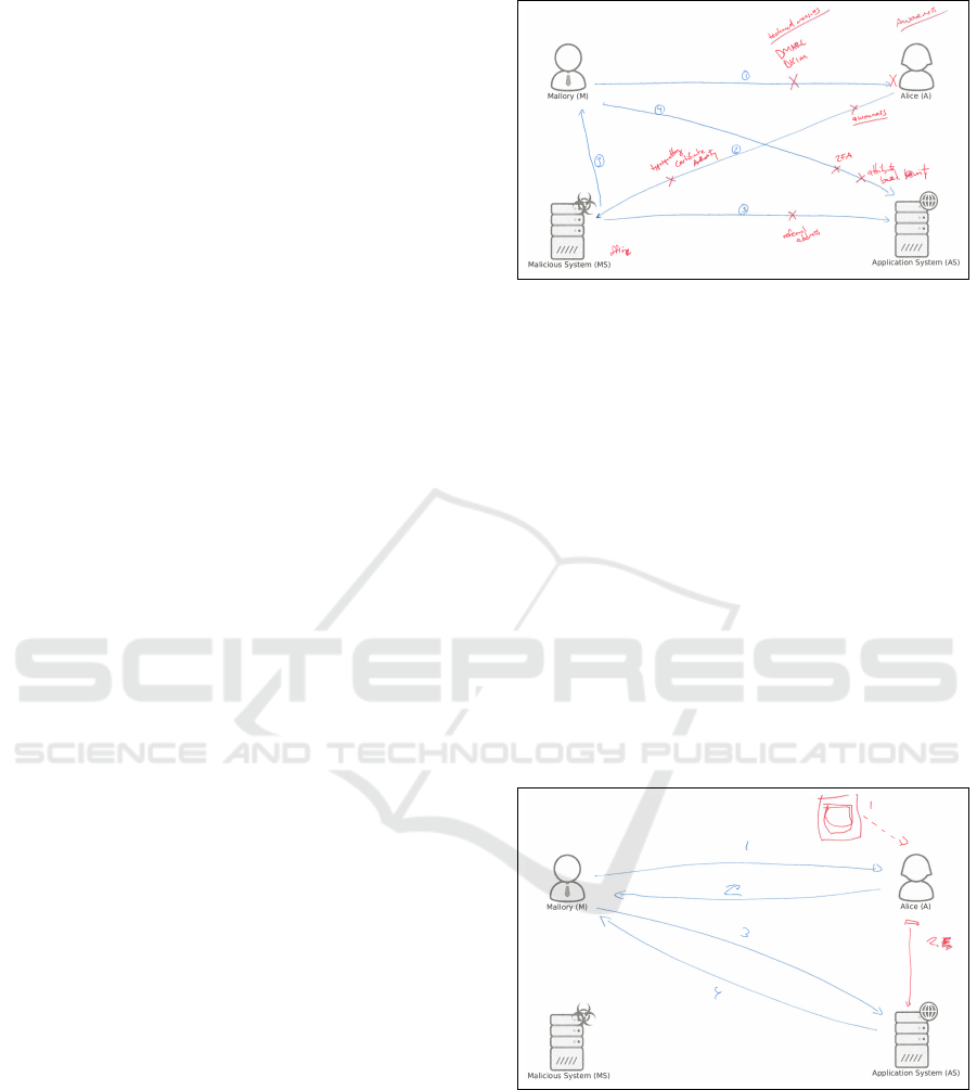
Figure 1: Interview drawing template.
The interview participants first drew their
thoughts on the attacks in blue colour in the tem-
plates. Afterwards, we asked them to draw security
measures in red colour while explaining them. Via
a questionnaire the interviewees provided their
demographic information (such as age or gender)
and assign themselves to one of the operational,
analytical or managerial groups.
3.2 Data Analysis
To analyse the interview results, we used the quali-
tative content analysis according to (Mayring, 2010)
and (Mayring, 2015). We structured the data into
different analysis units. These units usually corre-
sponded to one question. Few units spanned more
than one question. Some questions were covered by
more than one analysis unit. For each analysis unit,
we looked at the first interview and specified cate-
gories that the answer fitted in. Then, we tried to place
the answers from the other interviews into those cat-
egories. When the categories were insufficient, we
added a new category. For new categories, we went
back to previous interviews to see whether any an-
swer also fitted into this category. For most cases the
categories were non-exclusive. So an answer could
belong to one or more categories. If a person did not
answer a question, no category might be attached to
the analysis unit for this person. Table 1 shows the
Table 1: Categories of the questions on participants’ work.
Analysis Unit Categories
job title research, management, cert,
development
typical day read, write, meeting, partners,
analysis, development, coordi-
nation
typical data incidents, netflow, honeypots,
vulnerabilities, malware, to-
pography, actors, exploits, in-
fections, dns, whois
recommendation no, colleagues, partners, pub-
lic, policymakers, government
possible categories for the first questions exemplar-
ily. The differences in the interviews were sufficiently
large to have highly distinct categories.
3.3 Results
3.3.1 Identified Roles
The results of the job related questions show whether
the categorisation of the experts into the operational,
analytical and managerial groups fits. To investigate
whether different user groups might need different
dashboards, we first verified the user groups by their
job description. This is a prerequisite to talk about
user groups and not only about single users.
One operational person (person 6) handles inci-
dents and the other one (person 5) said that his role is
researcher but he is mainly doing development. The
typical days of the operational people includes soft-
ware development. The two participants, who identi-
fied themselves as analytical people, described their
roles as researcher. All participants that ticked the
management field on the questionnaire also described
their role as managerial during the interview. One
person (number 7) also mentioned his role is partly
researcher. Person 3 ticked both the analytical and
the managerial fields on the questionnaire, but only
described his role as managerial. All these suggest
that the classification of the participants into the three
groups is appropriate. The members of a group de-
scribed their roles similarly. Several tasks are mainly
or solely used in one of the groups. Therefore, it
seems reasonable to compare the cyber security men-
tal models of these groups and their data needs.
3.3.2 Mental Models over Cyber Attacks
The results of the mental model questions describe
how the participants of our study understand cyber
security attacks. Phishing attacks were the first cy-
Influence of Mental Models on the Design of Cyber Security Dashboards
131
ber attack described by the operational and analyti-
cal persons. The person who described himself as
analytical-management and another management per-
son described social engineering attacks that were not
phishing attacks. The other management person de-
scribed a Distributed Denial of Service (DDOS) at-
tack. Except the DDOS attack, all attacks were suit-
able to steal data from the application system. Com-
pared to the managers, the operational and analytical
persons were able to describe the attacks in more de-
tailed way and more fluently. Most participants used
technical terms in a correct way.
The description of a phishing attack by analytical
person 2 as follows. (Note that from this point on we
shall use use abbreviations [P] and [I] to mark the be-
ginning of the quotation made by the participant and
the interviewer, respectively.)
[P] Mallory sends an e-mail to Alice. This e-
mail looks identical to the one from the bank.
It has the bank’s logo. Has the bank’s every-
thing, house colour, etc. Everything looks just
like the bank. And it says: Mallory [sic!], your
account has been attacked, but, you know, we
have taken measures to secure it, but you need
to log in and make sure, everything is secure.
So click on this link and you login. When
she clicks on the link, she doesn’t go to the
bank, she actually goes to his, Mallory’s ma-
licious system, which looks identical to the
bank. Maybe, there is one letter difference.
I mean, it’s also shocking, how easy that is
to spoof. [...] And there is a place to fill in
your password and username. At that point,
as soon, as she fills in her password and user-
name, two things happen. The password and
username is send back to Mallory. And Alice
is send to the real bank. Then she is on the
real bank. Everything looks normal. [...] Ok,
she can go back to bed. But now, Mallory has
the username and password, so he sends that
to, he uses that to log in to the actual bank and
transfers all the money to his own account or
does whatever.
This description is very detailed. Each described
step corresponds to a line in the person’s drawing (see
Figure 2). The participant’s explanation guided us
through the process of how an attacker could create
a phishing e-mail to trick Alice into clicking a mali-
cious link, which in turn could give Mallory access to
her login data. In contrast to the previous case, the
description of the analytical/management person 3 is
not only less detailed, but also lacks important infor-
mation about the attack (see his drawing in Figure 3).
It describes a social engineering attack via telephone,
Figure 2: Drawing of attack 1 for analyst 2 describing a
phishing attack.
but does not say why Alice would be inclined to give
Mallory her password.
[P] Oh. The easiest one is to call Alice and
say: ”Hi, I am the helpdesk of Microsoft”. [I]
Ok. Then just make a line and number it one.
[P] One. Two. This is her password. Now
he is Alice. And he can do whatever Alice
does. [I] Ok. Can you describe it a bit more
in detail? When he says, he is the helpdesk
from Microsoft. [P] He can social engineer
into giving her credentials to him. And then
he can just, as the server has no clue and he
can I suppose remotely log on. And being,
pretend to be her and just has her user rights
and do whatever he wants.
Figure 3: Drawing of attack 1 for the analytical / manage-
ment person (3) describing a social engineering attack.
The description of a DDOS attack is an interest-
ing one to look at, as it is totally different from what
the other interviewees described. It is also the only at-
tack that does not allow Mallory to steal data from the
server. The description leads to the impression that
person 7 does not fully understand the ’effects’ of a
DDOS attack. The drawing suggests that the person
also tried to include features of a social engineering
IVAPP 2017 - International Conference on Information Visualization Theory and Applications
132
attack, as the AS should be used to trick Alice to en-
ter sensitive data (see Figure 4).
[P] Well, there would be a line of course, Mal-
lory to the malicious system. [I] Number it
with one, if it’s the first message. [P] I think,
this would be number two. Well, probably, Al-
ice would get that information and give some
feedback to that, which would lead for in-
stance. [I] Can you elaborate that a bit more?
So, what kind of attack is it? How do these
messages influence what Alice sees, or...? [P]
Well, Mallory would give some input for the
malicious system to start the attack. Then the
system would try to hack or break into the ap-
plication system. Of course, disguised. So Al-
ice sees something, but does not realise, that
it’s malicious attack, or it’s a malicious ques-
tion or a malicious query. She then gives some
input to the application system to send out in-
formation, which would get back to the mali-
cious system, which would get back to Mal-
lory. [I] And can you tell. You said the MS
would hack the application system, which is
request two. What kind of attack could this
be? [P] For instance a DDOS attack. Or?
Figure 4: Drawing of attack 1 for management person 7
describing a DDOS attack.
For the second attack, the field of attacks is a bit
more widespread. The participants mentioned two in-
jection attacks, two men-in-the-middle attacks, two
social engineering attacks and one malware attack.
Table 2 summarises the types of cyber-attacks de-
scribed by the participants (14 descriptions in total).
Also for the second attack the descriptive quality of
the managers was lower than that of the others.
3.3.3 Mental Models over Countermeasures
The countermeasures that the participants proposed to
prevent the attacks were mainly technical (e.g. two-
factor authentication, firewalls or attribute based de-
tection systems) and awareness related (e.g. aware-
ness campaign). Few measures were also related to
Table 2: Experts’ attack drawings categorised by attack.
Attack Number Percentage
Phishing 4 29%
Social Engineering 4 29%
Injection 2 14%
Man-in-the-Middle 2 14%
DDOS 1 7%
Malware 1 7%
law enforcement (e.g. detention of Mallory or take-
down of the system). The law enforcement related
measures were mainly described by two operational
persons as well as one analytical person.
A comparison of the groups show that the man-
agers described fewer countermeasures and the qual-
ity of their description was lower. As an example of
the quality of countermeasure descriptions for two in-
jection attacks, one operator (person 6) said:
[P] If this [MS] is one machine. You can just
block this machine after you see that machine
is scanning for vulnerabilities, of course. You
can harden the machine. Harden the machine
via firewall or something like that. Software
update policy. So that you don’t have the out-
dated plugins for Wordpress. And do regular
vulnerability scans, pentests yourself.
Whereas the management person 4 described:
[P] And the second one is a bit harder. Be-
cause, what you could do is, what you could
do is, something, here. To say well, the system
should recognise malware code. So what the
systems could do is check, whether an, what
the system could do is to check whether the
things that are brought in, into the system, are
they allowed. Is it allowed to store something
in your system. So that’s a solution direction
for this one. And for this one, Mallory, what
you could do, and what is done actually, is that
we keep track about the queries. Keep track
about what Mallory is asking. What you do is,
you keep track, well maybe Mallory is asking
a lot that she is not allowed to.
In summary, the managers described cyber attacks
and the corresponding countermeasures worse than
the other groups. During their attack descriptions the
managers mixed the order of steps, were less fluent
with the language, and missed important details of at-
tacks. Their pictures were less detailed and it was
more complicated to follow their explanations.
Influence of Mental Models on the Design of Cyber Security Dashboards
133

3.4 Discussion
In this study we found out that operators and analysts
understand what cyber attacks are and how they work.
They are aware of the different steps needed to per-
form a certain attack successfully. For each attack
step, they understand how it works in general and how
it contributes to the whole attack. If an attack contains
several different sub-attacks, they understand the con-
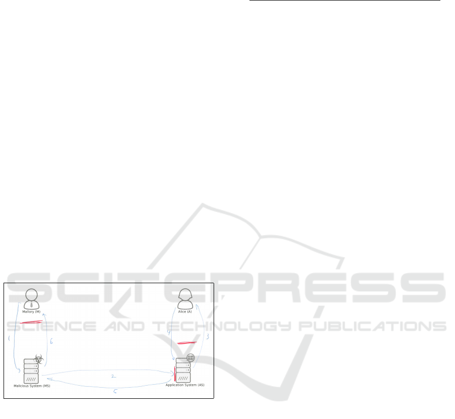
nection between them. Figure5 illustrates how an op-
erator or analyst might see the different steps in an
attack building up on each other. They are able to
elaborate different attacks. They understand what the
effect of a successful attack is. Therefore they can
think of those countermeasures that target one specific
step of the attack. They know countermeasures from
different areas such as technical measures, awareness
campaigns, or legal actions.
Figure 5: Visualisation how operators and analysts see cy-
ber attacks.
The managers in our study, on the other hand, un-
derstand that there are cyber attacks which need dif-
ferent steps to be carried out. They do not completely
understand which steps there are and how they con-
tribute to a successful attack. When describing an
attack, they do not elaborate on the specifics of the
steps and how they relate. The actual attack is more
like a black box with some single steps in it as illus-
trated in Figure 6. The managers know security mea-
sures to prevent attacks. Each countermeasure tries to
prevent one of the steps that make out the attack de-
spite the step being vague. The known measures are
mainly technical. The managers are not aware of law
enforcement measures such as detaining cyber crimi-
nals to prevent attacks. This might be due to the do-
main of attacks. As the attacks are technical, man-
agers might focus on technical countermeasures, and
think that technical solutions are the only ones feasi-
ble to deny such attacks. Using our data, we cannot
state why they did not think of any legal measure.
Figure 6: Visualisation how managers see cyber attacks.
4 DASHBOARD PROTOTYPE
In order to examine the impact of mental models on
cyber security dashboards we carried out a follow up
study through design, realisation and evaluation of a
prototype. Our initial study showed that managers
have a less detailed mental model over cyber security
than that of operators or analysts. As the operators
and analysts are the main people working with cyber
security data in our organisations, and considering our
available resources, we decided to design a cyber se-
curity dashboard for policymaking purposes, aimed
at the target group of the analysts and operators in the
initial study. Realising a single, on the other hand,
was enough to see whether the outcome is perceived
differently by the other group than it is perceived by
the target group.
4.1 Development
In order to match the design of the cyber security
dashboard to the target group we adapted a user cen-
tric approach whereby in 3 iterations the prototype
is evolved based on the feedback and requirements
of the target group users. Involving the target group
users in the design and development process in iter-
ative steps enabled us to elicit user requirements and
fine-tune the design to their needs. Designing a cyber-
security dashboard for policymaking purposes, on the
other hand, determined which data to use as input and
to display as output. The input data originate from the
Dutch National Cyber Security Centre (NCSC) (Min-
isterie van Veiligheid en Justitie, ) which at a strategic
level coordinates the countermeasures taken against
cyber attacks on Dutch governmental organisations
and Dutch critical infrastructures.
The final prototype is shown in Figure 7. This
figure shows a number of graphs, each of which we
are going to explain and refer to in the following.
The design of the dashboard followed an iterative pro-
cess (Nielsen, 1993). Each iteration included several
changes on the dashboard. After each iteration the re-
sulting dashboard prototype was discussed with some
of the original interview participants from the target
group for additional fine-tuning and further develop-
ment. Important aspects in the design process were
the simplicity of the dashboard to foster the under-
standing of the visualised data. The colours were cho-
sen to provide good readability. The arrangement of
dashboard elements tried to group the data and guide
the users’ view.
The first prototype showed how the total recorded
cyber security incidents develop over time. For the
period of twelve months, it showed in line graphs how
IVAPP 2017 - International Conference on Information Visualization Theory and Applications
134

many total incidents happened in general (similarly
to the graph on the centre-top side of Figure 7). Sev-
eral smaller graphs showed how different attack types,
such as phishing or injection attacks, were developed
(similarly to the graphs on the left side of Figure 7).
For prototype two, we changed the order of the
graphs for a better understanding of the connection
between the graphs of attack types, which sum up to
the numbers in the graph of total recorded incidents.
In the latter graph, we used another line to show the
total incidents that were reported in the previous year.
We added trend indicators to the graphs which – for
each of the graphs – compare the last month’s val-
ues with the mean of the previous eleven months. We
added a bar graph that displayed the incidents by the
sector (i.e., public, private, and international) from
which the incident report originated (similarly to the
graph on the centre-middle side of Figure 7).
In the final design we added further information
on the incidents per sector (see the graph on the
centre-bottom side of Figure 7) and included the num-
ber of security advisories produced per month for the
last 12 months (see the graph on the right side of Fig-
ure 7). These figures indicate the workload of NCSC
with regard to newly discovered vulnerabilities.
We chose a JavaScript implementation using the
Chartist (Kunz, ) framework for development. For
the website that embeds the charts, we used Boot-
strap (Getbootstrap.com, ) to create the base template.
Figure 8 shows how the software is structured. The
main components are the index.html, csd.js and dash-
board.js. The dashboard.js file uses the csd.js library
to modify the DOM-elements in HTML template.
The data is loaded from two .csv files into a TaffyDB
(Typicaljoe, ) object storage database. The csd.js
module provides functions to filter and group data
within the database and draw graphs using Chartist.
The full source code is available online (Maier, 2016).
4.2 Evaluation Mehtod
Evaluation of the realised cyber security dashboard,
which was designed for policymaking purposes, was
done by all members of the three user groups of man-
agers, analysts and operators (unlike the dashboard
development process where we involved only analysts
and operators). To this end, we showed the final dash-
board to all interviewees in the study (see Section 3)
and asked them to evaluate the dashboard. This led to
a user experience evaluation as well as an assessment
of the functionality. Due to the sensitive nature of the
real data, randomly generated dummy data was used
in evaluating the dashboard.
For a user experience assessment, we used the
User Experience Questionnaire (Laugwitz et al.,
2008). This questionnaire is a standardised measure
to gain insight in the user experience of software. It
asks participants to rate the software with the help of
word pairs. Every participant states which of the pair
words describes the software better on a scale of one
to seven. A one means that the first word totally de-
scribes the software. A seven means that the second
word fits completely. A four shows indifference and
the other numbers show further graduations. Example
word pairs are ’easy to learn’ vs. ’difficult to learn’ or
’valuable’ vs. ’inferior’. The answers are grouped
to provide measures for the scales of attractiveness,
perspicuity, efficiency, dependability, stimulation and
novelty (Laugwitz et al., 2008). We used a slider in
the online questionnaire tool LimeSurvey to simplify
the rating of the words.
There were also open questions to see how the par-
ticipants understood the dashboard. To answer these
questions properly, the participants needed to appro-
priately interpret the dashboard. One question was:
Recently, hackers managed to encrypt the data
of several German hospitals and demanded
Millions of Euros ransom in exchange for the
data. A Dutch member of parliament is scared
that something similar happens in the Nether-
lands. He asks you if this could be a problem
for the Dutch healthcare system as well. If
you look at the data of the dashboard. What
can you tell him?
Additional open questions looked at the usefulness
and the future perspective of the dashboard.
4.3 Evaluation Results
Due to the small number of participants, we do not
use the measures from the User Experience Question-
naire for any statistical test. When looking at Cron-
bach’s alpha for the scales in Table 3, one can already
see that the users did not rate very consistently es-
pecially on the efficiency and the dependability scale
(α .50, see (George and Mallery, 2007)). A gen-
eralisation to a larger population is not possible even
for such alpha values (Yurdugul, 2008). We did not
try to compare the values for the different user groups
either, as this would even shrink each sample size to
just two or 3 users. Nevertheless, we think that the de-
scriptive values might give some insight on how our
experts see the cyber security dashboard.
Table 3 also shows the mean and standard devi-
ation of the scales for all participants. The data is
transformed from the initially described scale from
1 to 7 to a scale from -3 to 3. A three denotes the
Influence of Mental Models on the Design of Cyber Security Dashboards
135
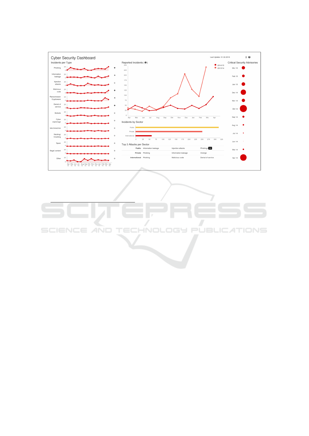
Figure 7: Final prototype design.
Table 3: Descriptive values of the User Experience Ques-
tionnaire evaluation.
Scale α Mean SD
Attractiveness .57 1.333 0.500
Perspicuity .68 2.179 0.535
Efficiency .25 1.571 0.607
Dependability .31 0.869 0.721
Stimulation .46 1.179 0.572
Novelty .83 0.357 0.911
best possible value on this scale. Due to the avoid-
ance of extreme values, extremely high or low values
are unlikely. Social desirability makes very low val-
ues even more unlikely (Bertram, 2013). For a rea-
sonable interpretation of these numbers, one needs a
point of comparison. Luckily, the creators of the User
Experience Questionnaire provide a benchmark set to
compare our dashboard data to ratings of 4818 peo-
ple from 163 different studies such as business soft-
ware or webshops. Even if no single software product
in the benchmark dataset may be directly comparable
to our dashboard, we argue that a comparison with
the mean values of more than 150 different software
products is reasonable. Figure 9 shows how the cy-
ber security dashboard compares to the data from the
benchmark dataset. The scales are ordered: Attrac-
tiveness, Perspicuity, Efficiency, Dependability, Stim-
ulation, Novelty. Table 4 shows what the ratings in
comparison to the benchmark mean.
The comparison with the benchmark shows that
our experts see the cyber security dashboard as out-
standing clear, respectively understandable and very
Table 4: Meaning of ratings in comparison to benchmark
dataset.
Excellent In the range of the 10% best results
Good 10% are better, and 75% are worse
Above Av. 25% are better, and 50% are worse
Below Av. 50% are better, and 25% are worse
efficient. It is quite attractive and stimulating. How-
ever, it seems they cannot depend too much on the
dashboard and do not see the design as innovative.
Several open questions related to specific parts of
the dashboard tried to assess how the participants un-
derstood the dashboard. Four questions asked for a
specific answer regarding data of the dashboard and
an explanation of that answer. Five participants pro-
vided reasonable explanations, backed up by the data
of the dashboard, for all those questions. Two partici-
pants only provided a reasonable explanation for three
questions. One of these wrong explanations is simi-
lar to the other experts’ explanations. According to
this answer, however, the question before should have
been answered differently. This might be a mistake
in reading the dashboard labels. The other wrong an-
swer uses background information on the frequency
of attacks that is not displayed in the dashboard.
As an example, we present some answers for the
question concerning ransomware in hospitals. Ana-
lyst 2 says:
[P] Yes, this can be a problem for the Dutch
healthcare system. According to the dash-
board this trend is increasing and it is now the
top attack in both public and private sectors.
IVAPP 2017 - International Conference on Information Visualization Theory and Applications
136
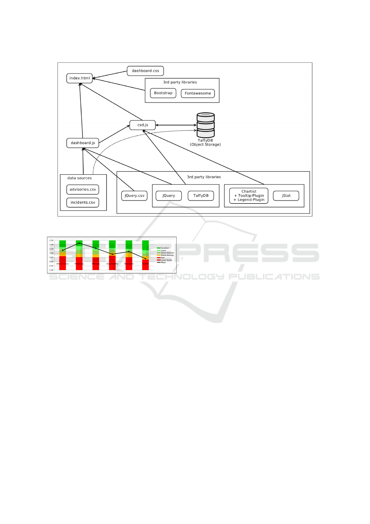
Figure 8: The architecture of the dashboard.
Figure 9: Comparison of dashboard rating with benchmark
data by (Laugwitz et al., 2008).
Manager 7 has a similar reasoning:
[P] While the healthcare system as such is not
specified in the dashboard, ransomware [sic]
makes out a high number of attacks in the pub-
lic sector, so it could be a problem.
Both these answers show how the participants read
the data from the dashboard and use them for their
answer. Although the second answer is completely
reasonable, it shows that some of the nomenclature of
the dashboard is not completely clear without back-
ground knowledge. The public sector data does not
include hospitals. Those belong to the private sector.
4.4 Discussion and Limitations
In this section we discuss first the results of the evalu-
ation of the prototype realised and subsequently the
influence of mental models on the design of cyber
security dashboards. We already argued that the de-
scriptive scales of the User Experience Questionnaire
should not be used for generalisation and can only
give some hints on how our experts see the dashboard.
The high rating on the perspicuity scale suggests
that the visualisation focuses on the relevant data. The
low rating on the novelty scale might also result from
this focus. There are no visual gadgets that are ob-
structive for the user. All the graphs are known to
the users and the users feel comfortable with them.
There is nothing surprisingly new in the design, which
could lead to a high novelty rating. The good rating
on the efficiency scale suggests that the users can use
the dashboard efficiently, e.g., see the numbers they
like to see very easily, do interesting comparisons and
get all needed information at a glance. The stimula-
tion and attractiveness give hints that the users like the
dashboard in terms of how it is designed.
The below average rating on the dependability
scale is difficult to interpret. On three of the four items
measuring this scale, at least one participant did not
give any rating. One of the items in this scale (unpre-
dictable vs. predictable) has no correlation with one
of the items of this scale and a negative correlation
with the two of the other items of this scale. The cyber
security dashboard is seen as unpredictable. An ex-
planation might be the use of randomly generated data
in the evaluation setting (see Subsection 4.2). This
data did not match what some of the experts might
expect from their prior knowledge.
Each user was able to interpret the dashboard rea-
sonably. There were only a few mistakes in the inter-
Influence of Mental Models on the Design of Cyber Security Dashboards
137

pretation of the dashboard figures. This indicates that
there were minor mismatches due to unfitting men-
tal models. One example is the wrong classification
of hospitals into the public sector. Based on these
results, further explanation of the used terms in the
dashboard seems useful to foster even a better under-
standing of dashboard information. Also, a more de-
tailed view on the data might improve the dashboard
experience. Nevertheless, the participants describe
the dashboard as a clean view, easy to read, and a
useful decision support means to prioritise their work.
The cleanliness described while answering the open
questions matches the good rating on the perspicuity
scale of the User Experience Questionnaire. In short,
we were unable to see any difference in how the dif-
ferent groups understood the dashboard, despite the
fact that we geared the design to the target group.
Two participants had interesting comments on ex-
tending and improving the dashboard. An analyst
(person 2) said that additional zooming functionality
would be good for a nice analytic dashboard. An op-
erator (person 6) stated that the cyber security dash-
board’s usefulness for operators is limited due to its
high abstraction level visualisation which tries to ”ap-
peal to both management and operations”. Therefore,
the development of a dashboard for analysts and oper-
ators based on their mental model has not been com-
pletely and exclusively appealing for this target group.
Due to the small sample size of the qualitative
method adopted, we cannot reliably assess the im-
pact of mental models on the design of cyber security
dashboard for policymaking purposes (for example to
claim that there were convincing indications that the
focus on mental models improved the dashboard de-
sign for or in favour of the targeted user group). Not
seeing meaningful difference in the way that the tar-
get group and the manager group perceived the cyber
security dashboard, despite their different cyber secu-
rity mental models, suggests that: (a) One needs to
examine the mental models of cyber security that is
specifically targeted for policymaking purposes (i.e.,
not at the deep level that we investigated) to see if
they differ per user group. (b) The study confirms the
claim of (Wash and Rader, 2011) in that the wrong
metal model of managers at the detail level that we
investigated does not hinder managers to correctly un-
derstand cyber security attacks for policymaking pur-
poses. (c) One should involve more participants in
elucidating the cyber security mental models. (d) Per-
haps our realisation of cyber security mental mod-
els did not catch the important differences leading
to a different cyber security understanding. E.g.,
we should have included the features additionally re-
quested by the operators and analysts (e.g., provid-
ing detailed information and zooming in smaller time
frames). This might have changed the perception also
for the managers.
Therefore, the mental model of cyber security
(i.e., the way that we examined based on how cyber
attacks take place) is not determinant of understand-
ing cyber security issues at the policymaking level
and for policymaking purposes. This research, nev-
ertheless, provides insight in the cyber security men-
tal models as presented in Section 3 and results in the
above mentioned preliminary insights for future re-
search on how mental models can further be investi-
gated for the design of (cyber security) dashboards.
5 CONCLUSION
The theory on dashboard design suggests the con-
struction of different types of dashboards for different
people. Different mental models dominating in differ-
ent user groups might be one reason for that. Mental
models describe how people understand a certain do-
main and provide a base for the creation of a cyber se-
curity dashboard. This work described the design, im-
plementation and evaluation of a cyber security dash-
board for policymaking purposes based on the mental
models of potential users.
Based on expert interviews, we showed that there
exists a difference in the perceptions (i.e., mental
models) of cyber attacks by the potential users of
the cyber security dashboard (i.e., among managers,
analysts and operators). We did not attempt to for-
malise the models and just showed the difference in
the depth of cyber attacks understanding. Managers
have a more superficial understanding of such attacks
than operators or analysts. Therefore managers might
need a different cyber security dashboard than the op-
erators and analysts. Based on those findings, we fo-
cused on the operators and analysts for the design of
the cyber security dashboard by using their feedback
during the development process of the prototype.
The evaluation of the cyber security dashboard
showed that it is usable and provides meaningful in-
sight. It visualises data in a comprehensive way and
can be used to prioritise the focus of governmental
institutions for cyber security. The evaluation fur-
ther showed that the dashboard is clearly arranged and
easy to use. Despite the focus on operators and ana-
lysts, an analyst and an operator pointed out limita-
tions (i.e., need for detailed information and zoom-
ing into smaller time frames). The evaluation showed
that there was no meaningful difference between all
three groups concerning the understanding of the cy-
ber security dashboard, designed for policymaking
IVAPP 2017 - International Conference on Information Visualization Theory and Applications
138

purposes. We enumerated a number of reasons for
this lack of meaningful difference in Subsection 4.4.
We expect similar results if mental models are applied
to the design of dashboards in other domains than the
cyber security domain.
Further research should investigate cyber security
mental models in more detailed ways. This can be
done first without considering the dashboard design
aspects. A combination of these subjects may seem
more useful after further exploring them on their own.
Some relevant questions to then explore include: (a)
Can the dashboard be used to nurture the right men-
tal model of security attacks in non-experts (like the
mental models of the managers in our study)? From
an educational perspective the important aspect is to
discover misconceptions (since practice makes it not
only perfect but also permanent). The question is to
what extent a dashboard can allow for this nurturing.
In our setting, for example, the additional interactiv-
ity requested by the analyst and the operator could add
more depth/detail, allowing users to verify their own
hypotheses and misconceptions. (b) Identification of
the utility of dashboard for different user groups. Do
analytical people actually need a dashboard? In what
context are dashboards relevant for managers? Here
it might be useful to couple a mental model approach
with task analysis, to identify if and where users with
mistaken mental models need support.
REFERENCES
Asgharpour, F., Liu, D., and Camp, L. J. (2007). Men-
tal Models of Computer Security Risks. In Workshop
on the Economics of Information Security, pages 1–9,
Pittsburgh.
Ben-Ari, M. (1998). Constructivism in computer science
education. ACM SIGCSE Bulletin, 30(1):257–261.
Bertram, D. (2013). Likert scales are the meaning of life.
Technical report.
Craig, K. J. W. (1943). The Nature of Explanation. Cam-
bridge University Press, Cambridge.
CTF365 Blog (2014). Interactive Cyber Attack Map.
Deutsche Telekom AG Honeypot Project (2015). T-Pot: A
Multi-Honeypot Platform.
D
¨
oring, N. and Bortz, J. (2015). Forschungsmethoden und
Evaluation in den Sozial- und Humanwissenschaften.
Springer, Berlin, Heidelberg, 5 edition.
Doyle, J. K. and Ford, D. N. (1998). Mental models con-
cepts for system dynamics research. System Dynamics
Review, 14(1):3–29.
Few, S. (2006). Information Dashboard Design. O’Reilly
Media, North Sebastopol, 1 edition.
Few, S. (2007). Dashboard Confusion Revisited. Perceptual
Edge, pages 1–6.
Fonteyn, M. E., Kuispers, B., and Grobe, S. J. (1993). A De-
scription of Think Aloud Method and Protocol Anal-
ysis. Qualitative Health Research, 3(4):430–441.
George, D. and Mallery, P. (2007). SPSS for Windows Step-
By-Step: A Simple Guide and Reference. Allyn & Ba-
con, 14 edition.
Getbootstrap.com. Bootstrap · The world’s most popular
mobile-first and responsive front-end framework.
Hinckley, J., Hinckley, J., and Robinson, J. G. (2005). The
Big Book of Car Culture: The Armchair Guide to Au-
tomotive Americana. Motorbooks, St. Paul.
Knorr-Cetina, K. (1981). The Manufacture of Knowledge:
An Essay on the Constructivist and Contextual Nature
of Science. Pergamont Press Ltd., Oxford, 1 edition.
Kunz, G. Chartist - Simple responsive charts.
Laugwitz, B., Held, T., and Schrepp, M. (2008). Con-
struction and Evaluation of a User Experience Ques-
tionnaire. In Holzinger, A., editor, 4th Symposium of
the Workgroup Human-Computer Interaction and Us-
ability Engineering of the Austrian Computer Society,
pages 63–76, Graz. Springer Berlin Heidelberg.
Maier, J. (2016). csd: v1.0.
Mayring, P. (2010). Qualitative Inhaltsanalyse. In Mey,
G. and Mruck, K., editors, Handbuch Qualitative
Forschung in der Psychologie, pages 601–613. VS
Verlag f
¨
ur Sozialwissenschaften, Wiesbaden, 1 edi-
tion.
Mayring, P. (2015). Qualitative Inhaltsanalyse Grundlagen
und Techniken. Beltz, Weinheim und Basel, 12 edi-
tion.
McNeil, S. (2015). Visualizing mental models: Understand-
ing cognitive change to suppor teaching and learning
of multimedia design and development. Educational
Technology Research and Development, 63(1):73–96.
Ministerie van Veiligheid en Justitie. What is the NCSC?
— NCSC.
National Cyber Security Center (2014). Cyber Security As-
sessment Netherlands 2014.
Nielsen, J. (1993). Iterative Design of User Interfaces. IEEE
Computer, 26(11):32–41.
Norman, D. A. (2013). The design of everyday things: Re-
vised and expanded edition. Basic books.
Trend Micro Incorporated (2015). Report on Cybersecurity
and Critical Infrastructure in the Americas.
Typicaljoe. TaffyDB - The JavaScript Database.
Wash, R. and Rader, E. (2011). Influencing Mental Models
of Security: A Research Agenda. Proc. of the 2011
workshop on New security paradigms, pages 57–66.
Wired UK (2015). Infoporn: Cyberattacks have created an
invisible but vast war zone.
Yurdugul, H. (2008). Minimum Sample Size for Cronbach’s
Coefficient Alpha: A Monte-Carlo Study. Hacettepe
University Journal of Education, 35:397–405.
Influence of Mental Models on the Design of Cyber Security Dashboards
139
