
A Clustering-based Visual Analysis Tool for Genetic Algorithm
Habib Daneshpajouh and Nordin Zakaria
High Performance Computing Center,
Universiti Teknologi Petronas,
Perak, Malaysia
Keywords:
Genetic Algorithm, Cluster Formation, Evolutionary Process, Search Space Analysis, Evolution Visualization.
Abstract:
While Genetic Algorithm (GA) is a powerful tool for combinatorial optimization, the vast population of can-
didate solutions it typically deploys and algorithm’s intrinsic randomness lead to difficulty in understanding its
search behavior. We discuss in this paper a clustering-based visualization tool for GA that attempts to mediate
this problem. GA population across its entire generations are clustered, and each cluster and its individuals
are mapped to a visual symbol. The tool enables a GA researcher or user to understand better the behavior
of a GA run, specifically the local searches it performs in its global exploration to go from one generation to
another.
1 INTRODUCTION
Genetic Algorithm (GA), initially conceived by John
Holland (Holland, 1975), is among the most popular
meta-heuristics for combinatorial optimization prob-
lems these days. GA typically generates a huge num-
ber of candidate solutions (individuals) to a problem
in a search process inspired by Darwinian natural evo-
lution, involving concepts such as selection, crossover
and mutation. While a powerful paradigm, the vast
amount of data semi-randomly evolved by GA eludes
an intuitive interpretation, leading to difficulty in un-
derstanding its search behavior.
The main approach pursued in this paper to ad-
dress the above-mentioned problem is visualization.
The mainstay of big data analysis (Fan and Bifet,
2013), visualization can serve users with different lev-
els of expertise (Gelman and Unwin, 2013). Applied
to GA, it can potentially be used to analyze its inner
working (Hart and Ross, 2001).
Specifically, this paper describes a clustering-
based visualization tool for GA. The proposed tool
performs an offline visualization on the GA data. The
clustering structures the population visited by GA
across its generations, allowing a GA researcher to
make sense of the local searches performed by GA in
its global exploration. Individuals within a cluster are
mapped in a certain way to a certain symbol, allow-
ing the researcher to make statements about the way
in which the GA has been progressing.
While there have been various tools for the visual-
ization of GA, the one proposed in this paper is unique
due to its emphasis. Prior work in general focuses on
the visualization of high-dimensional individuals in
GA, while our proposed tool concerns more on visu-
alizing the dynamics of cluster formations in GA. In
particular, this tool enables us:
1. To study the search space explored by GA and an-
alyze the behavior of the operators and parameters
deployed for the search.
2. To obtain useful information that can be used later
by the GA researcher to interactively manipulate
the search space.
The rest of this paper is organized as follows: In
section 2, work related to the visualization of GA
is reviewed. The details of the visualization imple-
mented in our proposed tool is elaborated in section
3. An example analysis is presented in section 4, fol-
lowed by a comparison with the existent tools in sec-
tion 5. Finally in section 6, the conclusion is drawn
along with suggestions for future work.
2 RELATED WORK
In the following, existent tools and methods for offline
visualization of GA are reviewed. Early works in the
90s were mostly published by Collins. In (Collins,
1996), Collins proposed a mapping method called
Genotypic-Space Mapping based on the direct lin-
ear two-way relationship between high-dimensional
Daneshpajouh H. and Zakaria N.
A Clustering-based Visual Analysis Tool for Genetic Algorithm.
DOI: 10.5220/0006135902330240
In Proceedings of the 12th International Joint Conference on Computer Vision, Imaging and Computer Graphics Theory and Applications (VISIGRAPP 2017), pages 233-240
ISBN: 978-989-758-228-8
Copyright
c
2017 by SCITEPRESS – Science and Technology Publications, Lda. All rights reserved
233
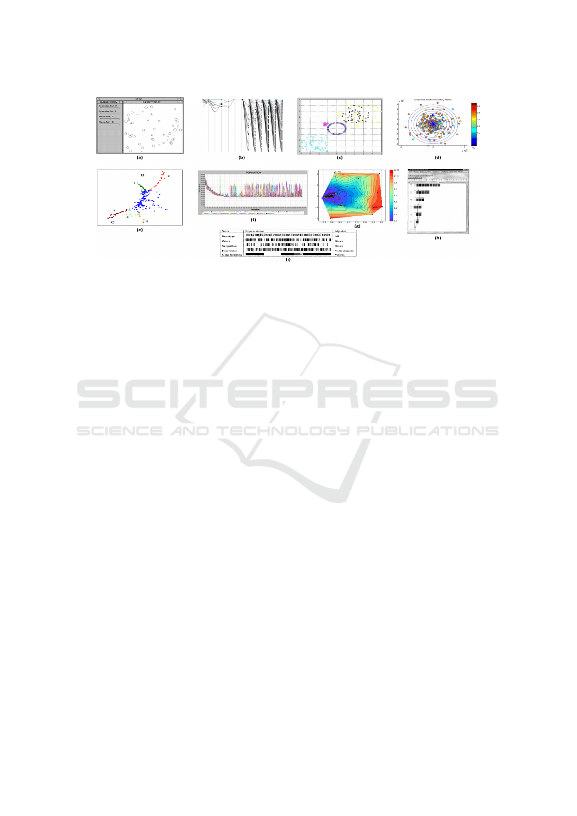
Figure 1: (a) Tool developed by Collins; (b) ELICIT tool; (c) Tool developed by He and Yen; (d) Tool developed by Craven
and Jimbo; (e) Tool developed by Kudo and Yoshikawa; (f) FOM tool; (g) Tool developed by Kramer and Luckehe; (h)
GAVEL tool; (i) VIS tool.
strings and two or three dimensional co-ordinates
for visualization of GA population. Although this
was the first dedicated work on visualization of high-
dimensional individuals, it only offers a single view
into the GA population and also insufficient level of
user interactivity.
A tool developed by Wu et al. (Wu et al., 1999)
called VIS to analyze the details of an Evolutionary
Algorithm (EA) run. For visualization of individuals,
five different graphical representations are offered by
this tool, namely: Genotype, Zebra, Neapolitan, Four
Color, and Gene Location, each of which is suitable
for a specific chromosome representation. Also, it of-
fers a view named Family Format to show the parents
and offspring of a particular individual. However, it
does not provide any view for the visualization of in-
dividuals in objective space, and also for individuals
phenotype.
GAVEL introduced by Hart and Ross (Hart and
Ross, 2001), is another analysis tool for GA. The
main idea of this tool is to start from the best solu-
tion found at the end of a GA run and trace back its
evolution by finding the parents and parents of par-
ents, etc., all the way back to the initial generation
of individuals. The aim of this process is to produce a
complete ancestry tree of the best solution. Moreover,
this tool tracks the history of every single gene in the
best individual’s chromosome to find the individual it
originated in. GAVEL visualizes the individuals using
three graphical representations, namely: Alleles Val-
ues, Gene Origins, and Operator Origins. Like the
VIS tool, this tool has the disadvantage of not provid-
ing any view for the individuals phenotype.
Parejo et al. (Parejo et al., 2003) developed
a framework for meta-heuristic optimization called
FOM. This tool includes the implementation of sev-
eral meta-heuristics such as Steepest Descent, Iter-
ative Steepest Descent, Tabu Search, Simulated An-
nealing, GRASP, Variable Neighbourhood Search
and GA. FOM provides visualization and some sta-
tistical information of the individuals fitness values.
However, no view is provided for representing indi-
viduals in parameter space and also for individuals
phenotype.
Kudo and Yoshikawa (Kudo and Yoshikawa,
2012) proposed a visualization method using an idea
of Isomap. They applied the proposed method to
data came from a Multi-Objective Genetic Algorithm
(MOGA), which was used to solve a problem in engi-
neering design field, i.e. conceptual design optimiza-
tion problem of hybrid rocket engine. The focus of
this method is to analyze the distribution of Pareto in-
dividuals by visualizing the manifold embedded in the
high dimensional objective space, and in fact, this is
the only view provided by this method.
Craven and Jimbo (Craven and Jimbo, 2014) in-
troduced a hybrid visualization scheme to determine
the stability of an EA with regards to changes of its
control parameters. In this method, the EA stabil-
ity is measured according to two perturbation metrics,
and will result a different visual representation of lo-
cal neighborhoods in parameter space for each met-
ric. However, the visualization using this method is
limited to parameter space, and objective space is not
considered.
Kramer and Luckehe (Kramer and L
¨
uckehe,
2015) presented a visualization approach for con-
tinues evolutionary runs, using isometric mapping
(ISOMAP) for mapping high-dimensional individu-
als to a two-dimensional representation. By perform-
ing some experiments, they claimed that ISOMAP re-
sults equally or better locally linear embedding than
IVAPP 2017 - International Conference on Information Visualization Theory and Applications
234

Principal Component Analysis (PCA) in maintaining
neighborhoods of high-dimensional individuals.
A tool called ELICIT was developed by Cruz and
Machado (Cruz et al., 2015) to enable the visual
exploration of evolutionary computation algorithms.
Two levels of view is provided by ELICIT, namely
General View to cover the whole population, and In-
dividual View to cover a particular individual. For an
individual, both genotype and phenotype can be visu-
alized. However, this tool lacks in providing enough
statistical information beside the visualizations.
In a recent effort, He and Yen (He and Yen, 2016)
proposed a new method to visualize the population of
Many-Objective Evolutionary Algorithms (MaOEAs)
in high-dimensional objective space. They claimed
that their proposed method maps individuals from a
high-dimensional objective space into a 2D polar co-
ordinate graph while preserving Pareto dominance re-
lationship, retaining shape and location of the Pareto
front, and maintaining distribution of individuals. Al-
though effective in visualizing the high-dimensional
objective space, this tool only provides a single view
into the EA population which might not be sufficient
for gaining a comprehensive insight.
A screenshot from each of the reviewed works is
presented in Fig. 1. Although all these works have
their own strengths and weaknesses which some are
already mentioned, each of them has at least one of
the following limitations:
• Poor level of user-interactivity.
• Expert knowledge required on the context in or-
der to digest the visualization result, which makes
it unsuitable for users with less knowledge in evo-
lutionary computation.
In contrast, by taking into consideration the above
limitations, the tool proposed in this paper provides
the user with a high level of interactivity in a 3-D en-
vironment to move inside and in between views with
different levels of granularity. However, it is notewor-
thy that the 3-D environment is merely used to orga-
nize the information space, and the third dimension
itself contains no information.
3 VISUALIZATION APPROACH
3.1 Overview
The data produced by the evolutionary process of GA
including all the individuals genotypes and their ob-
jective values will be given to the visualizer as in-
put. The process pipeline includes a clustering algo-
rithm to perform a (global) clustering across all gen-
erations of a GA run based on the distribution (simi-
larity) of individuals in parameter space. Then, clus-
ters will pass through a symbol mapping process, to
be described in subsections to follow. Finally, all the
clusters and their mapped symbols will be passed to
an interactive visualization interface. Since the infor-
mation to be visualized is over multiple generations,
clusters and sub-clusters, the visualization interface
contains square-walls to ease the organization, parti-
tioning and positioning of this information. Symbols
to be used in the elaboration are listed below:
• N: total number of individuals in all generations
of a GA run
• M: number of generations
• K: number of clusters
• I = {i
n
| 1 < n <= N } is the set of all individuals
• C
k
, 1 < k <= K,C
k
⊆ I is a cluster of individuals
across all generations
• C = {C
1
,C
2
,C
3
, ...,C
K
} is the set of all clusters
• c
km
, 1 < k <= K, 1 < m <= M, c
km
⊆ C
k
is a part
of cluster C
k
in generation m (sub-cluster)
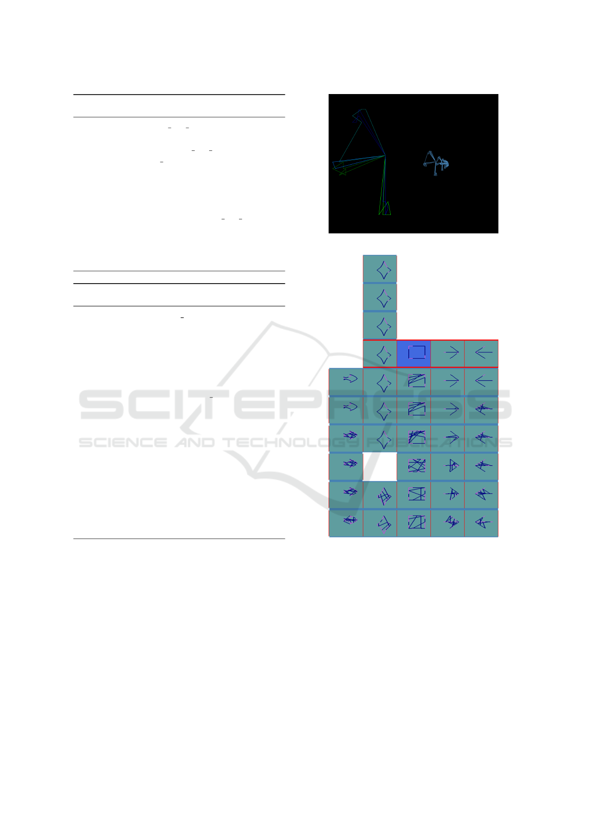
Fig. 2 gives a bird’s-eye view of the visualization
interface where the whole population of N individuals
are placed on a tower, with each column representing
a cluster, each row representing a generation and each
square-wall representing a sub-cluster.
There is a control panel at right side of the inter-
face (Fig. 2), which not only provides some statistics
of clustering and information about the individuals,
but also enables the user to choose between three op-
tions from different families of clustering algorithms,
set their associated parameters and re-run the cluster-
ing (i.e. restart the whole process pipeline). The op-
tions for clustering algorithm are as follows:
• Centroid-based: k-means
• Density-based: DBSCAN
• Connectivity-based: Hierarchical agglomerative
The user is able to move the camera in six direc-
tions to have a look from an arbitrary angle. More-
over, different walls, floors and towers (multiple tow-
ers in case of multi-population visualization) can be
chosen by a mouse click to get the related statistics
in the control panel. As shown in Fig. 2, the wall on
down-left corner of the tower is currently being ac-
tivated. In fact, blue color indicates the active wall
(sub-cluster) and red border indicates the active floor
(generation). The ”Next” and ”Previous” buttons in
the control panel can be used to navigate through in-
dividuals of the active wall to see their gene values,
A Clustering-based Visual Analysis Tool for Genetic Algorithm
235

Figure 2: A bird’s-eye view of the visualization interface.
Figure 3: An example set of reference shapes with 16 ver-
tices in their graph structures.
scaled aggregate fitness values and objective scores.
The active individual is always presented by a red
color. To gain a rich insight, the visualization inter-
face provides three levels of view into the GA popu-
lation which are described in the following.
3.2 Symbol-view
This is a high-level view in which a unique visual
symbol is assigned to each cluster. Then, a represen-
tative individual from each sub-cluster is mapped to
the symbol of the cluster it belongs to, so that shape
transformation of the symbol in each generation de-
picts the evolution of the representative individual.
Fig. 3 shows a set of five shapes drawn by our simple
shape-drawer program to be used as symbols. Each
of these shapes will be used as symbol of a partic-
ular cluster. Two methods of symbol mapping are
presented here. First, is Isomorphic Graph-Mapping
which is a genotypic-based method and is mainly use-
ful in case of combinatorial problems. Second, is
Polygon-Morphing which is a fitness-based method
and can be used for any kind of problem given to GA.
3.2.1 Isomorphic Graph-mapping
Let G={V, E} and G
0
= {V
0
, E
0
} be graphs. G and
G
0
are said to be isomorphic (G
∼
=
G
0
) if there is a
bijection ϕ = V → V
0
which preserves adjacency and
nonadjacency (with xy ∈ E ⇔ ϕ(x)ϕ(y) ∈ E
0
for all
x, y ∈ V ) (Diestel, 2000). Such a mapping ϕ is called
an isomorphism. Although two isomorphic graphs
might have different shapes, their structures are ex-
actly the same.
Algorithm 1 describes the assignment of a symbol
to each cluster, using Isomorphic Graph-Mapping. In
step 4 of the algorithm, we are facing with an opti-
mization problem to find the best mapping from the
graph produced by the representative individual (e.g.
in the case of Vehicle Routing Problem (VRP), the
graph includes customer nodes as its vertices and ve-
hicle routes as its edges) to the graph of its corre-
sponding symbol. A genetic algorithm is used here
to handle the optimization problem. The GA being
used tries to find the best mapping from the vertex-set
of the representative individual to the vertex-set of its
symbol. In order to measure the quality of mappings
found by the GA chromosomes, Hausdorff distance
is being used in the fitness function. This distance
measures the extent to which each point of a model
set lies near some point of another set and vice versa
(Huttenlocher et al., 1993). The Hausdorff distance is
presented as the function in Algorithm 2.
After assigning a symbol to each cluster (step 2 to
5 of Algorithm 1), each sub-cluster is taken to map its
representative to the symbol of the cluster it belongs
to, based on the mapping found in step 4.
3.2.2 Polygon-morphing
This method uses fitness values to assign symbols,
hence it is neither dependent on the type of prob-
lem nor the representation of individuals. Basically, it
generates a range of morphed shapes for each symbol.
The process begins by generating a random mapping
of vertex-list for the original symbol to get an ugly
instance of it. Then, the generated shape will be mor-
IVAPP 2017 - International Conference on Information Visualization Theory and Applications
236
Algorithm 1: Assigning symbols based on Isomorphic
Graph-Mapping.
1: procedure ASSIGN ISO SYMBOLS(C, shapes)
2: for k ← 1 to K do
3: ClRepIndv ← get rep indiv(C
k
)
4: ϕ
k
← best mapping(ClRepIndv, shapes
k
)
5: end for
6: for m ← 1 to M do
7: for k ← 1 to K do
8: SubClRepIndv ← get rep indv(c
km
)
9: map(SubClRepIndv, shapes
k
, ϕ
k
)
10: end for
11: end for
12: end procedure
Algorithm 2: Finding Hausdorff distance between two
graphs G and G
0
.
1: function HAUSDORFF DIST(G, G
0
)
2: hausDist ← 0
3: for each vertex (v in G and ϕ(v) in G
0
) do
4: longestDist ← 0
5: for each neighbor n o f v in G do
6: shortestDist ← +∞
7: for each neighbor n
0
o f ϕ(v) in G
0
do
8: d ← euclidean
Dist(n, n
0
)
9: if d < shortestDist then
10: shortestDist ← d
11: end if
12: end for
13: if shortestDist > longestDist then
14: longestDist ← shortestDist
15: end if
16: end for
17: hausDist ← hausDist + longestDist
18: end for
19: return hausDist
20: end function
phed towards the original shape in multiple steps.
The number of steps depends on defined length of
the morphing range by the user. Obviously, longer
length of the range results in a more accurate map-
ping while needing more computational time and re-
sources. Again by using Hausdorff distance, each
morphed shape will be compared to its original shape
and given a similarity score. Finally, representatives
of each sub-cluster will be associated with one of the
morphed shapes based on the closeness of their aggre-
gate fitness values to the similarity score of the mor-
phed shapes.
Figure 4: Phenotype-View.
Figure 5: Result of Isomorphic Graph-Mapping.
3.3 Individual-distribution View
This is a middle-level view which shows the distribu-
tion of individuals in clusters by placing circles (as in-
dividuals) on a square-wall. While a unique color (for
the circles) is assigned to each cluster, the positioning
of individuals on 2-D walls is based on their scaled
objective scores. The control panel enables the user
to choose between three options of individual rank-
ing that results different positioning on the walls: in
sub-cluster, in cluster, and in generation.
A Clustering-based Visual Analysis Tool for Genetic Algorithm
237
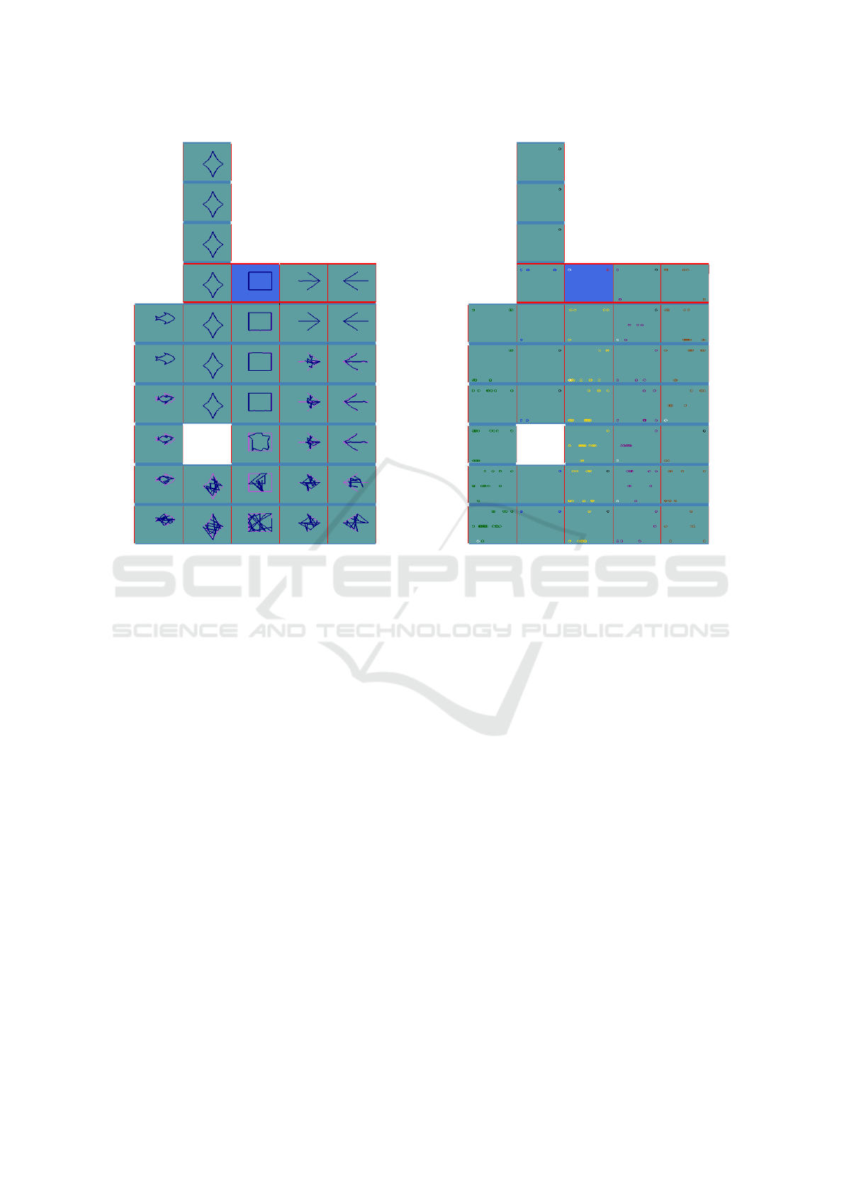
Figure 6: Result of Polygon-Morphing.
3.4 Phenotype-view
The lowest-level view of the visualizer provides phe-
notype of the individuals in a sub-cluster chosen by
the user (Fig. 4). The individuals are sorted from
highest to lowest aggregate fitness in a row. The cam-
era is placed on the 45-degree angle from the individ-
uals to provide a more dominant view of the whole
row, so the user is able to compare the most-front in-
dividual with some of those behind in one look. Nev-
ertheless, the active individual is always highlighted
by a different color. In addition, the control panel
includes a checkbox which enables the user to link
the camera to the active individual, so each time the
user switch to another individual, camera will auto-
matically be placed at a close position to the active
individual.
4 EXAMPLE ANALYSIS
A test application of the proposed approach is per-
formed in the following context: We applied Non-
dominated Sorting Genetic Algorithm II (NSGA-II)
(Deb et al., 2002) to an instance of VRP. The VRP in-
stance being used is a smaller version (15 customer
nodes) of C101 instance from Solomon’s bench-
Figure 7: Result of Individual-Distribution View.
marks. The maximum number of generations for GA
was set to 10 (which proved to be enough for a good
convergence as C101 has a clustered structure) with
50 individuals per generations.
Fig. 5 shows the result when Isomorphic Graph-
Mapping is chosen to map the symbols. In the first
few generations down there, all the symbols are seen
to be messy that is a proper representation of the weak
individuals. By each generational step, symbols tend
to be more similar to the perfect shape. For instance,
the left-most cluster with a fish as its symbol lasts un-
til sixth generation and it had no improvement from
fifth to sixth generation, because its symbols at these
generations are identical. However, second cluster
with a star symbol, despite of being absent in gen-
eration 3, lasts up to the end of evolutionary process
which obviously represents the place in fitness land-
scape where GA is converged in. The reason that sec-
ond cluster with a star symbol disappears in genera-
tion 3 is due to the fact that none of its individuals
belongs to this generation. In other words, GA left
this cluster in generation 3 and went back to it in gen-
eration 4 onward. Same goes to empty sub-clusters in
Fig. 2, Fig. 6 and Fig. 7.
Fig. 6 illustrates the results for the Polygon-
Morphing method of mapping symbols. Unlike the
previous method which takes care of similarity in
IVAPP 2017 - International Conference on Information Visualization Theory and Applications
238
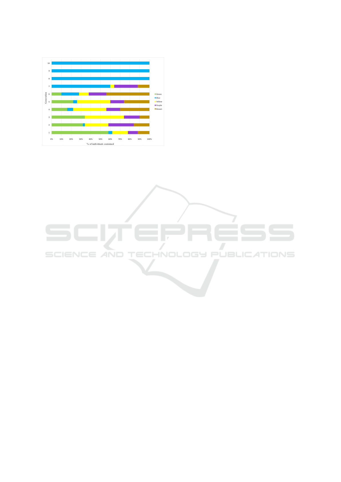
Figure 8: Number of individuals in different clusters during
each generation.
parameter space, Polygon-Morphing visualizes the
changes in objective space. As an example, the
square-symbol cluster on the middle of tower expe-
rienced two jumps in its fitness from first generation
to third, but form generation 4 onwards, the changes
are little.
Moving one level deeper, the Individual-
Distribution View is experimented with. One of the
useful insights given by this view is the diversity level
of the population. In Fig. 7, individuals are placed
on the walls based on their scaled objective scores
in sub-cluster for total traveled distance (horizontal
axes, left to right) and number of routes (vertical
axes, down to up). Further, at each floor, the best and
worst individuals in generation are presented with
black and white color respectively. When comparing
blue cluster with yellow, it can be seen that yellow
is much more diverse while blue is the one which
contains the best-in-generation individual for half of
the generations. Fig. 8 illustrates how GA converges
in the blue cluster. By referring to statistics given
by our visualization tool, we see that the variance of
the blue cluster is almost 28, which is the minimum
among all, together with the chart in Fig. 8, one can
conclude that GA tries to gradually find and climb
the global optima (i.e. the blue cluster) in the fitness
landscape while at the same time tests different places
(i.e. other clusters that might be around local optima).
In other words, by having a holistic look at the tower,
it is clear that GA tends to globally explore the fitness
landscape by hanging around different optima and
trying to evolve them using its local searches. Also,
it shows that at each generational step, depending
on competitiveness of the local optima compared to
others, GA might clone more individuals around it or
conversely, take out (some) individuals from there.
Last but not least, lowest-level view of the visual-
izer is presented in Fig. 4, which provides a close look
at the individual’s phenotype. As can be seen, the
active individual is presented with a different color,
which in the case of VRP, each route has a unique
color. By traversing the individuals in the row, it can
be seen that fitter individuals are less colorful due to
their superiority in the number of routes objective.
5 COMPARISON WITH OTHER
TOOLS
This section presents a comparison between the fea-
tures offered by our proposed tool and the tools pre-
viously discussed in section 2. The choice of the
characteristics for this comparison was based on three
main factors: the ability to visualize the evolutionary
process and individuals from various perspectives, the
suitability for users with different levels of expertise,
and the level of user-interactivity. This comparison
is shown in Table 1. As we can observe, the ability
of visualizing cluster formations in GA evolutionary
process is offered by none of the tools except our pro-
posed tool. Moreover, all other features provided by
the existent tools are also offered by our tool with the
exception of the feature to visualize many-objective
problems. This feature is planned to be integrated into
the current tool in the near future.
6 CONCLUSION AND FUTURE
WORK
A clustering-based visualization tool for GA has been
presented in this paper. The tool has the potential of
providing useful information on the dynamics of clus-
ter formations in GA. Since cluster formations corre-
spond to local searches performed by the GA, it can
provide insight on how effectively the GA is behav-
ing in its search effort. The proposed tool particularly
enables us to analyze the behavior of GA operators
and parameters, and also obtain useful information
that can be used later to interactively manipulate the
search space.
More work of course remains to be done to en-
hance the usefulness or usability of the tool and its
underlying paradigm. In the near term, we intend to
investigate the following:
• Full analysis of the clusters found by different
clustering algorithms.
• Using different distance measures for clustering
to possibly get different insights into the fitness
landscape.
A Clustering-based Visual Analysis Tool for Genetic Algorithm
239
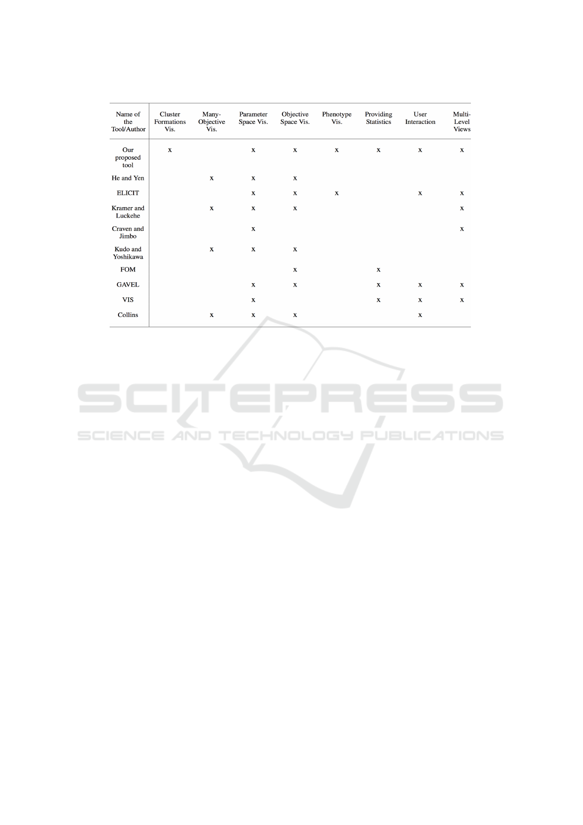
Table 1: A comparison between the features provided by the existent tools and our proposed tool.
• Incorporating dimensionality reduction tech-
niques into the visualizer to handle the case of
problems with many objectives.
ACKNOWLEDGEMENTS
This work is partially supported by FRGS Grant,
Malaysia.
REFERENCES
Collins, T. (1996). Genotypic-space mapping: Population
visualization for genetic algorithms.
Craven, M. J. and Jimbo, H. C. (2014). Ea stability vi-
sualization: perturbations, metrics and performance.
In Proceedings of the Companion Publication of the
2014 Annual Conference on Genetic and Evolution-
ary Computation, pages 1083–1090. ACM.
Cruz, A., Machado, P., Assunc¸
˜
ao, F., and Leit
˜
ao, A. (2015).
Elicit: Evolutionary computation visualization. In
Proceedings of the Companion Publication of the
2015 Annual Conference on Genetic and Evolution-
ary Computation, pages 949–956. ACM.
Deb, K., Pratap, A., Agarwal, S., and Meyarivan, T. (2002).
A fast and elitist multiobjective genetic algorithm:
Nsga-ii. IEEE transactions on evolutionary compu-
tation, 6(2):182–197.
Diestel, R. (2000). Graph theory {graduate texts in mathe-
matics; 173}. Springer-Verlag Berlin and Heidelberg
GmbH & amp.
Fan, W. and Bifet, A. (2013). Mining big data: current
status, and forecast to the future. ACM sIGKDD Ex-
plorations Newsletter, 14(2):1–5.
Gelman, A. and Unwin, A. (2013). Infovis and statistical
graphics: different goals, different looks. Journal of
Computational and Graphical Statistics, 22(1):2–28.
Hart, E. and Ross, P. (2001). Gavel-a new tool for genetic
algorithm visualization. Evolutionary Computation,
IEEE Transactions on, 5(4):335–348.
He, Z. and Yen, G. G. (2016). Visualization and
performance metric in many-objective optimization.
IEEE Transactions on Evolutionary Computation,
20(3):386–402.
Holland, J. H. (1975). Adaptation in natural and artificial
systems: an introductory analysis with applications to
biology, control, and artificial intelligence. U Michi-
gan Press.
Huttenlocher, D. P., Klanderman, G. A., and Rucklidge,
W. J. (1993). Comparing images using the hausdorff
distance. IEEE Transactions on pattern analysis and
machine intelligence, 15(9):850–863.
Kramer, O. and L
¨
uckehe, D. (2015). Visualization of evo-
lutionary runs with isometric mapping. In 2015 IEEE
Congress on Evolutionary Computation (CEC), pages
1359–1363. IEEE.
Kudo, F. and Yoshikawa, T. (2012). Knowledge extrac-
tion in multi-objective optimization problem based
on visualization of pareto solutions. In 2012 IEEE
Congress on Evolutionary Computation, pages 1–6.
IEEE.
Parejo, J. A., Racero, J., Guerrero, F., Kwok, T., and Smith,
K. A. (2003). Fom: A framework for metaheuristic
optimization. In International Conference on Compu-
tational Science, pages 886–895. Springer.
Wu, A. S., De Jong, K. A., Burke, D. S., Grefenstette, J. J.,
and Ramsey, C. L. (1999). Visual analysis of evo-
lutionary algorithms. In Evolutionary Computation,
1999. CEC 99. Proceedings of the 1999 Congress on,
volume 2. IEEE.
IVAPP 2017 - International Conference on Information Visualization Theory and Applications
240
