
Improved Identification of Data Correlations
through Correlation Coordinate Plots
Hoa Nguyen
1
and Paul Rosen
2
1
Scientific Computing and Imaging Institute, University of Utah, Salt Lake City, U.S.A.
2
Department of Computer Science and Engineering, University of South Florida, Tampa, U.S.A.
Keywords:
Correlation, Correlation Visualization, Statistical Visualization.
Abstract:
Correlation is a powerful relationship measure used in science, engineering, and business to estimate trends
and make forecasts. Visualization methods, such as scatterplots and parallel coordinates, are designed to be
general, supporting many visualization tasks, including identifying correlation. However, due to their gener-
ality, they do not provide the most efficient interface, in terms of speed and accuracy. This can be problematic
when a task needs to be repeated frequently. To address this shortcoming, we propose a new correlation
task-specific visualization method called Correlation Coordinate Plots (CCPs). CCPs transform data into a
powerful coordinate system for estimating the direction and strength of correlation. To support multiple at-
tributes, we propose 2 additional interfaces. The first is the Snowflake Visualization, a focus+context layout
for exploring all pairwise correlations. The second enhances the basic CCP by using principal component
analysis to project multiple attributes. We validate CCP performance in correlation-specific tasks through an
extensive user study that shows improvement in both accuracy and speed.
1 INTRODUCTION
Correlation is a powerful metric that provides a pre-
dictive relationship between variables used in science,
engineering, and business (Hong et al., 2010; Sharma
and Wallace, 2011; Yu et al., 2012). A correlation co-
efficient is a measure of the strength and direction of
such a relationship. While correlation is a powerful
metric, visual examination is also critical. The many-
to-one relationship between data and a correlation co-
efficient may obscure important features of the data.
In Anscombe’s Quartet (see Figure 1) (Anscombe,
1973), 4 distributions (i.e. the many relationship) have
identical correlation coefficients (i.e. the one relation-
ship). Visual examination can disambiguate the varia-
tions to outliers (case 1), noise (case 2), non-linearity
(case 3), and non-relationship (case 4).
Both scatterplots (SCP) (Jarrell, 1994) and paral-
lel coordinates plots (PCP) (Inselberg, 1985) are ca-
pable of being used to investigate correlation. How-
ever, that does not mean one should not infer that
these are the ideal tools for performing such a task. In
analytic scenarios where correlation is the most im-
portant task, these encodings are non-optimal. This
challenge is exacerbated by the increasing desire to
analyze multi-attribute data. A number of multi-
attribute visualization techniques exist for this anal-
ysis (Aris and Shneiderman, 2007; Bezerianos et al.,
2010; Wattenberg, 2006), with Scatterplot Matrices
(SPLOMs) and PCPs remaining the most popular.
SPLOMs simultaneously show all possible combina-
tions of attribute, but the plots become small as the
number of combinations grows quadratically. For
PCPs, the series of axes grow linearly, but the inter-
face relies heavily upon interaction.
The critical shortcoming to these methods is in
their design goal—they are designed as general-
purpose tools for performing a wide variety of ana-
lytic tasks. No special consideration has been made
to any single task, meaning that while they can be
used to identify correlation, they are not designed op-
timally for it.
With these limitations in mind, we have devel-
oped a new, correlation task-specific visual design
called Correlation Coordinate Plots, or CCPs (see
Figure 1: Anscombe’s Quartet (Anscombe, 1973) shows 4
distributions that all have correlation coefficients of 0.816.
62
Nguyen, H. and Rosen, P.
Improved Identification of Data Correlations through Correlation Coordinate Plots.
DOI: 10.5220/0005717500600071
In Proceedings of the 11th Joint Conference on Computer Vision, Imaging and Computer Graphics Theory and Applications (VISIGRAPP 2016) - Volume 2: IVAPP, pages 62-73
ISBN: 978-989-758-175-5
Copyright
c
2016 by SCITEPRESS – Science and Technology Publications, Lda. All rights reserved
(a) Positive (b) No Corr (c) Negative (d) Snowflake Visualization
Figure 2: Correlation Coordinate Plots (CCPs) transform data into a coordinate system better suited to investigating correlation
between 2 attributes. (a-c): Example CCPs show positive, no, and negative (or anti-) correlation, respectively. (d): The
Snowflake Visualization is a focus+context interface that combines CCPs for 1 attribute to all others in the middle (i.e. the
focus) and CCPs for all other attribute pairings on the perimeter (i.e. the context).
Figure 2(a-c)). CCPs use design attributes, such as
axis shape and a simple, yet effective, point transform
to enable quick and accurate determination of corre-
lation direction and strength.
To support multi-attribute analysis we developed
a focus+context style circular layout for CCPs, called
the Snowflake Visualization (see Figure 2(d)). This
visualization represents a compromise where the
screen space needed to represent additional attributes
in the focus region grows linearly, and it grows
quadratically for the context region. There remains
some reliance on interaction for full investigation.
We have also extended the visual metaphors of the
CCP to support a single visual interface for multi-
attribute analysis by using principal component anal-
ysis (PCA) of the data.
To validate the efficacy of our new approaches,
use case examples and a user study are used. Our
user study had novice and expert subjects perform
correlation-related tasks in SCP, PCP, and CCP en-
vironments. Our results confirmed that CCP methods
outperform SCP and PCP in accuracy and timing.
In summary, the contributions of this paper are:
• a task-specific visualization, the Correlation Co-
ordinate Plot, designed to efficiently identify cor-
relations;
• a circular layout, the Snowflake Visualization,
that provides an efficient focus+content style vi-
sualization of all pairwise relationships in multi-
attribute data;
• a single plot visualization for exploring multi-
attribute correlations using PCA; and
• a use case analysis and user study confirming the
superior performance of CCP with correlation-
related tasks when compared to SCP and PCP.
2 RELATED WORK
2.1 Correlation
Correlation is a metric calculated between data and
can be used to model and predict relationships (Hong
et al., 2010; Yu et al., 2012). The ”quality of rela-
tionship” is often measured using a correlation co-
efficient (Chen et al., 2010; Xu et al., 2008), with
positive correlation indicating 2 attributes are increas-
ing together, while negative or anti-correlation indi-
cates that 1 attribute increases and the other decreases.
There are several correlation coefficient measures,
the most common of which is the Pearson Correla-
tion Coefficient (PCC) (Magnello and Vanloon, 2009;
Wang and Zheng, 2013). PCC, ρ(x,y), measures the
linear relationship between 2 attributes x and y with
means ¯x and ¯y and standard deviations σ
x
and σ
y
. It is
defined as:
ρ(x,y) =
cov(x,y)
σ
x
σ
y
=
Σ(x
i
− ¯x)(y
i
− ¯y)
σ
x
σ
y
(1)
As far as correlation in visualization is concerned,
there are 2 schools of thought. The first is to show
metrics on data, not the data themselves. Examples
Improved Identification of Data Correlations through Correlation Coordinate Plots
63

include Corrgrams (Friendly, 2002a) and Scagnos-
tics (Wilkinson et al., 2005; Dang and Wilkin-
son, 2014). These approaches have the advantages
of visual scalability but the potential disadvantages
demonstrated by Anscombe’s Quartet (Anscombe,
1973). An overview of the metrics used in these ap-
proaches can be found in (Bertini et al., 2011).
The alternative approach shows all data points.
In this category, scatterplots and parallel coordinates
have been shown most effective (Harrison et al.,
2014). Since our approach follows this paradigm, we
compare against these techniques.
2.2 Scatterplot
A Scatterplot (SCP) (Buering et al., 2006; Jarrell,
1994) is a simple plot of points used to investigate
the linear and nonlinear relationships between 2 at-
tributes (Hartigan, 1975). The patterns of importance
in this context are when the data points slope from
lower left to upper right, suggesting positive correla-
tion, and sloping from upper left to lower right sug-
gests negative correlation. The direction of correla-
tion (positive or negative) can be confusing to novice
users. More importantly, the strength of correlation
(high versus low) can at times be difficult to interpret.
For multi-attribute data, a Scatterplot Matrix
(SPLOM) (Hartigan, 1975; Huang et al., 2012) shows
the relationships of all pairs of attributes by organiz-
ing a grid of SCPs with each attribute occupying 1
row and 1 column. As the number of attributes in-
creases, the number of plots grows quadratically mak-
ing it difficult to present all of the data. This prob-
lem can be mitigated by approaches such as Cor-
rgrams (Friendly, 2002b), which display a matrix of
correlation glyphs. These glyphs scale well and give
the user quick access to summary statistics, but they
may hide important data features (e.g. Anscombe’s
Quartet). In other cases, navigation can be used to
search larger spaces (Elmqvist et al., 2008).
2.3 Parallel Coordinates Plot
Parallel Coordinates Plots (PCPs) (Fanea et al., 2005;
Inselberg, 1985) are another well-known visualiza-
tion technique for exploring multi-attribute datasets,
which display n parallel axes, 1 for each attribute.
Data points map to vertices on each parallel axis and
connect with line segments. For PCPs, in simple
cases, the direction of correlation, though not intu-
itive, is easy to identify. Positive correlation appears
as a series of parallel lines, while negative correlation
appears as crossing lines.
In noisy cases, the ambiguity created by the cross-
ing lines hides patterns but retains outlier visibil-
ity (Zhou et al., 2009; Zhou et al., 2008). This makes
correlation direction and strength difficult to interpret.
Modifications to PCPs have been proposed by using
color, opacity, smooth curves, frequency, density or
animation (Heinrich and Weiskopf, 2013; Geng et al.,
2011; Holten and van Wijk, 2010) to partially address
this. However, previous studies have shown that PCPs
are slower and less accurate than SCPs for correlation
tasks (Li et al., 2010).
The advantage of a PCP is that it provides a con-
tinuous and comparative view across the axes, and
the screen space needed for the visualization scales
linearly with the number of attributes. At the same
time, PCPs do not show all possible combinations of
attribute pairs, requiring significant user interaction
for exhaustive exploration. Using 3D parallel coor-
dinates can enable exploration of the many-to-one re-
lationship (Johansson et al., 2006) with the traditional
downsides of 3D: perspective effects and occlusion in
large data. A PCP matrix (Heinrich et al., 2012) is
another method that may help overcome this limita-
tion.
3 CORRELATION
COORDINATES PLOT
The task generality (i.e. the support for many tasks)
plays as both an advantage and disadvantage for the
SCP and PCP. Either method is capable of being used
for correlation tasks, but they are not necessarily the
most efficient methods available. This has led us to
develop a new visual encoding focused specifically on
correlation tasks, called Correlation Coordinate Plots
(CCPs). The proposed method is centered on help-
ing users quickly identify the existence, direction, and
strength of pairwise correlations. The visual design is
motivated by our desire to make the correlation task
one of comparison using position along a common
baseline.
For clarity in notation, we assume a dataset X con-
tains n attributes and m data points, with X
i
indicating
a single data attribute of m values and X
i j
indicating
data point j of attribute i.
3.1 Coordinate System
We propose using a correlation coordinate system that
differs from the Cartesian coordinate system, so as
to highlight how well points adhere to the correla-
tion. The coordinate system can be seen as a 1D
parametrization of the data to an underlying model, in
IVAPP 2016 - International Conference on Information Visualization Theory and Applications
64
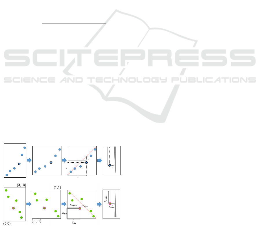
this case a line. The vertical position of a data point
is the parameterization of the data. The position hori-
zontally is more important, demonstrating the quality
of the fit. Therefore, identifying correlation primarily
relies on visibility of points to the left and right of the
axis.
Transforming the data from a Cartesian domain
into the correlation coordinate system is a two step
process laid out in Figure 3, with the top panel show-
ing the positive relationships and the bottom panel
demonstrating the negative relationships.
The first step is a scaling operation (Scl) that
forces the data into a square region (see Figure 3 pan-
els 1 & 2). The second step is the projection (P
ma jor
and P
minor
) operation, which measures the location of
the point relative to the positive correlation diagonal
(lower left to upper right) or negative correlation diag-
onal (upper left to lower right). That measure is used
to place the points into the CCP (see panels 3 & 4).
The process begins by normalizing the data to [−1,1].
Scl(X
i
) =
X
i
− argmin
X
i
X
i j
argmax
X
i
X
i j
− argmin
X
i
X
i j
(2)
Once normalized, the location of a point i from at-
tributes j and k can be determined. The location on
the major (vertical) axis is:
P
ma jor
(X
ji
,X
ki
) = X
ki
(3)
The position on the minor axis is:
P
minor
(X
ji
,X
ki
) =
α · (X
ji
− X
ki
) pos. or no corr.
α · (X
ji
+ X
ki
) neg. corr.
(4)
The variable α is a scalar that effects the spread of
data points when plotting. We selected a constant
value based upon the width of the CCP.
The plot orientation was initially chosen to be ver-
tical in order to pack many plots side by side on the
(0,0)
(3,10)
(-1,-1)
(1,1)
𝑷
𝒎𝒊𝒏𝒐𝒓
𝑷
𝒎𝒂𝒋𝒐𝒓
𝑿
𝒌𝒊
𝑿
𝒋𝒊
𝑷
𝒎𝒊𝒏𝒐𝒓
𝑷
𝒎𝒂𝒋𝒐𝒓
Figure 3: Conversion to correlation coordinate system for
positive (top) and negative (bottom) cases.
display. Ultimately, the choice of a vertical plot is
somewhat arbitrary and will be relaxed in forthcom-
ing sections. Nevertheless, we present and evaluate
our approach based upon the vertical orientation.
3.2 Coordinate Axis
We designed the coordinate axis to serves as a visual
indicator of the existence and direction of correlation.
For 2 attributes of a dataset, X
i
and X
j
, PCC is used to
indicate positive correlation by ρ(X
i
,X
j
) > ε, negative
correlation by ρ(X
i
,X
j
) < −ε, and uncorrelated by all
other values. The major coordinate axis is laid out
vertically and represented by a triangle whose base is
at the top for positive correlation (Figure 2a), the bot-
tom for negative correlation (Figure 2c), and a straight
line for uncorrelated (Figure 2b) data.
We have also considered mapping PCC to the
width of the axis, where higher values are wider and
lower values thinner. Due to the relatively small width
of the axis, we decided this mapping was not particu-
larly informative. Instead, to identify the strength of
correlation, users should investigate the distribution
of data in the correlation coordinate system, presented
in the following sections.
3.3 Coloring Data Points
A number of figures have had their data points col-
ored based upon their PCC value [{−1 : blue},{0 :
black},{1 : red}]. Strictly speaking, this encoding is
redundant and not required. However, if colors are in-
terpolated based upon PCC value, they do carry some
additional information, and in general, we find them
more aesthetically pleasing. Because our focus is on
the use of the coordinate axis and coordinate system,
our method does not rely on color, and color was not
used in the user study to be described in Section 7.
3.4 Correlation Identification
Using CCPs for correlation tasks is fairly simple. De-
pending upon your goal, we suggest:
• First, use the axis to determine if the data is posi-
tive, negative, or uncorrelated.
• Next, use the shape of the data points to determine
the basic relationship between the attributes (i.e.
linear, nonlinear, etc.).
• Finally, the distance of the points from the axis
can be used to estimate the strength of correlation,
with small distances indicating high correlation,
and other conditions such as outliers, noise, etc.
Improved Identification of Data Correlations through Correlation Coordinate Plots
65

For example, in Figure 2c, by checking the axis, a
negative correlation can be seen. By observing the
closeness of the data points to the axis, a strong linear
relationship with small amount of noise. On the other
hand in Figure 2a, the axis indicates positive correla-
tion. From the shape of the data, it is apparent that a
nonlinear relationship exists with weak linear correla-
tion properties.
4 SNOWFLAKE VISUALIZATION
Thus far, our approach can be used to investigate pair-
wise correlation. Our next goal was to develop an
approach for investigating multi-attribute data. We
focused on a radial based design due to their effi-
cient use of space for multiple attribute visualiza-
tions (Tominski et al., 2004). As such, we have de-
veloped the Snowflake Visualization, which is con-
structed of a focus+context views.
4.1 Focus View
The focus view (Figure 4a) enables investigating the
correlation of 1 attribute to all other attributes. Given
n attributes, there are (n −1) pairs laid out around the
center of the circle with equal angular spacing. By
default, the final attribute of data is the initial focus
attribute. Attributes are sorted by ID but can be re-
ordered with other sorting methods. The inner radius
(the start of the CCP axes) is chosen such that none of
the data points between CCPs will overlap. The outer
radius (the end of the CCP axes) is adjustable as to
give more or less space to the context views.
4.2 Context View
Given the attributes covered by the focus view, we
designed the context view to give complete coverage
(a) Focus view
(b) Upper branch of
context view
(c) Lower branch
of context view
Figure 4: A focus view (a) and multiple context views (b-c)
for Snowflake Visualization.
of the remaining attribute pairs. These context views
(Figures 4b and 4c) are attached to the branches of
the focus view. The objective is to prevent pairs of
attributes from being repeated. This is done by orga-
nizing the pairings based on parity of n.
When the number of attributes n is odd, m = (n −
1)/2. In this case, two types of context groups appear.
The first type contains the first m attributes, excluding
the focus attribute. Each attribute i is paired with the
following m attributes (with wrap around back to the
first attribute), again excluding the focus attribute. For
the second type, the attribute i is paired with the fol-
lowing m − 1 attributes. Each pairing represents one
CCP on the context branch. Figure 4b shows a view
from the first type where n = 9, m = 4, and i = 3. In
this case, the 4 attributes following (4, 5, 6, and 7)
are paired with attribute 3. Figure 4c shows a view
of the second type. Here, since i = 7, 3 attributes are
selected (8, 1, and 2), skipping the focus attribute 9.
When the number of attributes n is even, m = n/2.
Here, only a single type appears with each attribute
receiving m − 1 pairings.
4.3 Detail View & Interaction
Typically a single large CCP detail view is also in-
cluded with the Snowflake Visualization (a similar
practice to SPLOMs). A few interactions are included
with the Snowflake Visualization. These include:
• Click-to-swap: When the user clicks an attribute,
it becomes the focus attribute. After swapping,
outer attributes are reordered based upon a sorting
criteria (by attribute ID).
• Over-to-detail: As the mouse moves over a plot,
the detail view is updated to that pairing.
5 MANY-ATTRIBUTE
CORRELATIONS
Pairwise correlations are frequently important to un-
derstanding data. However, as the number of at-
tributes increases, the desire to explore relationships
of multiple attributes simultaneously increases as
well. The Snowflake Visualization partially addressed
the need by presenting many pairwise relationships
simultaneously. Comparing 3 or more attributes re-
quires looking at an exponentially increasing number
of plots and mentally fusing the distributions. We
can extend CCP design for presenting certain types
of multi-attribute relationships.
To do this, we slightly modify visual metaphors of
the CCP. First of all, we remove the positive/negative
IVAPP 2016 - International Conference on Information Visualization Theory and Applications
66
(a) SPLOM
(b) CCP of linear feature (c) CCP of nonlinear feature
Figure 5: CCP for multiple attributes using PCA. (b) The at-
tributes in red are a linear feature. (c) The nonlinear feature
in blue is 2D, with the residual visible in the red haze.
metaphor encoded via the axis. This is because multi-
attribute relationships tend to not have a directional
measure, only magnitude. Now, the parameteriza-
tion model can be relaxed to any invertible function,
[s,t] = g(¯x). The vertical axis still represents a 1D pa-
rameterization of the data, s. The horizontal axis can
now represent a secondary model parameterization, t.
Finally, we represent information lost in this encod-
ing via a series of partially transparent boxes, one per
data point, that form a “haze” surrounding the data
points. The size of the boxes found using the resid-
ual, r = || ¯x − g
−1
(s,t)||.
For our experiments we have used Principal Com-
ponent Analysis (PCA) to parameterize the data. This
could be replaced with any other model that fits our
functional definition. Using PCA, we set g( ¯x) equal
to the magnitude of the first two principal components
of the data, and the size of the box is set to the resid-
ual. Figure 5 shows 2 examples. The SPLOM on
the left (Figure 5a) shows all of the attributes of the
dataset. Two subsets have been selected in red and
blue. The red subset are attributes that all appear pair-
wise linear. When we use the many-attribute CCP
(Figure 5b), we can see that all of the attributes are
linear with respect to one another. On the other hand,
the blue attributes appear nonlinear. When visualized
with the many-attribute CCP (Figure 5c), we can see a
relatively simple nonlinear 2D pattern within the data.
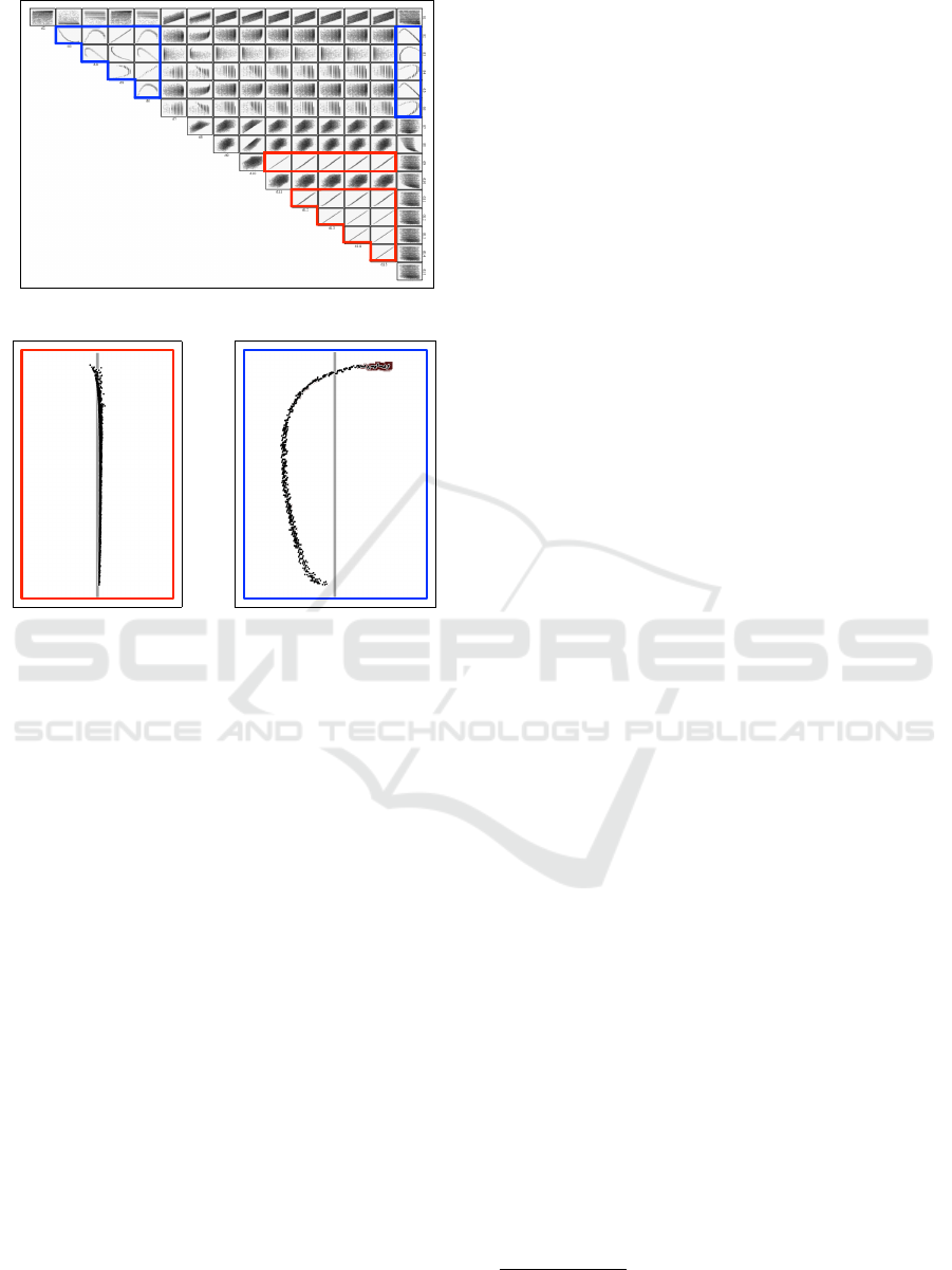
6 USAGE EXAMPLES
We applied three visualization methods, including
Snowflake Visualization, SPLOM, and PCP, to two
publicly available datasets including Boston house
price data
1
and Hurricane Isabel data
2
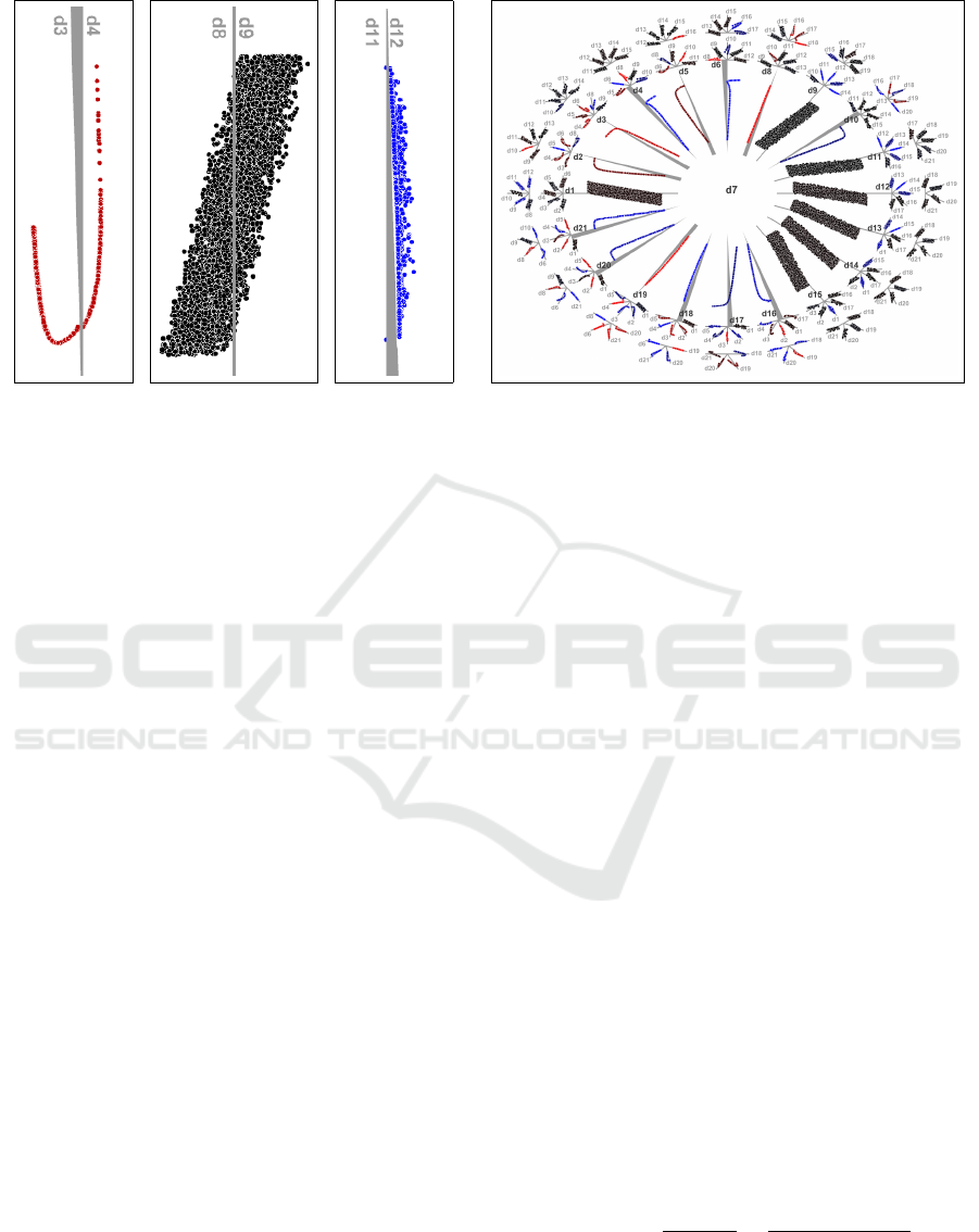
.
6.1 Boston House Price
Boston housing data (see Figure 6) is multivariate
dataset containing 506 items across 14 attributes.
When comparing this dataset in a Snowflake Vi-
sualization and SPLOM, there are a number of fea-
tures observable in both visualizations. For example,
in both visualizations the Age/Rad pairing is fairly
clearly a case for segmentation into two data groups.
However, in the SPLOM, it likely takes longer.
A big advantage in Snowflake Visualization is that
it makes way for exploiting additional visual chan-
nels. Take the Age/Ind pairing. In all visualization
approaches, coloring scheme we have used makes it
fairly easy to see that there is a strong positive corre-
lation. However, without the coloring that might not
be the case. If color had been used for some other
purpose, classification for example, suddenly we lose
the ability in SPLOMs to quickly determine correla-
tion, while observing classification. Since CCPs do
not rely on color to communicate correlation, we can
encode other information in the color channel without
significant loss of correlation information.
6.2 Hurricane Data
Hurricane Isabel (Figures 7) data is provided as part
of the IEEE Visualization 2004 contest. Hurricane Is-
abel data set consists of 48 timesteps, each containing
measurements of 11 attributes with a spatial resolu-
tion of 500 × 500 × 100. We also only show 7 of the
more “interesting” attributes due to space considera-
tions. Of the original data 25 million data items, we
only use 10 million because approximately 15 million
data items contain at least 1 invalid NaN field.
With 10 million data items in Hurricane data, the
overdraw problem in PCP makes it hard to understand
1
http://lib.stat.cmu.edu/datasets/boston
2
http://vis.computer.org/vis2004contest/
Improved Identification of Data Correlations through Correlation Coordinate Plots
67
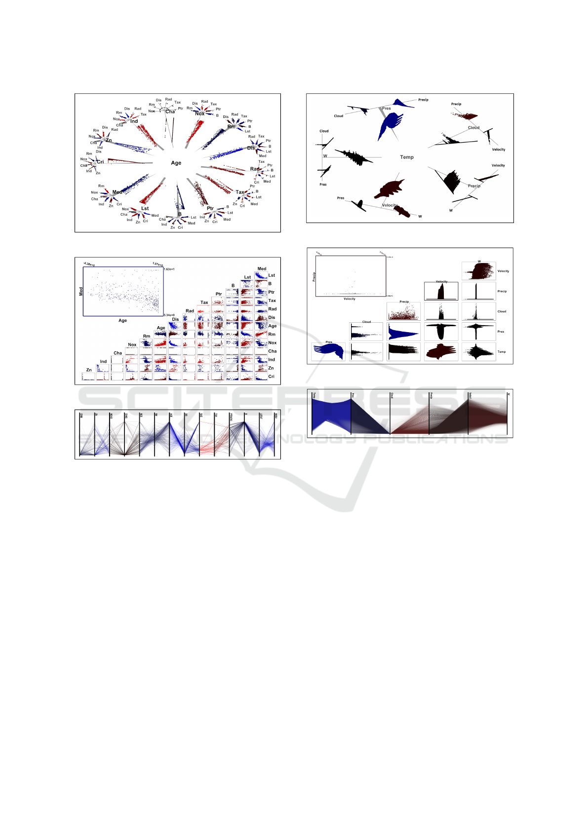
(a) Snowflake Visualization
(b) Scatterplot Matrix
(c) Parallel Coordinates
Figure 6: Visualizations for Boston House data.
relationships in the data. For example, the relation-
ship Temp/Pres shows only the bowtie shape, losing
the individual data patterns. In many ways, SCPs do
a better job than PCPs. The Temp/Press relationship
is visible with the SCP. However, clear interpretation
is difficult, since as Temp increases, Press first de-
creases, then increases, and finally decreases.
Our approach presents these relationships more
clearly. The direction and strength of relationship be-
tween Temp and Pres can be identified in Snowflake
Visualization. The lower triangle shape of axis iden-
tifies the negative relationship. Additionally, the data
points distribution, mostly being of similar distance
to the axis with a few spread out, enables identifying
that this relationship is not too strongly negative and
nonlinear.
(a) Snowflake Visualization
(b) Scatterplot Matrix
(c) Parallel Coordinates
Figure 7: Visualization techniques for Hurricane data.
7 USER STUDY ON
IDENTIFYING CORRELATION
To further evaluate our visualization methods, we
conducted a user study comparing CCP with SCP and
PCP. In this study, we performed 3 experiments that
ask subjects to perform correlation related tasks.
We invited 25 participants to take part in our study,
9 female and 16 male, all graduate students from a
variety of science and engineering fields. Their ages
range from 23 to 35 years old.
In each experiment, subjects started with a short
set of slides and/or video to introduce the neces-
sary background. Subjects were then given practice
questions where, after answering, the correct answers
were provided. They would then perform the experi-
mental tasks. For each test, the subjects’ answers and
response times were recorded. Following the experi-
ment, subjects completed a short survey. In total, the
IVAPP 2016 - International Conference on Information Visualization Theory and Applications
68

study lasted less than one hour, including training and
testing. For all visualizations, gray color was used for
axes and labels, black color was used to present data
items.
The software for the user study was built using
C++ and Qt, and run on a MacBook pro with a 2.5
GHz Intel Core i5, 4 GB RAM, and 512 MB Intel
HD Graphics 4000. The study used a particle physics
dataset containing 41 output attributes and 4000 data
items per attribute. The data represents a parame-
ter space search of 25 input attributes generated by
a series of tools that simulate the theoretical physi-
cal properties of subatomic particles under the Super-
symmetic extension of the Standard Model of particle
physics.
The independent and dependent variables used in
each experiment can be found in Table 1. We used
a mixed experimental design using t-testing to calcu-
late t-value, p-value, mean difference, and 95% confi-
dence interval to confirm our hypotheses. Only mean
value and p-value are reported, but other data can be
provided upon request.
7.1 Exp. 1: Speed/Accuracy in Pairwise
Correlation
When looking at SCP & PCP, 2 challenges persist.
First, it can be confusing to determine positive ver-
Table 1: Variables used to test hypotheses.
Independent Variables Potential Values
Data [ H1 | H2 | H3 | H4 ] 2 random attributes from 41 attribute data
Data [ H5 | H6 | H7 ] 10 or 21 attributes from 41 attribute data
Plot [ H1 | H2 | H3 | H4 ] SCP/PCP/CCP
Plot [ H5 | H6 | H7 ] SPLOM/PCP/Snowflake Visualization
Question [ H1 | H2 ] How are the 2 attributes correlated?
Question [ H3 | H4 ] What is the type of correlation?
Question [ H5 ] How are the 2 attributes correlated?
Question [ H6 ] How many attributes are correlated to i?
Question [ H7 ] Which attributes are correlated to i?
Dependent Variables Potential Values
Answer [ H1 | H2 | H5 ]
High Positive Correlation
Low Positive Correlation
No Correlation
Low Negative Correlation
High Negative Correlation
Answer [ H3 | H4 ]
Nonlinear Correlation
Linear Correlation
No Correlation
Answer [ H6 ] Number of attribute
Answer [ H7 ] List of attribute
Response Time [ all H ] Time recorded automatically
sus negative correlations. Granted, for experts this
is a trivial task, but for others, it can be confusing.
In many ways the identification of correlation direc-
tion is easier with PCP than SCP—parallel lines pos-
itive and crossing lines negative. Second, there is
some ambiguity when trying to identify the strength
of correlation between 2 attributes. Ambiguity is a
much larger problem for PCP. When the relationship
is noisy or nonlinear, overlapping lines quickly ob-
scure detail.
When comparing CCP with these other methods,
CCP: (1) provides simple visual cues making identifi-
cation of the direction of correlation fairly trivial; (2)
and reduces (not eliminates) the ambiguity by con-
centrating on correlation in the formulation of the co-
ordinate system. Given these factors, we developed 2
hypotheses as follows:
H1 | H2: Using a Correlation Coordinates Plot will
enable more accurate and faster identification in di-
rection and strength of correlation between 2 at-
tributes than a [ H1: Scatterplot | H2: Parallel Coor-
dinates Plot ].
7.1.1 Method
The experiment is summarized in Table 1 (H1 & H2).
For a block of trials, we showed a participant a plot
between 2 random attributes using either the SCP,
PCP, or CCP method and asked a forced choice ques-
tion. Subject accuracy and time were measured.
At the start of the experiment, participants were
given an introduction to correlation, instructions on
finding correlation in SCP, PCP, and CCP, and 6 train-
ing questions. Participants were then given 21 exper-
imental questions (7 for each plot type, interleaved
order).
7.1.2 Results & Discussion
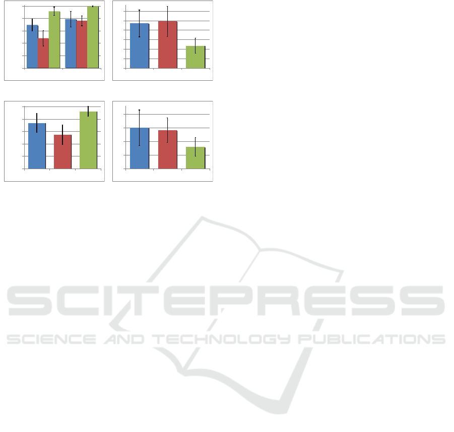
The results of both the measured speed and accuracy
of our experiments are shown in Figure 8a and 8b.
The results from Figure 8a shows that when com-
paring accuracy, CCP showed improvement over SCP
on average 91% compared to 69%, with statistical sig-
nificance (p = 0.001). We also looked at subjects per-
formance in just identifying the direction of correla-
tion, where CCP had an accuracy of 99% compared
to 79% for SCP, though not quite with statistical sig-
nificance (p = 0.06). The response times (Figure 8b)
showed similar results with CCP responses averaging
11.71s compared to 23.4s for SCP (p = 0.001). Given
that in our experiments CCP outperformed SCP in
both speed and accuracy, we consider H1 confirmed.
A similar analysis shows that the accuracy CCP
was 91% compared to 48% for PCP (p = 0.001). The
Improved Identification of Data Correlations through Correlation Coordinate Plots
69
0%
20%
40%
60%
80%
100%
Strength & Dir. Direction
0
5
10
15
20
25
30
SCP PCP CCP
(a) Accuracy in exp. 1
0%
20%
40%
60%
80%
100%
Strength & Dir. Direction
0
5
10
15
20
25
30
SCP PCP CCP
(b) Speed in exp. 1
0%
20%
40%
60%
80%
100%
SCP PCP CCP
0
5
10
15
20
SCP PCP CCP
(c) Accuracy in exp. 2
0%
20%
40%
60%
80%
100%
SCP PCP CCP
0
5
10
15
20
SCP PCP CCP
(d) Speed in exp. 2
Figure 8: Results of exp. 1 and exp. 2 show CCP (green,
col. 3) outperforming SCP (blue, col. 1) and PCP (red, col.
2) in speed (sec) and accuracy (%). In all figures, error bars
indicate standard deviation.
response times (Figure 8b) showed a similar result
with CCP coming in on average 11.71s compared to
24.5s for PCP (p < 0.001). Given that CCP outper-
formed PCP in speed and accuracy, we consider hy-
pothesis H2 confirmed.
The results of Exp. 1 confirmed the hypotheses
H1 and H2, indicating that using CCP subjects can
identify correlation in less time and with higher ac-
curacy compared to SCP and PCP. In our informal
discussions with subjects after the experiment, they
indicated that the shape of the axis and the distribu-
tion of points in CCP greatly assisted their compre-
hension of the correlation. Subjects complained that
both SCP and, in particular, PCP were more difficult
to distinguish positive and negative correlation in sce-
narios with low correlation. However, they found us-
ing CCP enabled them to easily recognize both the
direction and strength.
7.2 Exp. 2: Differentiating Linear,
Nonlinear, and Uncorrelated
Identifying nonlinear relationships between attributes
can also be an important task. When comparing CCP
with other methods, CCP provides simple visual cues
making identification of correlation direction easier.
Beyond that, CCP and SCP give similar visual cues
(i.e. the tasks performed are basically the same) for
the shape of the relationship, linear or nonlinear. This
motivates our next hypothesis:
H3: Using a Correlation Coordinates Plot and a
Scatterplot will result in similar accuracy and speed
for identification of linear, nonlinear, and uncorre-
lated relationships in 2 attributes.
For PCP, identifying these relationships is far
more challenging. The overdraw ambiguity that
plagues linear correlations becomes significantly
worse as even more lines overlap each other in non-
linear cases. This will slow and confuse users. This
leads to our next hypothesis:
H4: Using a Correlation Coordinates Plot will result
in more accurate and faster identification of linear,
nonlinear, uncorrelated relationships in 2 attributes
than a Parallel Coordinates Plot.
7.2.1 Method
The experiment is summarized in Table 1 (H3 & H4).
At the start of the experiment, participants were given
instructions on linear and nonlinear correlation. Par-
ticipants were then given 3 training questions fol-
lowed by 9 experimental questions (3 for each plot
type, interleaving order). For each question, partici-
pants saw a plot from 2 random attributes and were
asked a forced choice question. Subject accuracy and
time were measured.
7.2.2 Results & Discussion
The results of the measured speed and accuracy of
our experiments are shown in Figure 8c and 8d, with
all differences showing statistical significance (p <
0.005). The results of our experiment showed that
CCP outperformed SCP. Our hypothesis H3 however
had predicted that the performance of CCP and SCP
would be identical. This leads us to reject H3. In our
discussions with subjects after the experiment, they
indicated that the shape of axis and the distribution
of points in SCP was more difficult to distinguish and
that CCP assisted their comprehension of these spe-
cific types of correlation.
Due to CCP substantially outperforming PCP in
both speed and accuracy, we consider hypothesis H4
confirmed. As anticipated, participants complained
that the overdraw problems made it difficult differen-
tiate linear vs. nonlinear correlations in PCP.
7.3 Exp. 3: Accuracy/Speed in
Multi-Attribute Datasets
The Snowflake Visualization was designed specifi-
cally for the task of quickly and accurately explor-
ing pairwise correlations in multi-attribute data as
compared with SPLOMs and PCP. As the number of
attributes increases each SCP within a SPLOM be-
comes quite small and the number of plots becomes
IVAPP 2016 - International Conference on Information Visualization Theory and Applications
70
overwhelming. For PCP, as the number of attributes
increases, the interaction required for many tasks puts
increased pressure on the user to explore for features
of interest. With these factors in mind, we developed
3 hypotheses:
H5: Using a Snowflake Visualization will enable more
accurate and faster identification of correlation be-
tween 2 attributes in multi-attribute data than a Scat-
terplot Matrix or Parallel Coordinates Plot.
H6: Using a Snowflake Visualization will enable
more accurate and faster identification of how many
attributes are correlated with a chosen attribute in
multi-attribute data than a Scatterplot Matrix or Par-
allel Coordinates Plot.
H7: Using a Snowflake Visualization will enable
more accurate and faster identification of which at-
tributes are correlated with a chosen attribute in
multi-attribute data than a Scatterplot Matrix or Par-
allel Coordinates Plot.
7.3.1 Method
The experiment is outlined in Table 1 (H5-H7). Each
participant was given an introduction and demo video
for each visualization method and completed 12 sam-
ple questions using data unrelated to experimental
trials. Then, each performed 21 experimental ques-
tions interleaving first between visualization types,
then question types.
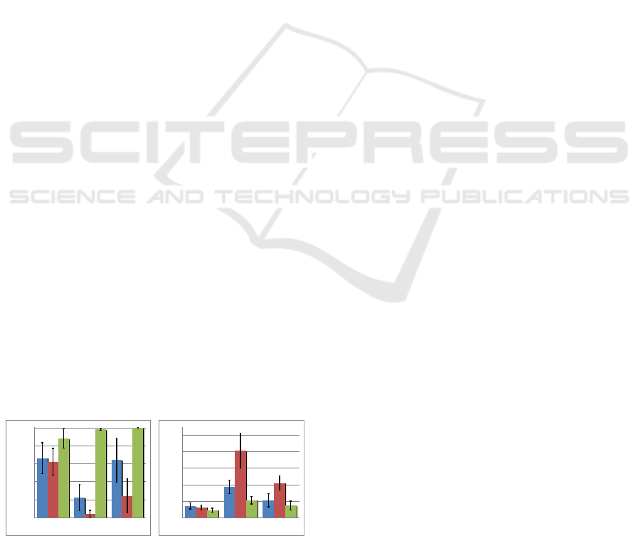
7.3.2 Results & Discussion
Identification of a Pairwise Correlation in Multi-
attribute Data. The results of measured speed and
accuracy in Figure 9 (Type 1) show the Snowflake
Visualization improved accuracy and speed over
SPLOMs and PCPs with statistical significance (all
p < 0.05). We consider hypothesis H5 confirmed.
Finding the Number of Correlated Attributes
in Data. Again, the results of the experiments
showed that the Snowflake Visualization improved
accuracy and speed over SPLOMs and PCPs (see Fig-
0%
20%
40%
60%
80%
100%
Type 1 Type 2 Type 3
0
40
80
120
160
200
Type 1 Type 2 Type 3
(a) Accuracy (%)
0%
20%
40%
60%
80%
100%
Type 1 Type 2 Type 3
0
40
80
120
160
200
Type 1 Type 2 Type 3
(b) Response Time (sec.)
Figure 9: Exp. 3 results show CCP (green, col. 3) outper-
formed SCP (blue, col. 1) and PCP (red, col. 2).
ure 9, Type 2) with statistical significance (p < 0.05).
Therefore, we consider hypothesis H6 confirmed.
Finding which Attributes are correlated in
Multi-attribute Data. The results of this final
test also showed improved accuracy and speed over
SPLOMs and PCPs (see Figure 9, Type 3) with statis-
tical significance (p < 0.05), leading us to also con-
sider hypothesis H7 confirmed.
The Snowflake Visualization’s focus+context
style greatly assisted subjects interactions and com-
prehension when working through multiple pairwise
correlation questions. The participants complained
that small SCPs made the SPLOM difficult to use, due
to inability to see individual plots and difficulty track-
ing rows or columns of plots. Using PCP, participants
complained that the number of dragging operations
required to explore multiple correlations made it very
difficult for them.
8 DISCUSSION
User Study Task Selection: Selecting realistic tasks
for a user study is a challenging problem when users
are unfamiliar with the data and potentially visualiza-
tion altogether. We have selected a number of sim-
ple tasks, which are building blocks for more com-
plicated data analysis tasks that are commonly per-
formed. The overall out performance of the CCP over
SCP and PCP stands as evidence of its superiority,
which should translate to more complex tasks.
Abstraction Selection: SCP and PCP have served a
straw man role in our evaluation. There are any num-
ber of modifications that could be applied to either
technique to better inform the user about correlation.
However, since there is no single de facto standard,
we did not want our evaluation to be clouded by ques-
tions of abstraction selection in SCP or PCP. There-
fore, we stuck to the basic formulations of each ap-
proach. We hope this paper spurs the community to
dig deeper into this subject and generate a more ex-
tensive evaluation of approaches.
Very High Attribute Count Data: For data with
large numbers of attributes, we believe that ap-
proaches to extract the natural dimensionality of data,
such as PCA, in combination with techniques such as
CCP, will be critical in analysis. For all practical pur-
poses, beyond 30 or 40 attributes, our approach is no
longer viable. However, this is a similar limitation to
SPLOMs and PCPs. We consider higher-dimensional
cases to still be an open problem.
Improved Identification of Data Correlations through Correlation Coordinate Plots
71

9 CONCLUSION
Correlation Coordinate Plots have been developed
with the specific task of correlation identification in
mind. They have distinct advantages when compared
to general task visualizations such as SCP and PCP.
The advantages, as confirmed by our user study, in-
clude:
• providing simple visual cues that make identifica-
tion of the existence and direction of correlation
fairly trivial;
• improving estimation of correlation strength by
focusing the coordinate system on model fit; and
• improving identification of linear, nonlinear, and
uncorrelated data by reducing ambiguity in the vi-
sualization.
In addition, the Snowflake Visualization showed
significant performance improvements over SPLOMs
and PCPs. The Snowflake Visualization is an efficient
focus+context style layout representing a fair compro-
mise between space efficient design, comprehensive
visualization, and reduced user interaction for show-
ing all pairwise correlations in multi-attribute data.
In conclusion, we believe that the CCP and
Snowflake Visualization represent complementary
approaches to existing techniques, replacing existing
approaches only where correlation is the major fea-
ture of focus in data. We believe that more of these
task specific approaches are on the horizon and will
provide data analysts better, faster access to relevant
information in their data.
ACKNOWLEDGEMENTS
We would like to thank our reviewers and colleagues
who gave us valuable feedback on our approach. We
would also like to thank our funding agents, NSF
CIF21 DIBBs (ACI-1443046), Lawrence Livermore
National Laboratory, and Pacific Northwest National
Laboratory Analysis in Motion (AIM) Initiative.
REFERENCES
Anscombe, F. J. (1973). Graphs in statistical analysis. In
American Statistical Association, pages 17–21.
Aris, A. and Shneiderman, B. (2007). Designing semantic
substrates for visual network exploration. In InfoVis,
pages 281–300.
Bertini, E., Tatu, A., and Keim, D. (2011). Quality metrics
in high-dimensional data visualization: An overview
and systematization. IEEE Trans. on Visualization and
Comp. Graphics, 17(12):2203–2212.
Bezerianos, A., Chevalier, F., Dragicevic, P., Elmqvist,
N., and Fekete, J.-D. (2010). Graphdice: A system
for exploring multivariate social networks. Computer
Graphics Forum, 29(3):863–872.
Buering, T., Gerken, J., and Reiterer, H. (2006). User in-
teraction with scatterplots on small screens - a com-
parative evaluation of geometric-semantic zoom and
fisheye distortion. IEEE Trans. on Visualization and
Comp. Graphics, 12(5):829–836.
Chen, Y. A., Almeida, J. S., Richards, A. J., Muller, P., Car-
roll, R. J., and Rohrer, B. (2010). A nonparametric
approach to detect nonlinear correlation in gene ex-
pression. Journal of Computational and Statistical
Graphics, 19(3):552–568.
Dang, T. N. and Wilkinson, L. (2014). Transforming
scagnostics to reveal hidden features. IEEE Trans.
on Visualization and Comp. Graphics, 20(12):1624–
1632.
Elmqvist, N., Dragicevic, P., and Fekete, J.-D. (2008).
Rolling the dice: Multidimensional visual exploration
using scatterplot matrix navigation. IEEE Trans. on
Visualization and Comp. Graphics, 14(6):1539–1148.
Fanea, E., Carpendale, M. S. T., and Isenberg, T. (2005).
An interactive 3d integration of parallel coordinates
and star glyphs. In InfoVis, pages 149–156.
Friendly, M. (2002a). Corrgrams: Exploratory displays
for correlation matrices. The American Statistician,
56(4):316–324.
Friendly, M. (2002b). Corrgrams: Exploratory displays for
correlation matrices. Ame. Stats, 1.
Geng, Z., Peng, Z., S.Laramee, R., Roberts, J. C., and
Walker, R. (2011). Angular histograms: Frequency-
based visualizations for large, high dimensional data.
IEEE Trans. on Visualization and Comp. Graphics,
17(12):2572–2580.
Harrison, L., Yang, F., Franconeri, S., and Chang, R.
(2014). Ranking visualizations of correlation using
weber’s law. IEEE Trans. on Visualization and Comp.
Graphics, 20(12):1943–1952.
Hartigan, J. A. (1975). Printer graphics for clustering.
JSCS, 4(3).
Heinrich, J., Stasko, J., and Weiskopf, D. (2012). The par-
allel coordinates matrix. In EuroVis - Short Papers,
pages 37–41.
Heinrich, J. and Weiskopf, D. (2013). State of the art of par-
allel coordinates. In Eurographics STAR, pages 95–
116.
Holten, D. and van Wijk, J. J. (2010). Evaluation of cluster
identification performance for different pcp variants.
EuroVis, 29(3).
Hong, X., Wang, C.-X., Thompson, J. S., Allen, B., Malik,
W. Q., and Ge, X. (2010). On space-frequency cor-
relation of uwb mimo channels. IEEE Trans. on Veh.
Tech., 59(9):4201–4213.
Huang, T.-H., Huang, M. L., and Zhang, K. (2012). An
interactive scatter plot metrics visualization for deci-
sion trend analysis. In Conf. on Machine Learning,
Applications, pages 258–264.
Inselberg, A. (1985). The plane with parallel coordinates.
The Visual Computer, 1(2):69–91.
IVAPP 2016 - International Conference on Information Visualization Theory and Applications
72

Jarrell, S. B. (1994). Basic Statistics. W. C. Brow Comm.
Johansson, J., Ljung, P., Jern, M., and Cooper, M. (2006).
Revealing structure in visualizations of dense 2d and
3d parallel coordinates. Information Visualization,
5(2):125–136.
Li, J., Martens, J.-B., and van Wijk, J. J. (2010). Judging
correlation from scatterplots and parallel coordinate
plots. InfoVis, 9:13–30.
Magnello, E. and Vanloon, B. (2009). Introducing Statis-
tics: A Graphic Guide. Icon Books.
Sharma, R. K. and Wallace, J. W. (2011). Correlation-based
sensing for cognitive radio networks: Bounds and ex-
perimental assessment. IEEE Sensors Journal, 11(3).
Tominski, C., Abello, J., and Schumann, H. (2004). Axes-
based visualizations with radial layouts. In ACM
symposium on Applied computing, pages 1242–1247.
ACM.
Wang, J. and Zheng, N. (2013). A novel fractal image com-
pression scheme with block classification and sort-
ing based on pearsons correlation coefficient. IEEE
Transactions on Image Processing, 22(9).
Wattenberg, M. (2006). Visual exploration of multivariate
graphs. In SIGCHI, CHI ’06, pages 811–819.
Wilkinson, L., Anand, A., and Grossman, R. L. (2005).
Graph-theoretic scagnostics. In InfoVis, volume 5,
page 21.
Xu, W., Chang, C., Hung, Y. S., and Fung, P. C. W. (2008).
Asymptotic properties of order statistics correlation
coefficient in the normal cases. IEEE Trans. on Signal
Pro., 56(6):2239–2248.
Yu, S., Zhou, W., Jia, W., Guo, S., Xiang, Y., and Tang, F.
(2012). Discriminating ddos attacks from flash crowds
using flow correlation coefficient. IEEE Trans. on
PDS, 23(6):1073–1080.
Zhou, H., Cui, W., Qu, H., Wu, Y., Yuan, X., and Zhuo, W.
(2009). Splatting lines in parallel coordinates. Com-
puter Graphics Forum, 28(3):759–766.
Zhou, H., Yuan, X., Qu, H., Cui, W., and Chen, B. (2008).
Visual clustering in parallel coordinates. Computer
Graphics Forum.
Improved Identification of Data Correlations through Correlation Coordinate Plots
73
