
Healthcare Data Visualization: Geospatial and Temporal Integration
Shenhui Jiang
1
, Shiaofen Fang
1
, Sam Bloomquist
1
, Jeremy Keiper
1
, Mathew Palakal
1,2
, Yuni Xia
1
and Shaun Grannis
3
1
Departmet of Computer & Information Science, Indiana University Purdue University Indianapolis,
IN 46202, Indianapolis, U.S.A.
2
School of Informatics, Indiana University Purdue University Indianapolis, IN 46202, Indianapolis, U.S.A.
3
Regenstrief Institute, Indiana University School of Medicine, Indianapolis, U.S.A.
Keywords: Healthcare Data, Spatiotemporal Visualization, Geospatial Information Visualization, Data and Text
Mining, Web-based Visualization Systems.
Abstract: Healthcare data visualization is challenging due to the needs for integrating geospatial information,
temporal information, text information, and heterogenious health attributes within a common visual context.
We recently developed a web-based healthcare data visualization system, Health-Terrain, based on a
Notifiable Condition Detector (NCD) use case. In this paper, we will describe this system, with emphasis on
the visualization techniques developed specifically for healthcare data. Two new visualization techniques
will be described: (1) A spatial texture based visualization approach for multi-dimensional attributes and
time-series data; (2) A spiral theme plot technique for visualizing time-variant patient data.
1 INTRODUCTION
As electronic healthcare systems are being fully
integrated nationally, the effective visualization of
large and complex healthcare data becomes
increasingly desirable for timely decision making
(Grossman et al., 2011). The problem, however, is
very challenging for several reasons:
1) Health data is a data-rich, information-poor
domain. In Electronic Health Record (EHR)
systems, data are almost always heterogeneous,
unstructured, hierarchical, and longitudinal.
2) EHR systems are large. While it is possible to
visualize an EHR system in small scales with a
focused scope, high impact knowledge
discoveries may come from population-wide
visualization and knowledge mining.
3) Visualizing population-level health data often
involves presenting geospatial and time-series
data in a common visual context. This presents a
challenge in visual encoding of the information
space.
For heterogeneous and complex data, feature
extraction through data mining is critical. For
healthcare data, this feature space often consists of
healthcare terms (ontology) and their relationships.
Therefore, the effective integration of data
processing, data mining, and text mining is
necessary in healthcare data visualization. Although
healthcare data is very large, the visualization of
aggregated features, combined with patient level
visualization, can be very effective in revealing the
patterns and trends of population health. It is
therefore important to develop multiple visualization
tools to be integrated within a common visual
interface to allow users to visually explore the data
through an easily accessible platform such as a web
browser.
One of the unique challenges in healthcare data
visualization is how to visualize multi-attributes and
time-series data with associated geospatial
information. In our approach, we embed multiple
attributes and the time variable within a geospatial
representation to take advantage of the available
geographic space. This can be done by mapping
texture images onto the geospatial surfaces. The key
is then to properly represent the multi-attributes and
time-series information in a texture image by
constructing visually effective texture
representations. While visualizing aggregated data
for geospatial areas provides global trends and
patterns in a geospatial context, we are often
interested in visualizing individual patient records
214
Jiang, S., Fang, S., Bloomquist, S., Keiper, J., Palakal, M., Xia, Y. and Grannis, S.
Healthcare Data Visualization: Geospatial and Temporal Integration.
DOI: 10.5220/0005714002120219
In Proceedings of the 11th Joint Conference on Computer Vision, Imaging and Computer Graphics Theory and Applications (VISIGRAPP 2016) - Volume 2: IVAPP, pages 214-221
ISBN: 978-989-758-175-5
Copyright
c
2016 by SCITEPRESS – Science and Technology Publications, Lda. All rights reserved

and their development over time. To this end, we
also developed a spiral theme plot technique for
visualizing time-variant patient records and
attributes. These new visualization techniques have
been implemented in a web-based healthcare data
visualization system called Health-Terrain, and
tested on real healthcare databases.
2 RELATED WORK
There are several existing works and visualization
systems that deal with the secondary use of
electronic health record data in a limited scope.
LifeLines (Plaisant et al., 1996) uses a traditional 2D
time line visualization technique to visualize specific
patient medical and health history. It emphasizes the
visualization of temporal ordering of events with
limited aggregation effect. An extension of LifeLine,
LifeLine2 (Wang et al., 2008), enables multiple
patient comparisons and aggregation for analysis,
but the visualization design limited its scalability. A
similar system, call TimeLine (Bui et al., 2007), re-
organizes and re-groups multiple EHR content types
in a layout of Y-axis to track multiple events along
the same time line. A set of visualization tools are
described for visualizing a patient’s electronic health
record to aid physicians’ diagnosis and decision-
making. The traditional matrix view and parallel
coordinates are the main techniques applied. The
VISITORS system (Klimov and Shahar, 2005; 2009)
combines a clinical knowledge base with
visualization to enable users to explore multiple
clinical records. It relies on domain ontologies to
define clinically meaningful higher abstractions
given raw, temporal data. CLEF (Hallett, 2008) is a
system enabling visual navigation through a
patient’s medical record using semantically and
temporally organized networks to represent events
throughout the patient’s medical history. CLEF also
supports limited text processing capabilities for
generating textual summaries. Interactive techniques
have also been developed for the navigation of space
and time dimensions (Bade et al., 2004; Maciejewski
et al., 2009). None of these existing systems is
capable of visualizing large-scale integrated EHR
datasets. A review paper on visualization tools for
infectious diseases is given in (Carroll et al., 2014).
A more general survey was given in (Chittaro, 2001)
about information visualization in Medicine.
Population-level healthcare data visualization
involves both geospatial information and time-
variant attributes. The geospatial visualization of
time-series data is challenging because it is difficult
to encode the time axis in a geospatial context.
Animation based techniques (e.g. Gemmell et al.,
2005) do not provide a good space-time overview.
Other techniques, such as color-coding of time (The
New York Times, 2013), connecting time-lines
(Google, 2013), and time-curves (Eccles et al.,
2007), often introduces visual clutter and occlusion,
which are infeasible for large scale datasets. A well-
known technique in geospatial time-series
visualization is Space-Time-Cube (Kraak et al.,
2003; 2007; 2004; Kwan, 2000; Andrienko et al.,
2003). It is a 3D representation of a combination of
time axis (Z-axis) and a 2D geographic map (X-Y
plane). Time-lines or time-curves are used to depict
data evolution over time. While time and spatial
information are integrated in a 3D visual
representation in a space-time-cube, the sense of
space-time embedding diminishes as the data moves
up in the time axis. Visual clutter will also be a
problem with large datasets. Similar 3D
representation of spatio-temporal data using 3D
icons have also been presented in (Tominski et al.,
2005). Many other techniques have been developed
for the visualization of time-series data without
explicit geospatial information such as time-series
plot (Tufte, 1983) and ThemeRiver (Havre et al.,
2000). Many variations of ThemeRiver styled
techniques have been applied in different time-series
visualization applications, in particular text
visualization (Cui et al., 2011). Spiral patterns have
also been used in visualizing time-series data
(Weber et al., 2001; Tominski et al., 2008) to
provide better identification of periodic structures in
the data.
Texture-based visualization techniques have
been widely used for vector field data, in particular,
flow visualization. Typically, a grayscale texture is
smeared in the direction of the vector field by a
convolution filter, for example, the Line Integral
Convolution (LIC), such that the texture reflects the
properties of the vector field (Cabral and Leedom,
1993; Stalling and Hege, 1995; Laramee et al.,
2004). Similar techniques have also been applied to
tensor fields (McGraw and Nadar, 2007; Auer et al.,
2012).
3 THE HEALTH-TERRAIN
SYSTEM
3.1 System Overview and Use Case
Our goal is to develop a prototype system, Health-
Healthcare Data Visualization: Geospatial and Temporal Integration
215
Terrain, to support visual exploration of large
healthcare data sets on a browser based interface.
The system integrates information visualization,
web-based user interaction, and text and data mining
techniques. A concept space approach is used to
unify data representation unified data representation
through data and text mining.
To test our visualization system we used a large
public health notifiable disease reporting system.
The Regenstrief Institute implemented and maintains
an unparalleled HIE-based, automated electronic lab
reporting (ELR) and case-notification system for
over ten years in the State of Indiana. The Notifiable
Condition Detector (NCD) System uses a standards-
based messaging and vocabulary infrastructure that
includes Health Level Seven (HL7) and Logical
Observation Identifiers Names and Codes (LOINC)
(Overhage, et al., 2008). The NCD receives real-
time HL7 version 2 clinical transactions daily,
including diagnoses, laboratory studies, and
transcriptions from hospitals, national labs and local
ancillary service organizations. The NCD dataset
contains 833,710 public health notifiable cases
spanning more than 10 years from among 439,547
unique patients. An additional dataset containing
325,791 unstructured clinical discharge summaries,
laboratory reports, and patient histories were
extracted. In order to comply with the patient
privacy policies and protocols of the institutes where
the datasets came from, the actual data visualized in
this paper has been altered or perturbed.
3.2 Concept Space
The “concept space” represents a uniform layer of
clinical observations and their associations, and
enables users to explore data using various
visualization and analysis methods. Concept terms
are derived from data mining and text-mining
processes applied to the use case datasets. Disease
concepts were extracted from the NCD dataset. Text
mining algorithms were then applied to additional
linked text dataset (unstructured clinical summaries)
to construct ontologies for different concept types,
including disease, symptom, mental behaviour, and
risky behaviour.
The concept space uses a controlled vocabulary
that can be pre-defined based on application needs,
and enhanced by data/text mining algorithms. These
terms and their relationships are represented in an
association map, as a space of extracted partial
knowledge. This association map is often the
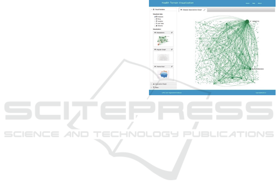
starting point of a visual exploration process. Figure
1 shows an example of the association map of
diseases. Association map is a graph visualization of
the association relationships among the diseases and
other terms in the concept space. It can serve as a
platform supporting interactive selection of concepts
to dynamically visualize data using a variety of tools
in the visualization system. To draw an association
graph, a spring-embedder algorithm (Kobourov,
2012) is used to layout the graph nodes. Nodes
picked on the association map are then be visualized
with geospatial information, possibly with time
varying variables.
Figure 1: A Disease association map.
In text mining, we processed 325,791
unstructured clinical notes containing patient
discharge summaries, laboratory reports, and
medical histories. Advanced NLP was applied in the
form of named entity recognition (NER) for
extracting diseases and other terms, with the help of
the Unified Medical Language System (UMLS)
(Humphreys, et al., 1998). Stemming and concept
clustering algorithms (Osinski and Weiss, 2005)
were applied to normalize the lexical variants and
duplications of the terms. Term correlations were
computed using the tf-idf (term frequency – inverse
document frequency) vector space model to identify
the significantly co-occurring diseases. An
association-mining algorithm was applied to the
combined terms to generate an association graph
among all the concepts terms. The resulting concept
space, along with the processed NCD data, is
represented in a data model designed to support our
specific ontology.
4 SPATIAL TEXTURE BASED
APPROACH
Population-level healthcare data and information are
IVAPP 2016 - International Conference on Information Visualization Theory and Applications
216
often tightly coupled with geospatial regions. The
visualization of this type data requires the
integration of geo-visualization and multi-
dimensional and time-variant information
visualization. For this purpose, we propose a Spatial
Texture based approach. In this approach, we encode
multi-dimensional attributes or time-variant
attributes for a geospatial region into a texture
image, and then map the texture image to the surface
of the geospatial region to provide an integrated
visual representation. The key is the visual encoding
of multiple attributes or a time-variant attribute in a
texture image.
4.1 Noise Texture
We aim to represent multiple attributes for each
geospatial region using color coded texture patterns
so that the users can visually perceive the
representations of different attributes, not only
within one region, but also its overall geospatial
distributions across many regions in a geographic
area (e.g. a state).
We first construct noise patterns to create a
random variation in color intensity, similar to the
approach in (Gossett and Chen, 2004). Different
color hues will be used to represent different types
of attributes, for example the occurrences of
different diseases. A turbulence function (Perlin,
1985) will be used to generate the noise patterns of
different frequencies (sizes of the sub-regions of the
noise pattern). These multi-scale patterns may be
applied to different scales of geographic areas (e.g.
counties vs zip-codes). Since the noise pattern
involves the mixing and blending of different color
hues, we choose to use an RYB color model instead
of RGB model, as proposed in (Gossett and Chen,
2004), since RYB color model provides more
intuitive representation of the weights of different
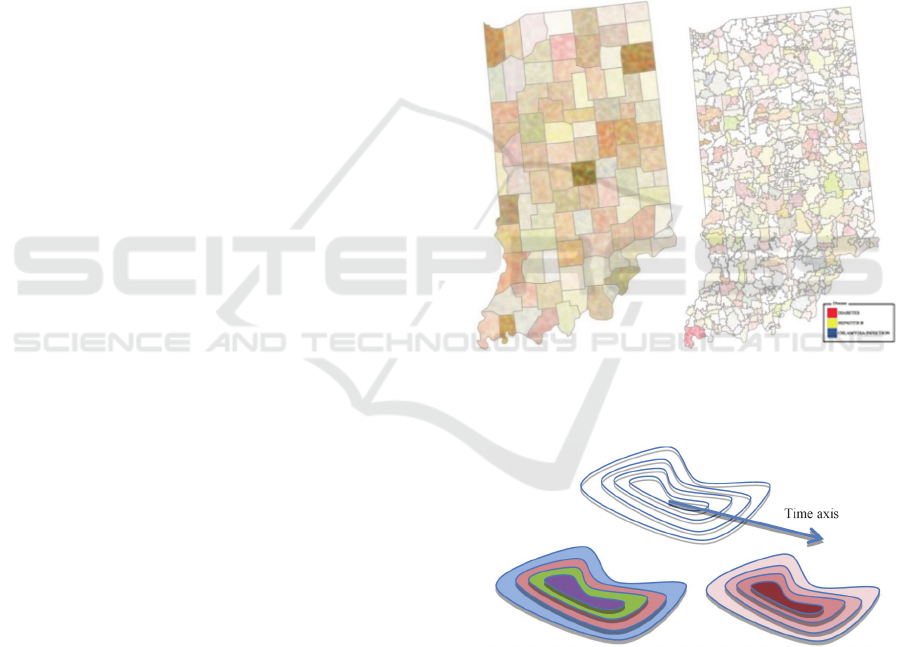
colors after blending. Figure 2 shows two examples
of the texture mapped views of three diseases,
Diabetes. Hepatitis B, and Chlamydia, over the
Indiana state map. For example, more reddish areas
exhibits higher rate of Diabetes and bluish areas
show higher occurrence of Chlamydia.
4.2 Offset Contours
Offset contouring is designed to represent attribute
changes over time within a geographic region. It can
also be used to represent multiple attributes by
assigning each attribute to each contour. Similar to
the Noise Pattern texture, we first construct a texture
image using offset contour curves to form shape-
preserving sub-regions. We will then use varying
color shades or hues to fill the sequence of sub-
regions to represent the change of attribute values
over time, or to simply fill the sub-regions with
different color values to represent multiple
attributes.
The offset contours are generated by offsetting
the boundary curve toward the interior of the region,
creating multiple offset boundary curves (Figure 3).
There are several offset curve algorithms available
in curve/surface modeling. But since in our
application, the offset curves do not need to be very
accurate, we opt to use a simple image erosion
algorithm (Rosenfeld and Kak, 1982) directly on the
2D image of the map to generate the offset contours.
(a) (b)
Figure 2: Noise textures mapped over the Indiana State
map: (a) county based; (b) zip-code based.
Figure 3: Offset contours with different colors or different
shades of the same color.
In time-series data visualization, the time line
can be divided into multiple time intervals and
represented by the offset contours. Varying shades
of a color hue can be used to represent the attribute
changes (e.g. occurrence of a disease) over time.
This approach, however, has two limitations. First,
when the boundary shape of a region is highly
Healthcare Data Visualization: Geospatial and Temporal Integration
217

concave, the image erosion technique sometimes
does not generate clean offset contours. This usually
can be corrected using a geometric offset curve
algorithm such as the one in (Hoschek, 1988). A
second limitation of this approach is that it requires a
certain amount of spatial area to layout the contours
and color patterns. In public health data, however,
these attributes are typically defined on geographic
areas, which provides a perfect platform for texture
based visual encoding. Figure 4 shows a few
examples of the texture mapped views of offset
contours over the Indiana state map. Figure 4 (a-b)
show the time-series views of Influenza, from 2004
to 2012. The time interval is divided into 8
subintervals. Figure 4 (c-d) show three diseases,
Influenza, Typhoid Fever, and Hepatitis B.
(a) (b)
(c) (d)
Figure 4: Texture mapped views of offset contours over
the Indiana state map: (a) County based time-series data;
(b) Zip-code based time-series data; (c) County based
multi-diseases data; (d) Zip-code based multi-diseases
data.
5 SPIRAL THEME PLOT
Spatial texture provides overviews of health care
data associated with geographic regions. It is
however often desirable for health administrators
and physicians to also see the details of individual
patients and theirs medical history (over time).
When this is done with a large population, the
collective view of patient medical histories often
exhibit identifiable patterns and trends that may not
be easily detected from the visualization of statistical
data over geographical regions.
We developed a new time-series visualization
method called Spiral Theme Plot by integrating
ThemeRiver (Havre et al., 2000) and spiral pattern
(Weber et al., 2001) to plot patients as points in
stacked spiral rings. Time is represented as a spiral
base curve. Diseases (or any other term) are
represented as stacked themes along a spiral base
curve. Patients are plotted within the regions of the
themes as points with proper visual attributes. One
significant attribute, for example “age”, will be
represented as radius. Other attributes of the
patients, such as race and gender, are represented as
color and shape of the dots. Spiral Theme Plot
allows multiple years of patients data be plotted
periodically such that seasonal patterns or abnormal
patterns for seasonal diseases can be easily detected.
For patients with multiple hospital visits at different
times for the same or different conditions, curves are
drawn to connect these multiple occurrences by the
same patient.
The base spiral curve is:
sin
cos
where is a monotonic continuous radius
function of angle θ. When is a linear function
, the gap between the spirals is a
constant 2, which can be estimated based on the
maximum cumulative width of the themes (Fig. 5).
When plotting patient data within each theme,
the width of the theme at a particular angle is
determined by the total occurrence of the disease at
that particular time. The boundary curve of each
theme can then be interpolated by spline curves.
This interpolation is done by splitting the time axis
into a fixed number of segments. The maximum
width of each segment is used as an interpolation
point. This leads to a discrete set of interpolation
points from which the spline curve can be generated
as the boundary curve of the theme. When plotting a
point for each patient, the width of the theme needs
to be computed first in order to determine the proper
IVAPP 2016 - International Conference on Information Visualization Theory and Applications
218
radius of the point. Although this width information
can theoretically be computed from the spline
representations, we found that it is more efficient to
simply check the color values along the normal
direction of the spiral curve to estimate the width of
a theme at each angle.
Lines are drawn between points representing
multiple occurrences of the same patient. Such lines
sometimes can become very dense leading to a
cluttered image. We implemented an edge bundling
strategy to bundle these connecting lines for each
pre-defined time interval (Fig. 6). Figure 7 show a
periodical (seasonal) pattern of Flu over 4 years.
Figure 5: Spiral Theme Plot for Hepatitis A, B, and C over
four years.
Figure 6: Spiral Theme Plot with bundled links.
Figure 7: Seasonal pattern of Flu.
6 SYSTEM INTERFACE AND
EVALUATION
The system is implemented using Javascript in an
HTML5 canvas. The visualization algorithms are
implemented using HTML, CSS, SVG, and WebGL
technologies with a number of open-source
Javascript libraries.
The user interface uses multiple split windows so
that multiple types of visualizations can be applied
and compared for the same dataset. Fig. 8 show a
screen shot of three visualizations for a dataset
selected from an association map. Visualization
results can also be saved into a slider bar, with time
stamps, and be brought back later (Fig. 9). This
provides a flexible workspace for health
administrators or physicians to explore and compare
different scenarios for health policy planning,
decision making, resource management, etc.
Figure 8: A screen shot of a split window interface.
Healthcare Data Visualization: Geospatial and Temporal Integration
219
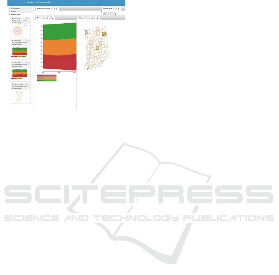
Figure 9: System interface with saved working windows.
To evaluate the system, we adopted the National
Institute of Standards and Technology (2007)
definition of usability for our participants. Using an
unstructured qualitative interview process, we
explored dimensions of effectiveness, efficiency,
and satisfaction. Due to the data privacy policy
provisions of the institutional review board research
process, we used obfuscated de-identified clinical
data for the usability assessment.
Prior to reviewing the interviewees were oriented
to a few detailed dimensions of the application: The
interviewees’ responses can be summarized as
follows:
• Users were pleased with the abilities to quickly
identify associations of different terms and form
subnetworks. Some felt that the visualization has
the potential to make them think about things
that they wouldn't otherwise, and that has value
to them.
• Some users felt that they may not use
visualization to identify disease outbreaks, but
would instead use this visualization after an
outbreak has been detected through other means
in order to explore the relationships and
characteristics of individuals within an outbreak
in order to identify potential risk factors and
target interventions.
• Users felt that this visualization system was very
complex and exhibited high information density,
which sometimes can obfuscated important
information. More in-line guidance or pop-up
descriptions (e.g., mouse-overs) would be
helpful.
• For geospatial data visualization, some suggested
adding a nonlinear scaling to highlight details in
lower prevalence regions, or presenting the data
as incident rates. Epidemiologist interviewees
requested extended functionality to visualize the
highest prevalence diseases in each county.
7 CONCLUSIONS
We present a health data visualization system which
emphasizes the integration of geospatial and
temporal information in healthcare data. We focus
on two new visualization methods we developed
specifically for public health data: Spatial Textures,
and Spiral Theme Plot. Spatial Texture approach is
effective because geospatial visualization
intrinsically provides additional screen space
(surface areas) that can be taken advantages of to
encode additional data and attributes. The Spiral
Theme Plot technique is a combination of several
information visualization methods including Theme
River, Spiral Plot and Scatter Plot. For public health
data with large patient databases, this particular
combination satisfies several key requirements for
visualizing time-variant patient records. With the
rich set of tools available to support web based user
interface, graphics, and data communications, we
also feel that it is as efficient to develop a web based
visualization system as in a traditional programming
environment.
In the future, we would like to continue refining
and expanding this visualization system by adding
new visualization tools and improving the existing
ones, in particular, the desired features and
improvements suggested by the evaluators. We
would also like to develop a configurable user and
data interface so that the system can be easily
configured for other types of use cases in public
health applications.
ACKNOWLEDGEMENTS
The project is supported by US Department of the
Army, award W81CWH-13-1-0020. We gratefully
acknowledge the contribution of Jennifer Williams;
and the Regenstrief Institute’s data engineers.
REFERENCES
Grossman, C., Powers B., McGinnis J. M., 2011. Digital
infrastructure for the learning health care system: the
foundation for continuous improvement in health and
health care. The National Academies Press.
IVAPP 2016 - International Conference on Information Visualization Theory and Applications
220

Plaisant, C., Milash, B., Rose, A., Widoff, S.,
Shneiderman, B., 1996. Lifeline: Visualizing Personal
Histories, CHI, pp. 221-227.
Wang, T. D., Plaisant, C., et al. 2008. Aligning Temporal
Data by Sentinel Events: Discovering Patterns in
Electronic Health Records, CHI’08, pp. 457-466.
Bui, A., Aberle, D. R., Kangarloo, H, 2007. Timeline:
Visualizing Integrated Patient Records. IEEE Trans.
Information Technology in Biomedicine 11(4):462-
473.
Klimov D., Shahar Y, 2005. A framework for intelligent
visualization of multiple time-oriented medical
records. AMIA Annual Symp Proc.; 405–409.
Klimov D., Shahar Y, Taieb-Maimon M, 2009. Intelligent
interactive visual exploration of temporal associations
among multiple time-oriented patient records. Methods
Inf Med. 48: 254–262.
Hallett, C., 2008. Multi-Modal Presentation of Medical
Histories. IUI’08: 13th International Conference on
Intelligent User Interfaces. pp. 80-89.
Bade, R., Schlechtweg, S. and Miksch, S., 2004.
Connecting time-oriented data and information to a
coherent interactive visualization. CHI’04. 105-112.
Maciejewski, R., Rudolph, S. and Hafen, R. 2009. A
Visual Analytics Approach to Understanding
Spatiotemporal Hotspots. IEEE Transactions on
Visualization and Computer Graphics, 16, 205-220.
Carroll LN et al. 2014. Visualization and analytics tools
for infectious disease epidemiology: A systematic
review. J Biomed Inform, 51:287-98.
Chittaro, L., 2001. Information Visualization and Its
Application to Medicine. Artificial Intelligence in
Medicine, 22(2), 81-88.
Gemmell, J., Aris A., Lueder R. 2005. Telling stories with
MyLifeBits. IEEE International Conference on
Multimedia and Expo, pp. 1536–1539.
The New York Times Company: Openpaths, Feb. 2013.
URL: https://openpaths.cc.
Google: Latitude, 2013. http://www.google.com/latitude/
Eccles, R., Kapler T., Harper, R., Eright, W. 2007. Stories
in GeoTime. In IEEE VAST, 19–26.
Kraak, M. 2003. The Space Time Cube Revisited from a
Geovisualization Perspective, Proc. 21st Int’l
Cartographic Conf., 1988-1996.
Kraak, M. J., and P. F. Madzudzo, 2007. Space time
visualization for epidemiological research.
Proceedings of the 23nd international cartographic
conference: Cartography for everyone and for you.
Kraak, M. J. and A. Kousoulakou, 2004. A visualization
environment for the space-time-cube. Developments in
spatial data handling. 11th International Symposium
on Spatial Data Handling. 189-200.
Kwan, M. P., 2000. Interactive geovisualization of activity
travel patterns using 3D geographical information
systems: a methodological exploration with a large
data set. Transportation Research C 8: 185-203.
Andrienko, N., G. L. Andrienko, et al., 2003. Visual data
exploration using space-time cube. 21st International
Cartographic Conference, Durban, South Africa.
Tominski, C., Schulze-Wollgast, P. and Schumann, H.,
2005. 3D information visualization for time dependent
data on maps. IEEE Information Visualization’05,
175-181.
Tufte, E. R., 1983. The Visual Display of Quantitative
Information. Graphics Press.
Havre, S., Richland, W. A., Hetzler, B., 2000.
ThemeRiver: visualizing theme changes over time.
IEEE Information Visualization, 115-123.
Cui, W., S. Liu, et. al., 2011. Textflow: Towards better
understanding of evolving topics in text. IEEE Trans.
on Visualization and Computer Graphics, 17 (12),
2412-2421.
Weber, M., Marc Alexa, Wolfgang Müller. 2001.
Visualizing Time-Series on Spirals. IEEE Information
Visualization, 7-13.
Tominski, C., Schumann, H., 2008. Enhanced Interactive
Spiral Display, Annual SIGRAD Conference Special
Theme: Interaction. 53-56.
Cabral, B., and L. C. Leedom. 1993. Imaging Vector
Fields Using Line Integral Convolution. In Poceedings
of ACM SIGGRAPH, 263–272.
Stalling, D. and H. Hege. 1995. Fast and Resolution
Independent Line Integral Convolution. In
Proceedings of ACM SIGGRAPH 95, 249–256.
Laramee, R. S., et al., 2004. The State of the Art in Flow
Visualization: Dense and Texture-Based Techniques.
Computer Graphics Forum, 3(2):203–221.
McGraw, T., M. Nadar. 2007. Fast Texture-Based Tensor
Field Visualization for DT-MRI. 4th IEEE
International Symposium on Biomedical Imaging:
Macro to Nano, 760-763.
Auer, C., Stripf, C., Kratz, A., Hotz, I., 2012. Glyph- and
Texture-based Visualization of Segmented Tensor
Fields. Proc. Int. Conf. on Information Visualization
Theory and Applications, 670-677.
Overhage J. M, Grannis S. J., McDonald C. J., 2008. A
comparison of the completeness and timeliness of
automated electronic laboratory reporting and
spontaneous reporting of notifiable conditions. Am J
Public Health. 98(2):344-50.
Stephen, G., Kobourov, 2012. Spring Embedders and
Force Directed Graph Drawing Algorithms. arXiv:
1201.3011.
Humphreys, B. L., D. A. Lindberg, H. M. Schoolman, G.
O. Barnett, 1998. The unified medical language
system: An informatics research collaboration J. Am.
Med. Inform. Assoc., 5 (1), 1–11.
Osinski, S., D Weiss, 2005. A concept-driven algorithm
for clustering search results - Intelligent Systems,
IEEE Intelligent Systems, 48-54.
Gossett, N., Baoquan Chen, 2004. Paint Inspired Color
Mixing and Compositing for Visualization. IEEE
Symposium on Information Visualization. 113-117.
Perlin, K., 1982. An image synthesizer. In Proceedings of
SIGGRAPH’85
, 287–296.
Rosenfeld, A. and A.C. Kak, 1982. Digital Picture
Processing. Academic Press, New York.
Hoschek, J., 1988. Spline Approximation of Offset
Curves. Computer Aided Geometric Design. 33–40.
Healthcare Data Visualization: Geospatial and Temporal Integration
221
