The Challenges of Designing Metro Maps
Michael Burch
1
, Robin Woods
2
, Rudolf Netzel
1
and Daniel Weiskopf
1
1
VISUS, University of Stuttgart, Stuttgart, Germany
2
Communicarta Ltd., High Wycombe, Bucks, England
Keywords:
Cartography, Schematic Mapping, Transit Maps, Map Design.
Abstract:
Metro maps can be regarded as a particular version of information visualization. The goal is to produce
readable and effective map designs. In this paper, we combine the expertise of design experts and visualization
researchers to achieve this goal. The aesthetic design of the maps should play a major role as the intention of
the designer is to make them attractive for the human viewer in order to use the designs in a way that is the
most efficient. The designs should invoke accurate actions by the user—in the case of a metro map, the user
would be making journeys. We provide two views on metro map designs: one from a designer point of view
and one from a visualization expert point of view. The focus of this work is to find a combination of both
worlds from which the designer as well as the visualizer can benefit. To reach this goal we first describe the
designer’s work when designing metro maps, then we take a look at how a visualizer measures performance
from an end user perspective by tracking people’s eyes when working with the formerly designed maps while
answering a route finding task.
1 INTRODUCTION
Stop! I want to get off... Not an unreasonable request.
But where?
Cartographers face many challenges, not least of
which is how to represent the physical world in as true
a form as possible. Public transport mapping is no dif-
ferent. Leaving aside the long-standing debate about
schematics, one of the challenges the map designer
encounters is the requirement to provide maps to cus-
tomers in the travel and publishing industry where
page size is everything. Here, schematic maps work
very well indeed.
We first go back to the basics, i.e., to good old-
fashioned fieldwork. On surface-based networks,
such as Amsterdam, Budapest, or Pisa, walking the
streets plotting each of the routes and stops had to
be done. And in 1990, when we (second author and
his company) first started doing this, there was no
internet, which meant that pre-departure information
was very limited. We would not necessarily have
known how many lines there were and over how much
ground. That meant guessing the time required to do
the job and that in turn meant either a long or short
stay or a short stay with long hours.
There was no technical aid like digital cameras
for recording tram and bus stop names in those early
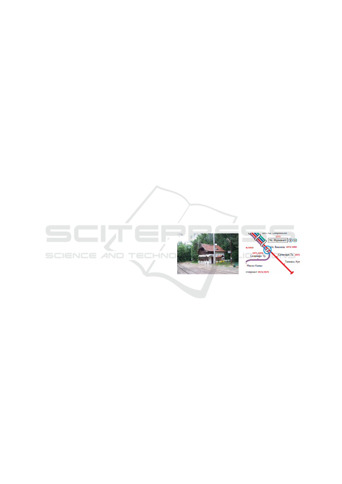
(a) (b)
Figure 1: (a) One of the charming little stops in the middle
of a park in Sofia. A direct line from the city center goes
here. (b) A section of the corresponding map. The stop
labeled 1879/1880 is the one in the photo on the left.
days. Everything was handwritten. The arrival of dig-
ital cameras, at prices making ownership a reasonable
proposition, was certainly a boon. It has made field-
work so much easier, particularly where the Latin al-
phabet is not used in signage, i.e., in Athens, Bel-
grade, Sofia, and St Petersburg, for example. We now
have a library with more than 48,000 photos of every
single station or stop name on every line in every city
we cover, together with an assortment of other inter-
esting subjects, objects, artifacts, and oddities. Fig-
ure 1 shows a typical example of a photo of a stop
and the associated map.
A decision as to which lines to incorporate and
which to leave out must be made and that always de-
pends on the type of system. Mindful that the end-
Burch, M., Woods, R., Netzel, R. and Weiskopf, D.
The Challenges of Designing Metro Maps.
DOI: 10.5220/0005679601950202
In Proceedings of the 11th Joint Conference on Computer Vision, Imaging and Computer Graphics Theory and Applications (VISIGRAPP 2016) - Volume 2: IVAPP, pages 197-204
ISBN: 978-989-758-175-5
Copyright
c
2016 by SCITEPRESS – Science and Technology Publications, Lda. All rights reserved
197

user is a tourist who may not have much time to get
to grips with the complexity of the network, we gen-
erally first select the fixed route types, such as tram,
trolleybus, or metro and then bus if there is either
space or the book author specifically mentions a par-
ticular point of interest only reachable by bus.
Naturally, if the system is predominantly bus, like
Pisa, or in the case of Venice, waterbus, then we
choose a selection of routes that properly cover the
most important points of interests first, and then in-
clude others to complement those where space and
time allow.
Fixed routes are good to map for tourists—it is
easy for them to locate lines visually at street-level—
either overhead catenary in the case of trolleybus, or
tracks and catenary, in the case of trams. Getting lost
is no problem; exploring the city you will eventually
come across a route somewhere. It is a simple case of
following the line in either direction until you come
across a stop, note the name (or number), look at your
schematic map, and off you go, or on you get!
In fact, perhaps to the wrath of other cartogra-
phers, we would argue that getting lost and exploring
somewhere without a street map is absolutely fine and
very enjoyable—armed with your transport map you
will always get back to where you want.
In this paper, we illustrate some challenges when
designing metro maps from a designer’s point of view
but also from a visualizer’s point of view. Both have
different goals in mind, but in the end they also share
some common goals, i.e., generating readable and
useful metro maps helping travelers find their ways
in a foreign city.
2 RELATED WORK
From a visualization perspective, metro maps fall into
the category of relational data, i.e., they should be
an efficient means to display graphs (Battista et al.,
1999). The difference to abstract graph data comes
from the fact that the vertices already have some kind
of spatial information attached which stems from the
inherent topographic dimension in the data. There-
fore, we are not allowed to freely choose a stan-
dard graph layout algorithm from a given reper-
toire (Fruchterman and Reingold, 1991; Kamada and
Kawai, 1989; Sugiyama et al., 1981) following aes-
thetic graph drawing criteria (Ware et al., 2002).
‘Metro map’ is a commonly used term aiming to
describe a schematic map, i.e., a diagrammatic repre-
sentation of some kind of geospatial data which was
epitomized by Henry Charles Beck (Garland, 1994).
There is an ongoing debate by commentators and his-
torians about the real origin of the metro map as it
is known today. One version is to suppose that Beck
himself had a significant influence by George Dow,
who designed, among other ideas, a carriage diagram
for the London & North Eastern Railway company
(LNER). In Andrew Dow’s book “Telling the Passen-
ger Where to Get Off” (Dow, 2005), we can find a fas-
cinating perspective on the evolution of diagrammatic
railway maps and the work of someone who, although
nowhere near as famous as Beck, made a number of
pioneering designs preceding Beck. These map de-
signs are already some kind of information visualiza-
tion since their common goal was to graphically de-
pict data in a sense to make them understandable and
readable in a rapid manner. The difference to today’s
map design is that the map creators in these early days
had to do map research without the help of computers
and the pre-knowledge acquired on the internet.
Today the term metro map is widely used but
maybe the term public transport map may be the bet-
ter choice since there is a variety of transportation
modes and systems combined in a single map like
tubes, metro lines, buses, water buses, and so on. Al-
though such combined maps are beneficial, they eas-
ily produce an information overload resulting in vi-
sual clutter (Rosenholtz et al., 2005). This high de-
gree of complexity may lead to the assumption that
some commentators and aficionados would argue that
they are not even maps at all and should be referred to
as diagrams (Horne, 2012).
For example, the London Underground map has
been known, at different times during its history, to
refer to itself exactly as a diagram of lines. In any
case, it no longer portrays purely a metro system ei-
ther now. The most recent editions include suburban
surface rail (the so-called London Overground), light
rail (Docklands), and even a cable car (so-called Emi-
rates Air Line) across the Thames river. In an exten-
sive collection of maps, Ovenden brings together ex-
amples from around the world (Ovenden, 2005).
To really understand the usability and readability
aspects in metro map systems, i.e., graphical depic-
tions of transportation system data, user studies have
been conducted. Eye tracking can be used as one tool
(Burch et al., 2014b; Yarbus, 1967) to analyze where
and when visual attention is paid (Kurzhals et al.,
2014) to a map and which visual task solution strate-
gies (Burch et al., 2013; Netzel et al., 2014) are ap-
plied to perform a route finding task. From a graph
visualization perspective, such route or wayfinding
tasks have already been explored (Huang, 2007) with
the main result that people tend to follow the geodesic
path tendency (Huang et al., 2009). This tendency is
also present in metro maps (Burch et al., 2014a) but
IVAPP 2016 - International Conference on Information Visualization Theory and Applications
198
here, the original task is subdivided into subtasks be-
tween the interchange points. Each subtask is per-
formed by following the geodesic path and finally
cross checking the answer for correctness. Moreover,
it was found out that the map complexity has an influ-
ence on task completion times.
3 DESIGNING METRO MAPS
Designing metro maps is a challenging task since the
designer must be aware of two major aspects: the de-
sign in the sense of beauty and art making a map aes-
thetically appealing to a traveler and second, the de-
sign in the sense of readability making the map useful
as a means to effectively and safely travel in a foreign
city (Burch, 2015).
3.1 The Designer’s Perspective
Let us take a look at an example after the completion
of ground research. Figure 4 shows a section of the
Communicarta Style45
R
map for the city of Sofia.
Generally, in transport mapping we must be aware
of the information a traveler needs to make success-
ful journeys. There is a bare minimum and, for some
strange and unknown reason, not all transport author-
ities deem this part important. That perhaps, is for
another discussion. For now, however, we can agree
that a traveler will need at least three pieces of infor-
mation for stress-free wayfinding that are at ground
level, on and inside the vehicle, and on the map (see
Figures 2, 3, and 4):
• At Ground Level (Figure 2): If people walk
around in a city, the most important aspect
when using public transportation is the easy
recognition of the metro, tube, and bus stops.
Without them, the metro map is useless even if
it is well-designed.
1. Boarding Point: The name of the stop should
ideally be written on the stop sign and should
be the same as in the metro map to avoid mis-
interpretations (Figure 2 (a), (1)).
2. Interchange Point: If the stop is an inter-
change point, this should be already indicated
on the stop sign. Again, ideally the name of the
stop should be written on the stop sign (Figure 2
(a), (2)).
3. Where to Alight: For passengers, it is very
important to directly see where a metro line is
going to. This gives them the information in
which coarse direction they will be going even
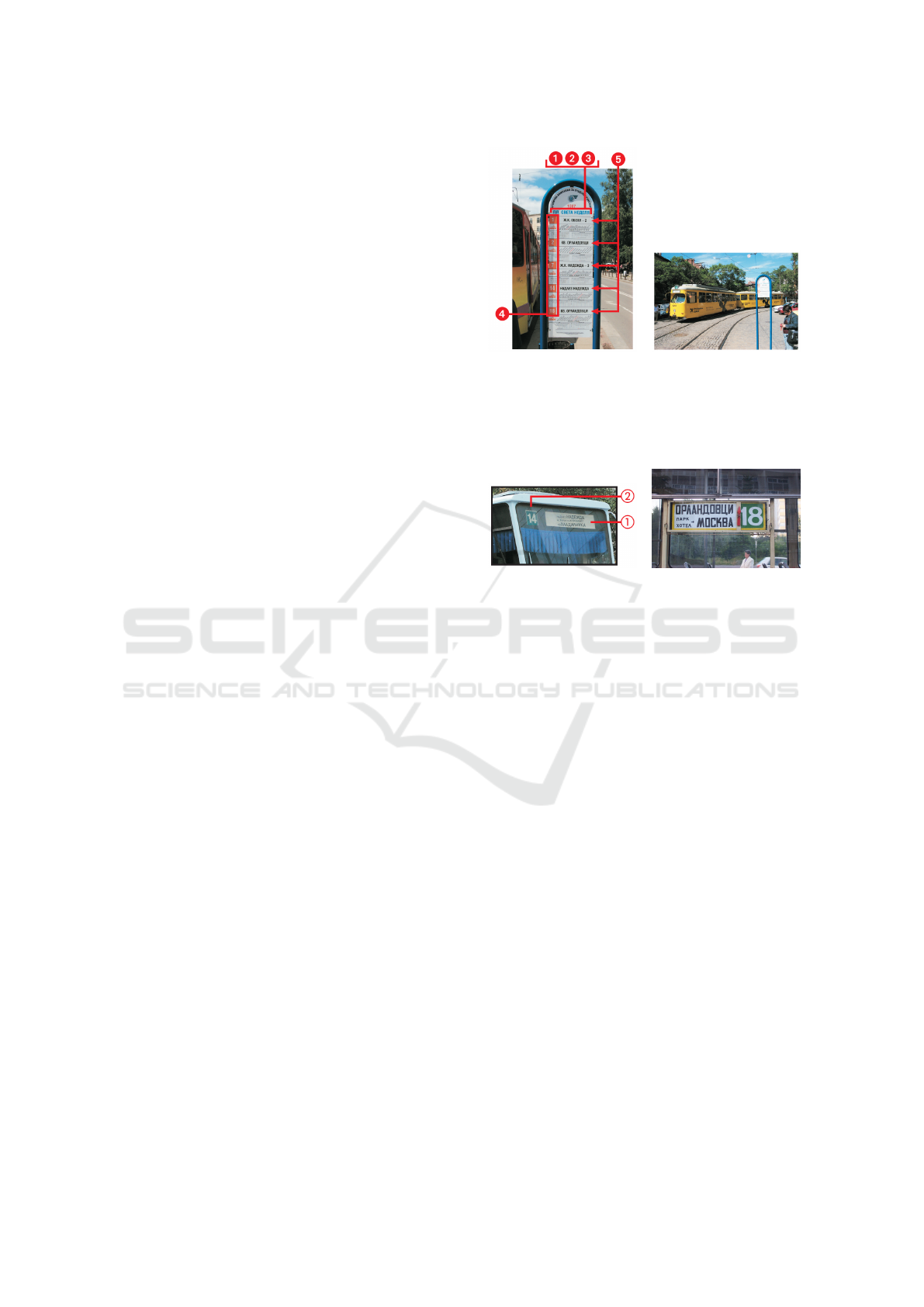
(a) (b)
Figure 2: At ground level: (a) A multi-route nameboard:
Note the red number (1307) above the stop name, which is
unique for this platform. Each platform has its own unique
number. (b) Central Sofia: Typical tram stop and name-
board position.
(a) (b)
Figure 3: On and inside a tram: (a) Front of a tram dis-
playing route number (in this example route 14), the service
identifier, and destination names. The destination name of
both ends of the line are shown. Ideally, only the actual di-
rection the vehicle is traveling in should be shown. (b) The
inside signboard of a tram where the red arrow shows the
‘direction’ the tram is going.
if the destination stop is not indicated (Figure 2
(a), (3)).
4. The Lines or Service Identifiers: Numbers,
names, letters, or symbols of routes for each of
the intended journey(s) should be clearly indi-
cated. A certain unique color for each metro
line should be used since color can easily be
perceived and mentally mapped to a certain
metro line (Figure 2 (a), (4)).
5. The Direction of Travel: The ‘towards’ or
‘destination’ of the services so as to select (a),
the correct platform, and (b), the right vehicle
traveling in the desired direction is also very
important (Figure 2 (a), (5)).
• On and Inside the Vehicle (Figure 3): Once en-
tered a tram, we are dependent on this first de-
cision. Are we right? Is it going to the correct
direction? Do we have to change lines and after
how many stations do we have to do that?
1. Destination: The ‘towards’ or direction of
travel should be clearly indicated on the front
The Challenges of Designing Metro Maps
199

Figure 4: Information about the public transport system
in an easy-to-read and intuitive format: the Communicarta
Style45
R
map. Note that all stops have both the names and
individual unique platform numbers.
of a tram, train, or metro (Figure 3 (a), (1)).
2. Service Identifier: Also the service identi-
fier, i.e., which line or route the train operates
should be given to the passenger before enter-
ing the vehicle (Figure 3 (a), (2)).
3. Inside the Vehicle: Clear announcements be-
fore each stop would be great, in addition, next
stop indicators in visual format would be fabu-
lous. Without these last two items, it is not im-
possible to get around it is just rather annoying
(Figure 3 (b)).
• On the Map (Figure 4): Having a metro map
in hand, a traveler is well-equipped to get not
lost in a foreign city—assumed the map is well-
designed and the visual encodings and designs
inside the map correspond to those given at
ground level and also on the vehicle.
1. Linking between the Stations: An easy-to-
read format has to be used for the visual encod-
ing of the linking of individual stations. From
a graph visualization perspective, a node-link
visual metaphor is suitable. Also laymen are
able to directly understand the principle of con-
nectedness when links in the form of straight
colored lines are used.
2. Topography: In many situations—even if trav-
elers are not familiar with a city—they already
know some points of interest like sights, the
airport, the main station, or a river. This to-
pographical information is important to rapidly
find stations in a map.
3. Individual Lines: Color coding is typically
used to visually encode individual metro lines.
Keeping the same color coding for the lines is
important since map users build some kind of
mental map which helps them directly manage
the many map details.
4. Interchange Points: Traveling long routes in
a city oftentimes demands for changing lines,
i.e., passengers have to identify suitable sta-
tions where they could change trains without
wasting time or making the journey unneces-
sarily unpleasant.
Having pre-purchased a street map, printed it in
black and white for easy mark-up, we can commence
fieldwork; to begin we need to establish the types of
transport and if possible highlight the routes on our
street map. Visiting the transport information office,
we are sometimes able to obtain some information
about the routes. Now at least we may know the types
and extent.
3.2 The Visualizer’s Perspective
From a visualization expert’s perspective, metro maps
can be considered as node-link diagrams representing
stations as nodes and metro lines between stations as
links. There is additional data attached to the stations
and metro lines, e.g., categorical data expressing the
direction of travel under certain conditions or the time
periods a link (a metro line) is active. Additional in-
formation is placed on a metro map to guide a spec-
tator through the city or serve as a mental aid, i.e.,
the mental map. This is important in graph visual-
ization but also generally in all visual depictions of
data, in order to find and observe visual patterns, re-
locate them, and finally compare them with others to
derive meaning and knowledge by remapping them to
the underlying data, i.e., the metro map system.
Interpreting a schematic map reliably and effort-
lessly is important to make it a useful guide for a
traveler in a foreign city. If there is only the metro
map with its lines and stations, it may be readable and
understandable, but the information it provides is not
enough to be really useful for the traveler. The map
designer has to outweigh the benefits and drawbacks
of the design being sure to not end up at either end
of the design space, i.e., information overload is as
worse as information sparsity.
To fully understand how the end user of schematic
maps behaves we need user studies comparing differ-
ent map designs with each other. Although we can
measure accuracies and response times of the study
participants, we also investigate the applicability of
eye tracking techniques to explore the visual task so-
lution strategies, visual attention, and visual behavior
of people when working with the map. Consequently,
the map designer generates questions that the visual-
ization expert tries to answer.
From a visualization perspective, comparative
user studies are highly appreciated (Lam et al., 2012).
In the best case, recording the time-varying visual at-
tention paid to a metro map stimulus is very inter-
esting but such spatio-temporal eye movement data is
difficult to analyze. The inherent space and time di-
IVAPP 2016 - International Conference on Information Visualization Theory and Applications
200

mensions in the data build another dependent variable
in a user experiment in addition to the traditional ones
like error rates and response times.
By inspecting eye movement data visually, e.g., by
visual analytics techniques (Andrienko et al., 2012),
we might be able to analyze the map designs for de-
sign flaws, reading difficulties, or missing visual sup-
port like labels or legends. These evaluations can sup-
port the map designer in improving the maps or cho-
sen design.
4 SOFIA: A METRO MAP
DESIGN—REAL-WORLD USE
In public transport mapping, we must be aware of the
information a traveler needs to navigate around a sys-
tem. Here, in these illustrations, we can see how the
designed map links to the real-world situation, i.e.,
what the map user will see in the city. There is a bare
minimum and, we can agree that a traveler will need
these pieces of information for wayfinding (Figure 2
illustrates such a scenario at ground level): boarding
point, interchange point, where to alight, the line or
service identifiers, and the direction of travel. Note
that the last two points are particularly important for
stops or stations where multiple routes operate from
the same platform, as in this example here in Sofia.
Sofia has good coverage by trams with the major-
ity of platforms having signboards with both a name
and unique number. Those facts, combined with our
digital camera, proves very useful in saving time an-
notating the street map markup because, as all the
names are in Cyrillic, we do not actually have to write
the names down merely the numbers.
The signboards also show service identifiers to-
gether with the destination stations of each route. Not
only that, there are also timetables for each route, a
line diagram with each of the stop names in end-to-
end order and, highlighted in red, the name of the ac-
tual stop where the sign is located. This is a perfect
scenario. All very good information for the user and
for us is present to build a great map.
The service identifiers and destination names also
appear on the front and sides of most of the trams.
Even if they were not, so long as you have the map
and have noted the name at the end of the route in the
direction you wish to travel, you merely need stand
on the correct platform to make the journey.
Given all this information and in possession of a
well-designed and thoroughly researched Style45
R
transport map, it is truly a synch to get around
and enjoy the city, its suburbs and the surrounding
countryside—even if you do not read Cyrillic.
Strangely, despite providing all this really useful
navigational information on the ground, it is amaz-
ing why some transport authorities around the world
(actually quite a lot) choose to issue the most useless
map information to their customers.
Back in the office after 5 full days of research and
having obtained all the photographic evidence, plot-
ted the stops and lines, it is time to complete the job.
We import the marked-up street map (Figure 5), over-
draw the geographic layout of each of the routes on a
‘trace’ layer, then draw each of the individual routes,
typeset the stop names, straighten the lines, stylize
with 45 degree angles, add station symbols and ser-
vice identifier numbers.
In Figure 5, we can see all the individual tram
routes overlaying the street map we used for the re-
search, i.e., the network of interconnected tunnels,
lines, and stations. This ‘hardware’ is essentially in-
visible to passengers’ eyes. What we mean is that,
without good and clear map information there can be
no perception or indeed, comprehension on the part of
the customer as to where the network goes and how to
navigate their way around.
What brings the invisible to light? What makes
the wonderful network—all the hardware of overhead
wires, rails, tunnels, stations and vehicles—the bril-
liant engineering and the careful attention to safety
and good materials, actually of use to the traveling
public? The answer is a brilliant map. The kind of de-
sign that brings (carto)graphic reality to the user. The
map brings confidence and connection to the user. It
is this graphic representation with all the careful skill
of design and attention to detail that makes the differ-
ence.
In Figure 6, all that was effectively hidden is now
revealed in all its glory. This is one of the key ele-
ments in customer information and whether it is de-
livered to customers on a website or as a paper give-
away, or indeed on digital devices like a smart phone,
the net effect is that the network makes sense, is visi-
ble, and gives customers the opportunity to travel with
knowledge and confidence.
Maps are constantly being referred to. We have all
seen customers looking at maps and trying to make
sense of what they see. And indeed, the most im-
portant consideration when commissioning a map de-
signer is to make sure they have an understanding of
what works and what does not.
Working with visualization experts, the map de-
signer can gain deeper knowledge and insight of how
the end-user interprets the information and so can de-
sign more effective maps leading to better use of the
transport systems.
Aesthetics plays a major role in the design of
The Challenges of Designing Metro Maps
201
Figure 5: Research markup for Sofia showing the post re-
search ‘trace’ of the individual lines. The background map
is artificially blurred for illustration purposes.
metro maps. Without careful attention to detail and
careful design, the maps would be useless. Commu-
nicarta employs many of the ‘Good Design Princi-
ples’ (Ovenden, 2008), and more. Chief among those
being the horizontal placement of station names, en-
suring names do not cross over lines, smooth curves
as opposed to right-angles which aid, what we like to
call, the ‘flow’ of the designs, and services separated
out into their individual routes as required.
As we also now know from our experience in
wayfinding and research, the direction of travel-
‘towards’ names and line or service identifiers play a
major role in the users’ ability to navigate the system.
Emphasis on these aspects are important elements in
the design.
And of course, famously, we use the 45 degree an-
gle for the diagonal lines which we have found work
very well for guidebook size pages which has been
the majority of the use of the maps.
Space is everything. This helps both the flow and
the way that users are able to read the maps. Not only
does the correct spacing help the user the designs also
look and feel better.
5 CHALLENGES AND OPEN
ISSUES
There are many problems, limitations, challenges,
and open issues which could not be addressed in the
context of this paper. These aspects can be found on
both sides, i.e., either for the map designer but also
for the visualization expert.
Figure 6: The final transport map of the city of Sofia in the
Style45 as designed for Thomas Cook City Spot guidebook.
5.1 Interactive Maps
Interactive maps are much more difficult to design
since an infrastructure is required in the form of soft-
ware and data bases updating the displayed informa-
tion on user’s demand. However, interactive maps—
those on digital devices or computers—are a topic
worthy of note. They build the basis for a separate
subject altogether in the sense that the type of eye-
tracking study would need to be different from that of
a static kind of map.
That begins to open the topic up to a far
greater study realm since it would involve other ar-
eas such as user interface and user interpretation of
information—actually something we should be very
interested in, specifically in regards to public trans-
port, i.e., not just maps but wayfinding in general, also
in the areas of timetables, ticketing, vehicle design
(for example, where and what types of information
are placed on-board and outside) and even subjects
such as ‘how to use the system’.
5.2 Scalability and Visual Clutter
A real problem for both—the map designer and the
visualization expert—are growing datasets. For the
map designer much more work on recording data,
taking pictures, or traveling has to be done until the
final map is ready for print. For the visualization
expert, larger datasets cause visual, perceptual,
and also algorithmic scalability problems, i.e., the
question comes up if the visual design can still keep
pace with the growing number of metro stations,
lines, and additional information.
IVAPP 2016 - International Conference on Information Visualization Theory and Applications
202

5.3 Progress of Transportation Systems
Public transportation systems are typically growing
with the increasing population in a city, requiring
adapted infrastructures to the novel situation. Stations
have to be added or new lines have to be designed
making a journey through a city more efficient and
more pleasant to the passengers. The map designers
have to keep pace with the steady growing or change
of the transportation system in order to provide in-
formative and up-to-date traveling information to the
tourists. The map designer should be aware of possi-
ble changes in a transportation system, otherwise the
maps soon get obsolete.
5.4 Evaluation of Real-World Scenarios
In real life, passengers sometimes do not have enough
time to read a map very carefully. Typically, they are
in a hurry to catch the next train or metro which brings
them to the airport for example. This more realistic
scenario demands for another kind of user evaluation.
The question arises if maps in a certain design are still
useful in such situations where the traveler is under
time pressure.
5.5 Hazards of Map Research
As a public transport map researcher, we have to carry
a rucksack with all the equipment and reference ma-
terial. Spare cameras, spare batteries, spare memory
chips for the cameras, at least two sets of clip boards,
markup pens in a multitude of different colors, high-
lighters, torch for when it gets dark, all the street maps
that have been printed out in large A2 and A1 sizes of
various sections of the city to actually do the markups
on, wet weather gear where necessary, sun blocker as
necessary, drinking water, hand hygiene and a space
to store hats, scarves and gloves as necessary. Basi-
cally anything you would need for an expedition.
The life of a public transport map researcher is
not always plain sailing either. No, from freezing cli-
mates of -17
◦
C on one occasion in Berlin and Oslo to
the searing sun and humid highs of +50
◦
C in places
like Dubai to torrential rain and flash floods of Tunis
and the fog of Milan, the researcher has to deal with
it all and still get the job done in the time allocated.
Sometimes the seemingly ridiculous (but true) oc-
casion of getting stuck in the Castelletto-Portello lift
in Genoa and having to be rescued, amazingly by an-
other lift in the opposite lift shaft—in case you were
wondering, are set alongside the more serious situ-
ations of being threatened with arrest in Rome (for
(a) (b)
Figure 7: A couple of amusing photo’s that aptly illustrate
what some of the hazards of map research are in some cities.
taking pictures in the metro) or being chased by hood-
lums in San Francisco and losing a day’s work in the
process, yes our researchers go through it all.
In other cases, it is just plain frustrating whilst
trying to get the job done. Like having to avoid
peak hours in cities like Beijing for example when re-
searching the trolleybuses, or being asked to delete
photo’s from the camera by security guards in Madrid
whilst working on line 12. We know there is a risk of
this, so we exchange the memory chip for a fresh one
every 2–3 hours so there is only that much loss if this
happens.
Weather, of course, plays a major part in our frus-
trations. Rain being one of the biggest threats to pro-
ductivity. In these situations if we have both metro
and surface systems to research we can choose to do
the metro first and then go on to the surface system
when it has cleared up. Otherwise, it is a case of
ducking for cover and marking up the map without it
getting wet. All of this prolongs the time to complete.
In some instances, we wonder if we would ever
be able to complete the job before the system crum-
bles apart in front of us. St Petersburg tram system is
an example of this where you can see the state of the
tracks. In some cities, the state of the infrastructure
means we have to keep a look down instead of up.
Sofia is a great example of where not looking down
could cause more than just an embarrassment (see il-
lustrations in Figure 7). At other times, we have had
to contend with strikes and vehicle breakdowns.
6 CONCLUSION AND FUTURE
WORK
In this paper, we discussed and explained the art of
designing metro maps. We looked at this challenge
The Challenges of Designing Metro Maps
203

from two different perspectives, i.e., the one from the
map designer and the one from a visualization expert.
We identified different subgoals such as aesthetics,
understandability, intuitiveness, and readability in the
sense of user performance. A combination of these
goals can result in advanced metro maps serving as
good means to convey data but also to make metro
maps attractive to the eye and aesthetically appealing,
two major goals typically standing in a trade-off be-
havior. We illustrated the design of metro maps in a
real use case showing its design for the city of Sofia.
From a visualization perspective, user studies are per-
formed to measure the performance of people trying
to answer route finding tasks which depends on the
complexities of the maps that can lead to tremendous
design problems for the map designer, in particular
when many transportation systems like bus, metro, or
tube have to be displayed together.
For future work, we plan to collaborate, i.e., the
map designer raises questions that he is not able to
answer where the visualization expert designs user
studies with the goal to get hints about user perfor-
mance problems or even reading problems which can
be analyzed by applying eye tracking techniques for
recording and measuring time-varying visual atten-
tion paid to metro map stimuli. This is challenging
for static maps printed on a sheet of paper but be-
comes even more challenging for dynamic and inter-
active metro maps—maybe also on small displays like
smart phones.
ACKNOWLEDGEMENTS
We would like to thank the German Research Foun-
dation (DFG) for financial support within project B01
of SFB/Transregio 161.
REFERENCES
Andrienko, G. L., Andrienko, N. V., Burch, M., and
Weiskopf, D. (2012). Visual analytics methodology
for eye movement studies. IEEE Transactions on Visu-
alization and Computer Graphics, 18(12):2889–2898.
Battista, G. D., Eades, P., Tamassia, R., and Tollis, I. G.
(1999). Graph Drawing: Algorithms for the Visual-
ization of Graphs. Prentice-Hall.
Burch, M. (2015). The aesthetics of diagrams. In Proceed-
ings of International Conference on Information Visu-
alization Theory and Applications.
Burch, M., Andrienko, G., Andrienko, N., H
¨
oferlin, M.,
Raschke, M., and Weiskopf, D. (2013). Visual task
solution strategies in tree diagrams. In Proceedings
of the IEEE Pacific Visualization Symposium, pages
169–176.
Burch, M., Kurzhals, K., and Weiskopf, D. (2014a). Vi-
sual task solution strategies in public transport maps.
In Proceedings of the 2nd International Workshop on
Eye Tracking for Spatial Research, pages 32–36.
Burch, M., Raschke, M., Blascheck, T., Kurzhals, K., and
Weiskopf, D. (2014b). How do people read metro
maps? An eye tracking study. In Proceedings of 1st
International Workshop on Schematic Mapping.
Dow, A. (2005). Telling the Passenger where to Get Off:
George Dow and the Evolution of the Railway Dia-
grammatic Map. Capital Transport Publishing.
Fruchterman, T. M. J. and Reingold, E. M. (1991). Graph
drawing by force-directed placement. Software, Prac-
tice, and Experience, 21(11):1129–1164.
Garland, K. (1994). Mr. Beck’s Underground Map. Capital
Transport Publishing.
Horne, M.A.C.(2012). Information design as-
pects of the London underground map. http://
www.metadyne.co.uk/UndMap.html.
Huang, W. (2007). Using eye tracking to investigate graph
layout effects. In Proceedings of the Asia-Pacific Sym-
posium on Visualization, pages 97–100.
Huang, W., Eades, P., and Hong, S.-H. (2009). A
graph reading behavior: Geodesic-path tendency. In
Proceedings of the Pacific Visualization Symposium,
pages 137–144.
Kamada, T. and Kawai, S. (1989). An algorithm for draw-
ing general undirected graphs. Information Process-
ing Letters, 31(1):7–15.
Kurzhals, K., Fisher, B. D., Burch, M., and Weiskopf, D.
(2014). Evaluating visual analytics with eye tracking.
In Proceedings of the Fifth Workshop on Beyond Time
and Errors: Novel Evaluation Methods for Visualiza-
tion, pages 61–69.
Lam, H., Bertini, E., Isenberg, P., Plaisant, C., and Carpen-
dale, S. (2012). Empirical studies in information vi-
sualization: Seven scenarios. IEEE Transactions on
Visualization and Computer Graphics, 18(9):1520–
1536.
Netzel, R., Burch, M., and Weiskopf, D. (2014). Compara-
tive eye tracking study on node-link visualizations of
trajectories. IEEE Transactions on Visualization and
Computer Graphics, 20(12):2221–2230.
Ovenden, M. (2005). Metro Maps of the World. Capital
Transport Publishing, 2nd edition.
Ovenden, M. (2008). Paris Metro Style: In Map and Station
Design. Capital Transport Publishing.
Rosenholtz, R., Li, Y., Mansfield, J., and Jin, Z. (2005).
Feature congestion: a measure of display clutter. In
Proceedings of the Conference on Human Factors in
Computing Systems, pages 761–770.
Sugiyama, K., Tagawa, S., and Toda, M. (1981). Methods
for visual understanding of hierarchical system struc-
tures. IEEE Transactions on Systems, Man, and Cy-
bernetics, 11(2):109–125.
Ware, C., Purchase, H. C., Colpoys, L., and McGill, M.
(2002). Cognitive measurements of graph aesthetics.
Information Visualization, 1(2):103–110.
Yarbus, A. L. (1967). Eye Movements and Vision. New
York: Plenum Press.
IVAPP 2016 - International Conference on Information Visualization Theory and Applications
204
