
Supporting Event-based Geospatial Anomaly Detection with Geovisual
Analytics
Orland Hoeber
1
and Monjur Ul Hasan
2
1
Department of Computer Science, University of Regina, Regina, SK, S4S 0A2, Canada
2
Department of Computer Science, Memorial University of Newfoundland, St. John’s, NL, A1B 3X5, Canada
Keywords:
Geovisual Analytics, Event-based Anomaly Analysis, Spatial Event Representation, Anomaly Detection.
Abstract:
Collecting multiple geospatial datasets that describe the same real-world events can be useful in monitoring
and enforcement situations (e.g., independently tracking where a fishing vessel travelled and where it reported
to have fished). While finding the obvious anomalies between such datasets may be a simple task, discover-
ing more subtle inconsistencies can be challenging when the datasets describe many events that cover large
geographic and temporal ranges. This paper presents a geovisual analytics approach to this problem domain,
automatically extracting potential event anomalies from the data, visualizing these on a map, and providing
interactive filtering tools to allow expert analysts to discover and analyze patterns that are of interest. A case
study is presented, illustrating the value of the approach for discovering anomalies between commercial fish-
ing vessel movement data and their reported fishing locations. Field trial evaluations confirm the benefits of
this geovisual analytics approach for supporting real-world data analyst needs.
1 INTRODUCTION
The analysis of event-based anomalies between mul-
tiple geospatial datasets is a challenging task, due
to the geotemporal complexity of the data (Dykes
and Mountain, 2003; Kraak and de Vlag, 2007;
MacEachren and Kraak, 2001). However, such anal-
yses can provide useful insights, helping analysts to
identify trends and patterns among the activities upon
which the data were collected, as well as identify-
ing potential problems with the data collection, data
processing, or even intentionally introduced inaccu-
racies. While simply visualizing the data in layers on
a map may allow for the obvious to become apparent,
discovering previously unknown anomalies within the
data can be challenging.
Although geospatial datasets may take multiple
forms with varying complexity, this research con-
siders geospatial events, independently described by
movement and geographical point datasets. These in-
dependent datasets represent the actions of the same
conceptual entities, but from different perspectives
(e.g., the movement of an entity over time, and the
location and time at which the entity performed some
notable action). When the temporal granularity be-
tween the datasets is synchronized, detecting anoma-
lies can be done with a simple distance calculation.
However, such synchronization is not guaranteed for
independently collected data sets. Thus, uncertainty
is introduced into the anomaly detection process, ne-
cessitating the need for human-centred analysis to
separate the meaningful anomalies from those that are
a result of the mismatch between the temporal scales.
Following a geovisual analytics approach, this re-
search combines automatic data processing methods
with information visualization and human-computer
interaction techniques, with the goal of supporting
data exploration, analytic reasoning, information syn-
thesis, and decision-making (Keim et al., 2008), with
special consideration given to the geotemporal as-
pects of the data (Andrienko et al., 2007a). After
matching the datasets and calculating the potential for
the events being anomalous, these are represented on
a map allowing the analyst to examine their relation-
ship with one another. Interactive filtering tools are
provided to address information overload issues asso-
ciated with showing too much data at the same time.
These include spatial, temporal, and attribute-based
filtering, along with novel anomaly threshold filters
that control how the datasets with different temporal
granularities are matched to one another. Interactively
manipulating these filters to focus on a particular type
of anomaly being investigated allows analysts to hide
uninteresting features of the data in order to isolate
17
Hoeber O. and Ul Hasan M..
Supporting Event-based Geospatial Anomaly Detection with Geovisual Analytics.
DOI: 10.5220/0005268000170028
In Proceedings of the 6th International Conference on Information Visualization Theory and Applications (IVAPP-2015), pages 17-28
ISBN: 978-989-758-088-8
Copyright
c
2015 SCITEPRESS (Science and Technology Publications, Lda.)

those that are of interest. Individual entities can be in-
spected in detail, showing their complete movement
path and linking them to other anomalies that may
have occurred for the same entity.
While many situations exist in which data is being
collected from multiple sources that relate to the same
conceptual entity, this particular research was moti-
vated by the challenges of comparing where fishing
vessels have travelled and their reported fishing loca-
tions. Anomaly detection in this domain can be used
for detecting data entry errors and instrument failures,
as well as for enforcement purposes. Because of the
significant differences in temporal granularity (hourly
fishing vessel position data and daily fishing location
data), automatic methods are difficult to tune in order
to find the important anomalies and avoid an overload
of false-positives. Manual analysis often consists of
detailed visual inspection and comparison, requiring
significant cognitive effort and focus. The geovisual
analytics approach described in this paper automates
the menial aspects of anomaly detection, allowing the
analysts to consider, examine, and explore among a
much larger number of potential anomalies than with
their existing methods. This is illustrated with a case
study, and supported with the results of field trial eval-
uations with expert data analysts.
2 RELATED WORK
While much of the research on geovisualization and
geovisual analytics focuses on exploration within a
single geospatial dataset, some have studied meth-
ods for handling multiple related datasets. In addi-
tion to the traditional approach of layering multiple
datasets on the same map, more advanced approaches
have been explored. For example, it is possible to
transform and merge multiple geospatial datasets to-
gether into a common viewing framework (Treinish,
2000). Alternately, multiple coordinated views of the
different datasets may be provided (Johansson and
Jern, 2007; Mandiak et al., 2005), such that manipula-
tions in one representation (e.g., panning and zoom-
ing) affect the configuration of the others. In cases
where the multiple datasets contain many different at-
tributes, parallel coordinate plots have been used to
filter the data and choose which aspects to show on
the map (Lundblad et al., 2009).
When the geospatial data represents the move-
ment of entities through space and time, new com-
plexities are introduced in the representation and anal-
ysis of such movement data (Kraak and de Vlag,
2007; Andrienko et al., 2012). While flow lines can
support the interpretation of the movement paths, si-
multaneously representing the data from many enti-
ties often results in a visually complex display that
is difficult to decode (Enguehard et al., 2013). Some
alternatives to addressing this problem include using
animation (Andrienko et al., 2000), taking advantage
of the third spatial dimension with space-time cubes
(Kapler and Wright, 2005; Kraak, 2003), perform-
ing automatic machine learning on the data to ex-
tract and represent the high-level features (Andrienko
et al., 2007b), and providing complex methods for in-
teractively filtering the data to highlight the interest-
ing low-level features (Enguehard et al., 2013).
A further challenge with using movement data is
extracting events based on the motion and contextual
characteristics of an entity. Andrienko et al. (2011)
proposed a general approach to extract noteworthy
events from movement data, treating these as inde-
pendent objects. They suggest a conceptual model in
which movement is considered in relation to events of
diverse types and extents in space and time. With this
model, the relationships between movement events
and elements of the spatial and temporal contexts in
which those events are occurring can be visually rep-
resented and analyzed.
While the aforementioned works have sought to
find similarities between elements within the geospa-
tial data, either automatically (Andrienko et al., 2011)
or based on interactive exploration (Enguehard et al.,
2013), few have approached the problem of find-
ing differences, discrepancies, or anomalies. The
LAHVA system (Maciejewski et al., 2007) was de-
signed to extract events from human emergency room
data and veterinary hospital data, providing a visual
interface to allow analysts to detect similarities and
differences in order to identify disease outbreaks be-
fore they become epidemics. GTdiff (Hoeber et al.,
2011) took a small multiples approach to visually rep-
resenting the changes in a geospatial dataset, organiz-
ing a series of difference graphs in an inverted pyra-
mid structure to allow analysts to explore where and
when the data have changed. While these approaches
work well when the datasets are temporally synchro-
nized to one another, they do not address the situation
where there may be a mismatch in the granularity at
which the data was collected.
3 PROPOSED APPROACH
The focus of this research is to explore methods
for automatically extracting anomalies from indepen-
dently collected movement and geographical point
data that represent the activities of the same concep-
tual entities, and to visually represent this informa-
IVAPP2015-InternationalConferenceonInformationVisualizationTheoryandApplications
18

tion within an interactive interface that supports ex-
ploration and analytical reasoning about the anoma-
lies and their underlying sources. In order to real-
ize this goal, four critical elements are necessary: (1)
event extraction, (2) geospatial anomaly detection and
thresholding, (3) anomaly representation, and (4) in-
teractive filtering and exploration. Here, we outline
the key elements of each of these aspects of our re-
search, along with a brief description of the imple-
mentation details.
3.1 Event Extraction
The event extraction process in this work is based on
the knowledge that the geospatial point dataset has
captured the existence of the events of interest. Us-
ing common identifier fields between the two datasets
supports the matching of these events to their asso-
ciated entities in the movement dataset. The compli-
cating factor is the potential mismatch between the
temporal granularity of the datasets.
If the movement data is at a higher level of gran-
ularity than the geospatial point data, then a pair of
movement data points will be mapped to a single
event data point, representing where the entity was
before and after the event occurred. Alternately, if the
movement data is at a lower level of granularity than
the geospatial point data, then a series of movement
data points will be mapped to the event, representing
the path of the entity during the temporal range of the
event. In either case, there is a degree of uncertainty
in the matching of the data, which must be addressed
when seeking anomalies.
3.2 Geospatial Anomaly Detection and
Thresholding
Once the movement data and geospatial point data are
matched together in the context of the events, the task
then is to detect whether any geospatial anomalies ex-
ist within the events. The approach taken in this work
is to consider both the geographic distances between
the event and the entity location, and the amount of
time (i.e., the number of movement data points) the
entity spent within an acceptable distance threshold.
For example, in the case where there are multiple
movement data points captured at hourly intervals and
related to a single event that occurred sometime dur-
ing a six hour period, the event may be considered
normal if the entity was within a distance of 1 km for
three or more hours, and an anomaly otherwise.
Figure 1 illustrates three possibilities within this
scenario. Here, the movement data is shown with ar-
rows indicating the movement direction, and the lo-
(a) (b) (c)
Figure 1: Examples of potential anomalies between move-
ment paths and event locations.
cation of the event is shown as a point in space with
a circle indicating the threshold distance that is con-
sidered acceptable. In the first case (Figure 1(a)), the
entity was not within an acceptable distance from the
event at any time. In the second case (Figure 1(b)),
the entity was within an acceptable distance from the
event, but only long enough for two data points to be
captured. In the third case (Figure 1(c)), the entity
was near the event location for four continuous hours.
As a result, in this example, we may consider the first
and second cases anomalies, and the third normal.
A unique feature of this approach is the use of two
parameters for determining whether a specific event
is considered an anomaly, one based on space and the
other on time. Choosing appropriate threshold set-
tings for these parameters cannot be done automati-
cally, since they require domain-specific knowledge
regarding the actual activities of the entities. As a re-
sult, interactive support is provided to allow analysts
to manipulate these threshold parameters in order to
filter the set of potential anomalies to show those that
exhibit abnormal behaviour. Simple slider controls
are employed for this purpose, supporting indepen-
dent adjustment of the minimum distance from the
reported event and the amount of time the entity is
expected to have been within this distance radius.
3.3 Anomaly Representation
Representing anomalies that have been detected in the
context of the movement of entities requires visual en-
coding of multiple aspects of the data. These include
representing the movement paths of the entities, the
locations of the events, and the positional discrepan-
cies between the two. Anomaly visualization should
allow analysts to visually group data corresponding to
the events and the movement paths easily and quickly,
while at the same time, not overwhelm them with a
visual representation that is difficult to interpret.
Since in the context of this work the positional dis-
crepancies between the datasets are the essence of the
anomalies, it is important to illustrate these clearly.
Taking advantage of the Gestalt Principle of Connect-
edness (Koffka, 1935; Palmer and Rock, 1994), each
anomaly is represented by the graphical connection
SupportingEvent-basedGeospatialAnomalyDetectionwithGeovisualAnalytics
19
of a line between the event location and the nearest
position on the movement path within the associated
timeframe. Representing anomalies in this way is a
powerful mechanism for expressing the relationships
between the data, supporting pre-attentive processing
(Ware, 2004). An added benefit of this approach is
that the severity of the anomalies will automatically
be visually encoded, with more extreme anomalies
carrying more visual weight in the display due to the
length of the connecting lines.
It is also important to represent the paths of the
entities from the movement dataset in a way that can
readily be perceived and interpreted as a movement
path that is distinct from the connection to the event.
For this, flow lines are used, with chevrons represent-
ing the locations of the movement data points along
with the direction to the next data point in the series.
Since the chevrons can add visual complexity to the
movement path when there are a large number to dis-
play, these can be interactively hidden or shown.
Representing such data on a geographical map in a
way that can readily be perceived and correctly inter-
preted is challenging (MacEachren and Kraak, 2001).
In particular, it is important to make careful choices
of the colours for the movement data flow lines and
the anomaly lines used to connect these to the event
locations. Knowing the ambient colours used to rep-
resent the geographical features on the map can allow
for the selection of a set of colours that are percep-
tually distinct from the base map. For example, it is
common to represent oceans and land on a map us-
ing shades of blue and green, and other features using
black or grey. Following the Opponent Process The-
ory of Colour (Hering, 1964), this leaves yellow, red,
and white as perceptually distinct colours for repre-
senting aspects of the data.
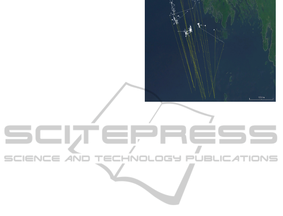
An example showing a set of significant anoma-
lies within an oceanic dataset is provided in Figure
2. Here, one can readily identify the movement paths
of the entities and the severity of the anomalies. In
addition the pattern of the anomalous behaviour can
also be observed and interpreted. While there remains
some overlap and clutter in this display, the selection
and highlighting features described in the following
section support an interactive disambiguation of the
anomalies.
It is also important to consider how to deal with
and represent situations where there are missing data
points in the movement dataset. This is a concern,
since it is common for movement datasets to be col-
lected remotely, using a regular time interval for log-
ging the data. When there are communication prob-
lems, data points may not be properly saved in the
dataset, leading to missing data. For these situations,
Figure 2: Anomalies are represented by the yellow line con-
necting where an event was reported and the white move-
ment path of the entity.
in order to maintain a consistent representation of the
movement activity, the missing data is interpolated on
a straight line between the known data points. Since
an anomaly may be detected as a result of this miss-
ing data and the interpolation method for filling in the
gaps, it is important to visually convey this interpola-
tion back to the analysts. This is done by replacing
the chevrons that represent the movement data points
with empty circles. However, because in some cases
a few missing data points may not have much of an
affect on the anomaly detection, an option is provided
to allow the analyst to determine how many missing
data points are necessary in order for these to be high-
lighted as distinct from the regular movement path
representation.
Since it can be difficult to systematically inspect
each anomaly when they are represented only on
a map, a secondary representation is also provided.
Event anomalies are grouped by their entity identi-
fier, and represented in a tree structure to facilitate in-
teractive selection. Each entity for which at least one
anomaly was detected is included as a node at the top-
level of the tree. Along with the entity identifier, in-
formation about the number of anomalous events and
the total number of events are provided. Individual
events for a given entity are included as children of
the entity node, showing the timestamp and domain-
specific data about the event. A checkbox beside each
node in this tree structure allows for the visibility of
the anomalies to be toggled within the map display.
This tree structure and map operates as coordinated
views, dynamically updating what is shown in each
based on interactive filtering and focusing. This is il-
lustrated in a screenshot of the entire interface display,
provided in Figure 3.
IVAPP2015-InternationalConferenceonInformationVisualizationTheoryandApplications
20
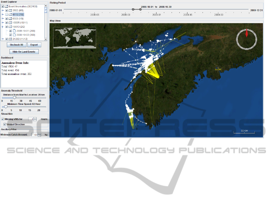
Figure 3: The interface for event-based geospatial anomaly detection and exploration includes a temporal filter (top-right),
map view of the movement paths and anomalies (bottom-right), tree representation of the entities and anomalies (top-left),
and interactive filters (bottom-left).
3.4 Interactive Filtering and
Exploration
Interactive filtering is provided by four analyst-
controlled parameters: temporal extent, spatial extent,
anomaly thresholding, and ancillary data filtering. By
filtering out uninteresting or obvious anomalies, ana-
lysts are able to focus their attention on those that are
of particular interest. Any modification of these pa-
rameters results in an interactive update of the anoma-
lies shown in all views of the system, allowing the
analysts to readily see the results of their actions.
The temporal and spatial filtering features oper-
ate using commonplace interface controls and inter-
action mechanisms. A timeline is provided showing
the temporal range of the datasets. A temporal win-
dow control allows analysts to modify the upper and
lower bounds of the window, as well as pan the win-
dow over the temporal range. The spatial filtering op-
erates within the geographic representation, allowing
analysts to zoom to the desired spatial scale and pan
to regions of interest.
As previously noted, the anomaly threshold con-
trols can be used to filter the data to only show those
that match the spatial and temporal threshold param-
eters. Two slider controls allow analysts to set the ac-
ceptable distance between the event location and the
associated movement data points, and the amount of
time the entity must have remained within this dis-
tance. All events that exceed these parameters are
considered anomalies and are displayed with the sys-
tem; all others (e.g., normal behaviour) are hidden.
In many cases, when an event occurs, there is ad-
ditional data that is collected in the context of this
event. For example, in the motivating case for this re-
search, when a fishing event occurs, data on the catch
amount is logged. In the context of detecting anoma-
lies, we consider this ancillary data, and provide a
mechanism for the analysts to filter what is shown
based on this data. Another type of ancillary filter can
be used to hide data that is clearly not possible. For
the fisheries case, this will remove anomalies where
the reported fishing location is on land.
These interactive features for filtering the data can
be used to address a common concern with geovisu-
alizaiton and geovisual analytics: the visual clutter
that arises when many data elements are displayed in
close spatial proximity (J
¨
anicke et al., 2012). Tem-
poral, spatial, anomaly threshold, and ancillary data
filtering all enable the analyst to interactively control
how much data is shown. An example of this is shown
in Figure 4, where a large number of anomalies is re-
duced to a manageable number through interactive fil-
tering.
The highlighting of one or more anomalous events
is enabled by clicking on the anomalies within either
the map or tree views, supporting an interactive in-
spection of the data. Doing so changes the colour en-
coding of the movement path for the anomaly from
SupportingEvent-basedGeospatialAnomalyDetectionwithGeovisualAnalytics
21
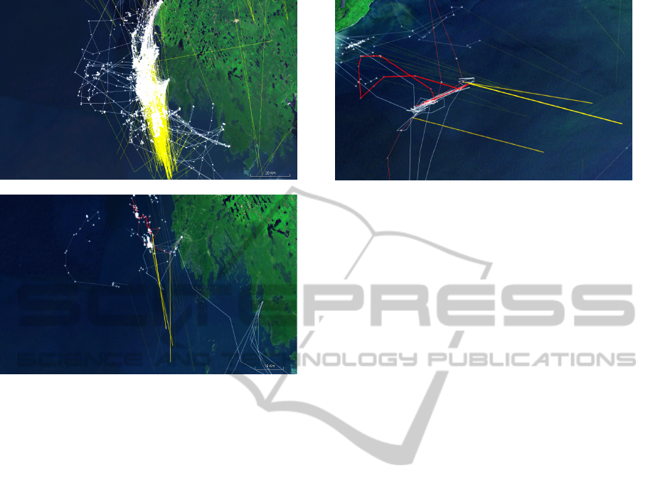
Figure 4: Showing all potential anomalies within the
datasets can result in significant visual clutter (top). Inter-
active filtering and a narrowing definition of what it means
to be an anomaly can allow the analyst to focus on a small
number of anomalies to examine in detail (bottom).
white to red, both for the selected anomalous event,
as well as for any other anomalies for this same en-
tity. Additional contextual information of the move-
ment path of the highlighted entity within the selected
temporal range is added to the display as white lines
without directional markers, providing contextual in-
formation of where the entities travelled before, be-
tween, and after the anomalous events. In addition,
the visual intensity of the anomalies are provided at
three different levels: the highlighted event is shown
at a high level of intensity; other anomalies for this en-
tity are shown at the normal level of intensity; and all
remaining non-selected anomalies are shown at a low
level of intensity. This allows the analysts to readily
see what was selected, along with other contextual in-
formation about the entity, while fading the remaining
data to the background (see Figure 5).
4 CASE STUDY
In order to illustrate the features of the proposed ap-
proach for event-based geospatial anomaly detection,
a case study is presented in the context of commercial
fishing datasets. The datasets were collected for the
Figure 5: Highlighting an anomaly changes the colour en-
coding of the path of the entity to red and increases the
brightness of the yellow link to the event location. Other
anomalies for this same entity remain at the normal visual
intensity, and all others are faded to allow the analyst to fo-
cus on what was selected.
inshore scallop fisheries in Atlantic Canada over the
two year period of Jan 1, 2008 to Dec 31, 2009. One
of the stipulations for receiving a commercial fishing
license in Canada is that each fishing vessel must be
equipped with a Vessel Monitoring System (VMS),
which automatically and independently records the
GPS location of the vessel on an hourly basis. Upon
returning to the port after a multi-day fishing voyage,
the vessel must report where it fished each day, as well
as the amount of fish caught in each location. This
data is logged in the MarFis database system, along
with details regarding the fishing vessel identifier and
license. The data analysis goal in this case study is to
explore and understand the spatial discrepancies be-
tween these two datasets that are meant to describe
the same conceptual entities (fishing vessels) and their
noteworthy events (fishing activities).
These particular datasets contain a substantial
amount of data that must be analyzed to identify
anomalies. From the MarFis data, 209 fishing vessels
preformed a total of 18,030 fishing events during the
two-year period, representing an average of 43.1 fish-
ing events per vessel per year. Within the VMS data,
1,967,341 data points were collected for these fish-
ing vessels, representing an average of approximately
196 days at sea per vessel per year. This discrepancy
between the average days of fishing scallop and the
average days at sea is a result of the limits on the scal-
lop fishing season and the common practice of fish-
ing vessels obtaining licenses to fish multiple species
throughout the year. Of note is the temporal mis-
match between the two datasets: the VMS data con-
tains hourly fishing vessel locations, while the MarFis
data contains daily locations of where they fished. As
a result, extracting and analyzing anomalies is not as
straightforward as it would first appear.
The current anomaly analysis practice among fish-
IVAPP2015-InternationalConferenceonInformationVisualizationTheoryandApplications
22

eries experts is to map each dataset independently,
and then manually inspect and compare the maps to
find anomalies. Clearly, doing this for many vessels
over a long period of time and a large geographic
range is not feasible. As such, a first analysis step is
to identify a small subset of vessels to study in detail.
The selection criteria may include choosing specific
vessels over a specific time period, specifying vessels
based on having been near some point of interest such
as a marine protected area, or even performing ran-
dom sampling for inspection purposes. With the data
filtered in this way, the process of tracing the move-
ment of a particular vessel on one map and comparing
it to where it reportedly fished on another map is cog-
nitively complex and requires a great detail of focus
and attention. Even using GIS approaches that sup-
port multiple views and interactive layers does not al-
leviate the cognitive task of having to manually link
the data. Because of the effort involved, this type
of analysis is generally only done when there is al-
ready a clear indication of the existence of notewor-
thy anomalies within the data for a particular subset
of vessels. This means that this approach is seldom
used to discover anomalies, but is instead used to ver-
ify those that are already suspected or known.
Using this geovisual analytics approach for detect-
ing and discovering new anomalies in the data, a good
starting point is to view the entirety of the data with
a generous definition of what constitutes an anomaly.
For example, in the context of fishing for scallop, nor-
mal fishing events might be defined as those for which
the vessel was within 40 km of the reported location
for more than 5 hours. The specific settings for such
an anomaly threshold filter would be based on the an-
alyst’s experience with the fishing practice (e.g., how
long fishing sessions normally last, as well as how far
they normally travel in this time) and the expected ac-
curacy within the data. With this particular dataset,
such a first-pass filter eliminates 12,789 normal fish-
ing events, leaving 5,241 for further exploration and
filtering. While showing these within the system re-
sults in a significant amount of visual clutter (see Fig-
ure 6(a)), it does provide a high-level overview of the
extent and pattern of anomalies within the data. Even
from this cursory analysis of the data, it is clear that
there are a significant number of cases for which the
fishing location was reported on land. While this fact
may have been discovered simply by mapping all of
the fishing locations within the MarFis data, the ex-
tent of the problem may not have been clear due to
the common practice of only inspecting a small num-
ber of vessels during a limited period of time.
To further explore among the anomalies, the ana-
lyst may choose to focus on data for a particular pe-
riod of time, and remove those anomalies that have
the fishing location reported on land. Figure 6(b)
shows 43 anomalies detected among a total of 466
fishing events in the month of September 2008. Fur-
ther reduction of the visual clutter is achieved by
hiding the directional markers on the fishing vessel
movement data, since at this level of detail the vessel
direction is not contributing to insight into the data.
Based on the analyst’s knowledge of the fishing
practice within this region, the anomaly threshold
could be configured to require the vessel to be closer
to the reported fishing location (e.g., within 25 km),
but for less time (e.g., at least 2 hours). The analyst
may also wish to view only those fishing events for
which a large catch amount was reported (e.g., 300 kg
or more). Doing so reduces the total number of fishing
events to 328, of which 34 are detected as anomalies.
These are illustrated in Figure 6(c), from which three
separate geographical regions can be readily identi-
fied in which anomalies are present: the northern bay
region, the central bay region and the southern region.
Noting the large number of anomalies in the
southern region, the analyst may use the pan and
zoom features of the map to focus on the anomalies
in this region. For this detailed analysis, the analyst
may also choose to enable the vessel direction indica-
tors. Within this spatial region, a total of 25 anoma-
lies remain for further exploration and examination
(see Figure 6(d)). Viewing these anomalies, the ana-
lyst can readily identify clusters of where the fishing
vessels were spending their time, yet all of these ves-
sels are reporting their fishing locations for these days
significantly further south.
In order to support the analyst in understand-
ing the potential causes of these anomalies, individ-
ual vessels may be selected for detailed inspection
and evaluation. Upon making such selections, the
anomalies from the other vessels in the region are
dimmed, the selected anomalies and their vessel paths
are highlighted, and contextual information regarding
the paths of the vessels before and after the anoma-
lous event are included in the display. Further insight
into potential problems can also be provided by turn-
ing on the highlighting of missing VMS data points.
From this view of the anomalies (see Figure 6(e)), the
specific activities of the highlighted vessels can then
be inferred based on what is being shown. For ex-
ample, the vessel on the right indicated fishing at the
exact same location on four separate days, but did not
come within 25 km of this location. In addition, there
is one particular period of 11 hours in which the ves-
sel’s VMS system was not responding. While this
may be an indication of equipment failure, it could
also have been a result of intentional equipment sabo-
SupportingEvent-basedGeospatialAnomalyDetectionwithGeovisualAnalytics
23
(a) All anomalies within a two-year period. (b) Filter to one month of data.
(c) Defining anomalies more strictly. (d) Zooming into a spatial region.
(e) Highlighting specific vessels. (f) Zooming out to provide context to the anomalies.
Figure 6: This series of screenshots of the map interface illustrate the interactive filtering, exploration, and highlighting of
anomalies within a fisheries dataset. Temporal filtering, anomaly thresholding, and spatial zooming allow an analyst to explore
the patterns of anomalies, and discover particular vessels that require further investigation.
IVAPP2015-InternationalConferenceonInformationVisualizationTheoryandApplications
24

tage in order to disguise illegal activities. By contrast,
the vessel on the left made many trips back and forth
between a nearby port and a fishing region just 15-20
km from port, but reported the fishing location at least
double that distance. However, in this particular case,
the vessel moved around the fishing region in a pattern
that is indicative of fishing activity, but took efforts to
report locations that were distant from this location
and that slightly varied from one another. In both of
these cases, using the proposed approach gives the an-
alyst some insight into the activities surrounding the
anomalies, providing evidence to support supplemen-
tal investigation of these particular vessels.
Further insight and context regarding these ves-
sels and their anomalous fishing events can be ob-
tained by zooming out to explore where else the ves-
sels have been travelling, broadening the temporal
range in which the data is shown, and including those
anomalies that are on land. In such a case, the analyst
may also wish to completely hide all other anomalous
events in order to avoid misinterpretation and visual
clutter. Figure 6(f) shows the movement paths and
anomalies for these two vessels over the entire scal-
lop fishery region and a six-month period. From this
view, it is clear that data is normally reported prop-
erly when fishing within the bay region (with the ex-
ception of a few data entry errors that put the fish-
ing location over land), but when the vessels travel
to the southern peninsula, they consistently misreport
their fishing locations. From a fisheries management
and enforcement perspective, this may be an indica-
tion that there is a need for more monitoring in the
southern region of the fishery.
This case study illustrated how the visual and in-
teractive features of the system support not only an
exploration of the anomalies within the data, but also
analytical reasoning about the underlying behaviour
that has caused the anomalies. The system is highly
interactive, allowing analysts to easily focus on a ge-
ographic and temporal range of interest, as well as
set the parameters for what constitutes an anomaly.
Specific anomalies can be compared to one another
within the geographic context, for the same vessel as
well as across multiple different vessels. Patterns of
anomalies can be extracted, and using their existing
knowledge about the domain in question, analysts can
readily interpret these (e.g., systematic data quality
problems, intentional misrepresentations, potentially
illegal activities). In comparison to the existing prac-
tice of analyzing this fisheries data, the use of this
geovisual analytics approach supports more than just
verification of what is already known, but also discov-
ery and analysis of what was previously unknown.
5 FIELD TRIALS
Further validation of the proposed approach was ob-
tained via a set of field trials conducted with real
world data analysts working in the fisheries domain.
Rather than studying each of the novel elements of
this work in isolation, these field trials take a holis-
tic approach to the evaluation, focusing on the sup-
port the software provides to the practice of event-
based geospatial anomaly detection and exploration.
The use of field trials for evaluating systems such as
this are beneficial when the data analysis activities are
complex, there are a limited number of experts avail-
able, and there is no reasonable system against which
to make a comparison. They provide real-world evi-
dence of the value the approach provides for support-
ing the actual activities of the target users (Lam et al.,
2012; Plaisant, 2004).
The target participants for these field trails were
professional fisheries data analysts working at Fish-
eries and Oceans Canada. Invitations were sent to
all the potential analysts who had prior familiar with
the analysis of VMS and MarFis data, and the scallop
fisheries for which this data was collected. Five par-
ticipants voluntarily participated, of which four (Par-
ticipants A-D) had 4-6 years of experience with ana-
lyzing this data, and reported high degrees of prior fa-
miliarity with visualizing data with various software
packages. The fifth (Participant E) had less experi-
ence with analyzing the data (1-2 years) and reported
moderate familiarity with the visualization methods
the others used.
Each participant was given a training session on
the use of the complete range of features of the soft-
ware. The participants were then invited to use the
software themselves in the exploration and analysis
of anomalies within the same two-year dataset de-
scribed in the case study. This use of the software
was driven by the participants’ interests and exper-
tise in the fisheries domain, and was entirely open-
ended and self-directed. When necessary, the investi-
gator helped the participants to operate the software,
allowing them to perform their tasks at a level beyond
the novice level. Once the participants felt they had
sufficiently evaluated the anomalies within the data,
a post-study questionnaire was administered using a
survey instrument adapted from the Technology Ac-
ceptance Model (Davis, 1989). An interview was also
conducted, focusing on the participants’ qualitative
impressions of the software and the types of anoma-
lies they were able to discover during the course of
the study.
While using the software for their self-directed
data analysis activities, we observed the participants
SupportingEvent-basedGeospatialAnomalyDetectionwithGeovisualAnalytics
25

following the same pattern of filtering and exploring
among the data. They started with setting the tempo-
ral range and configuring the anomaly threshold filter,
and then zoomed to a geographical region of interest.
After observing the anomalies present in this region,
they each undertook further filter refinement steps, in-
cluding setting the ancillary data filter, re-focusing the
spatial filter, adjusting the temporal filter, and refin-
ing the anomaly threshold settings. Doing so brought
the number of anomalies displayed on the map down
to a manageable number, allowing the participants to
highlight particular vessels and evaluate the details of
the anomalies. In using the software, all of the partic-
ipants were able to find and evaluate specific anoma-
lies, conducting detailed investigations of their activ-
ities before, during, and after the event in question to
try to make sense of what was happening.
While the participants were already highly experi-
enced in analyzing these data, most expressed their
surprise by the large number of anomalies present.
This finding highlights the difficulty they currently
experience in performing anomaly analysis between
these two datasets. While they have tools to map
the two datasets independently, matching the fishing
events to the fishing vessel movement paths, and then
studying the anomalies in detail, requires a significant
amount of cognitive effort. Participant D noted that
“without tools like this... it is very difficult for anyone
from enforcement to deal with this kind of problem.”
This participant further noted that doing this type of
analysis with their current software systems “is too
tedious.”
The post-study questionnaire administered after
the participants finished using the software focused on
the their perceptions of usefulness and ease of use of
various aspects of the software. For each feature, six
related questions were asked for each of these mea-
sures, with answers provided on a five-point Likert
scale. Although each participant had a different anal-
ysis goal while using the software, we observed that
they made full use of the features of the software to
support their analysis tasks. As such, we report here
the aggregated responses for each specific feature of
the software.
The perceived usefulness and ease of use of each
of the key features of the software are reported sep-
arately for each participant (A - E) in Table 1. Note
that since the anomaly representation feature is some-
thing that is observed but not manipulated, no data
was collected regarding its ease of use. While most
participants had a positive view of the usefulness of
the features of the system, one was neutral about
the anomaly representations and another was nega-
tive about the ancillary data filters. Given the open-
ended nature of the analysis activities, these negative
responses may be attributed to the feature not being
useful for the specific type of analysis the participant
was undertaking. In terms of ease of use, while the
responses were generally positive, some participants
reported negatively regarding the spatial and tempo-
ral filters and the anomaly highlighting. As prototype
software, some of this difficulty with using the system
may be attributed to its novelty and lack of sophisti-
cation in comparison to commercial-grade software.
The analysis of the interview responses revealed
a number of common themes. All of the participants
commented positively on the method for visually con-
veying the existence of an anomaly using a line con-
necting the event location and the vessel movement
path, and the method for visually highlighting se-
lected anomalies. They appreciated the value of these
methods for not only identifying anomalies, but also
for representing the degree of the spatial discrepancy
in the data. Participant C noted that “in terms of being
able to quickly visualize the differences in the data,
and the magnitude of discrepancies, this is huge.” Par-
ticipant B echoed this sentiment, stating that “it’s an
eye-opener for me. I didn’t realize that there are some
cases where there is such a discrepancy.” Participant
D noted the value of this approach for identifying
which vessels to investigate in further detail: “I am
not concerned [about the minor anomalies]. But if the
degree is big, then we will have major concern about
that.”
In terms of supporting the specific anomaly analy-
sis activities, and in comparison to their existing prac-
tice for this type of data analysis, all of the partici-
pants commented positively on the value of the ap-
proach. They indicated that with existing tools at
their disposal, their only option is to inspect the data
for potential anomalies on a case-by-case basis. Us-
ing this software, they identified the ability to view
the anomalies over a broad temporal and geographi-
cal scale as a significant improvement. Participant D
highlighted these differences by stating that “this kind
of whole picture is very different than how I look at
the data right now. [This new approach] is definitely
useful.” Participant C noted that using this software
“is huge step up in terms of productivity and effi-
ciency compare to what we are currently do, which
is basically... running three separate programs.”
Some participants highlighted a few basic usabil-
ity difficulties they had with using the software, and
noted additional features that could further enhance
the usefulness of the approach (e.g., data export fea-
tures, the ability to layer additional data on the map,
additional filtering mechanisms). However, all of the
participants were enthusiastic about the possibility of
IVAPP2015-InternationalConferenceonInformationVisualizationTheoryandApplications
26
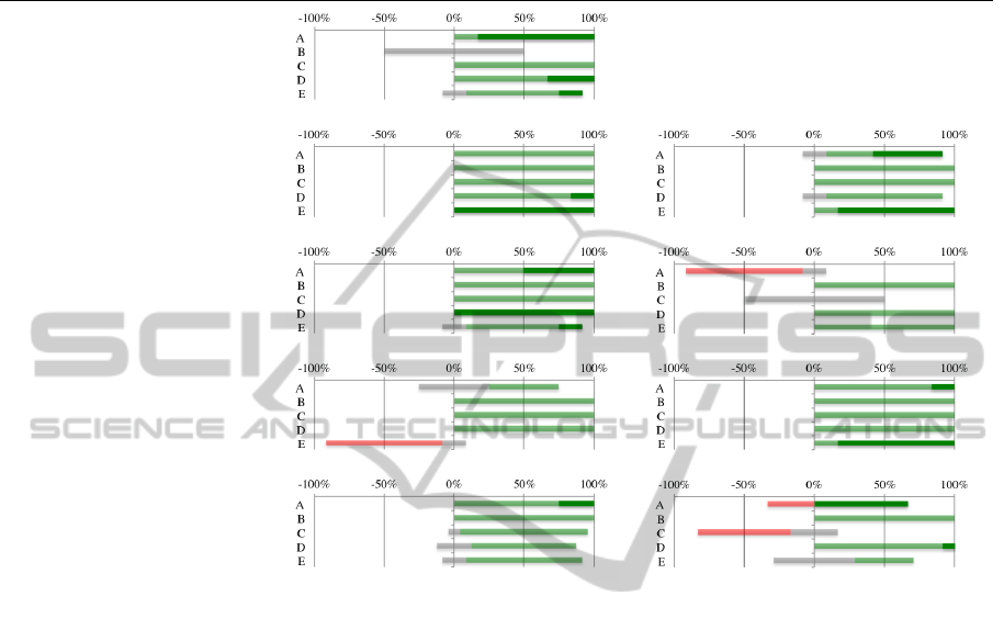
Table 1: Aggregated responses regarding percieved usefulness and perceived ease of use for each participant and each feature
of the software. Agreement is represented to the right, in light green for agreement and dark green for strong agreement;
neutral is in the middle in grey; disagreement is to the left in red, noting that there were no responses that were of strong
disagreement.
Feature Perceived Usefulness Perceived Ease of Use
Anomaly Representation
Anomaly Threshold Filters
Spatial and Temporal Filters
Ancillary Data Filters
Anomaly Highlighting
being able to have access to this software after the
field trials were complete. Participant A noted that
“if I can have this software package, I would be a
happy [person].” Participant D said “its very useful
and something that is much needed in our current en-
vironment... it would be used almost as a daily tool
for me.”
6 CONCLUSION AND FUTURE
WORK
This paper described the geovisual analytics methods
we employed for analyzing geospatial anomalies be-
tween movement and event datasets representing the
same conceptual entities, but collected independently
and at different temporal granularities. A case study
for using this approach in the context of fisheries
data analysis was presented, along with the findings
from field trials conducted with expert fisheries ana-
lysts. This research illustrates the great potential for
geovisual analytics to support the identification, ex-
ploration, and analytical reasoning about event-based
geospatial anomalies.
While this research was motivated and conducted
in the context of fisheries data analysis, the meth-
ods developed generalize to other data analysis do-
mains where there is a need to match and analyze the
anomalies between independently collected move-
ment and event datasets for common conceptual en-
tities in off-line or real-time. For example, the move-
ment paths measured from mobile phones and the lo-
cations where people use their credit cards at point-of-
sale machines can be analyzed to identify potentially
fraudulent charges, or tracking the movement of taxis
and the reported locations for pick-ups and drop-offs
can be used to detect the potential misreporting fares.
Future work includes the development and evalua-
tion of alternate approaches for identifying anomalies
between the movement and event location data, the
addition of a graph within the timeline to illustrate
when the anomalies are occurring, and the implemen-
tation of edge bundling approaches on the anomaly
representation lines to reduce the visual clutter. Ad-
ditional features to support the analytical reasoning
about the anomalies are also being investigated, such
as adding annotations, logging analysis sessions, sav-
ing anomaly threshold configurations, and linking the
data to other external resources.
SupportingEvent-basedGeospatialAnomalyDetectionwithGeovisualAnalytics
27

ACKNOWLEDGEMENTS
The authors wish to thank Fisheries and Oceans
Canada for making available the data used in the
case study. This work was supported by a Strategic
Projects Grant from the Natural Sciences and Engi-
neering Research Council of Canada held by the first
author.
REFERENCES
Andrienko, G., Andrienko, N., and Heurich, M. (2011).
An event-based conceptual model for context-aware
movement analysis. International Journal of Geo-
graphical Information Science, 25(9):1347–1370.
Andrienko, G., Andrienko, N., Jankowski, P., Keim,
D., Kraak, M.-J., MacEachren, A., and Wrobel, S.
(2007a). Geovisual analytics for spatial decision sup-
port: Setting the research agenda. International Jour-
nal of Geographical Information Science, 21(8):839–
857.
Andrienko, G., Andrienko, N., and Wrobel, S. (2007b). Vi-
sual analytics tools for analysis of movement data.
ACM SIGKDD Explorations Newsletter, 9(2):38–46.
Andrienko, N., Andrienko, G., and Gatalsky, P. (2000).
Supporting visual exploration of object movement. In
Proceedings of the Working Conference on Advanced
Visual Interfaces, pages 217–220,315.
Andrienko, N., Andrienko, G., Stange, H., Liebig, T., and
Hecker, D. (2012). Visual analytics for understand-
ing spatial situations from episodic movement data.
K
¨
unstliche Intelligenz, 26(3):241–251.
Davis, F. D. (1989). Perceived usefulness, perceived ease of
use, and user acceptance of information technology.
MIS Quarterly, 13(3):319–340.
Dykes, J. A. and Mountain, D. M. (2003). Seeking structure
in records of spatio-temporal behaviour: Visualization
issues, efforts and applications. Computational Statis-
tics & Data Analysis, 43(4):581–603.
Enguehard, R. A., Hoeber, O., and Devillers, R. (2013). In-
teractive exploration of movement data: A case study
of geovisual analytics for fishing vessel analysis. In-
formation Visualization, 12(1):65–84.
Hering, E. (1964). Outlines of a Theory of Light Sense.
Harvard University Press, Cambridge, MA, USA.
Hoeber, O., Wilson, G., Harding, S., Enguehard, R., and
Devillers, R. (2011). Exploring geo-temporal differ-
ences using GTdiff. In Proceedings of the Pacific Vi-
sualization Symposium, pages 139–146.
J
¨
anicke, S., Heine, C., Stockmann, R., and Scheuermann,
G. (2012). Comparative visualization of geospatial-
temporal data. In Proceedings of the International
Conference on Information Visualization Theory and
Applications, pages 613–625.
Johansson, S. and Jern, M. (2007). GeoAnalytics visual
inquiry and filtering tools in parallel coordinates plots.
In Proceedings of ACM International Symposium on
Geographic Information Systems, pages 33:1–33:8.
Kapler, T. and Wright, W. (2005). Geotime information vi-
sualization. Information Visualization, 4(2):136–146.
Keim, D., Andrienko, G., Fekete, J.-D., G
¨
org, C., Kohlham-
mer, J., and Melanc¸on, G. (2008). Visual analytics:
Definition, process, and challenges. In Kerren, A.,
Stasko, J. T., Fekete, J.-D., and North, C., editors, In-
formation Visualization: Human-Centered Issues and
Perspectives, pages 154–175. Springer-Verlag, Berlin,
Heidelberg.
Koffka, K. (1935). Principles of Gestalt Psychology. Har-
court Brace and Company, New York.
Kraak, M.-J. (2003). The space-time cube revisited from a
geovisualization perspective. In Proceedings of Inter-
national Cartographic Conference, pages 1988–1995.
Kraak, M.-J. and de Vlag, D. E. V. (2007). Understanding
spatiotemporal patterns: visual ordering of space and
time. Cartographica, 42(2):153–161.
Lam, H., Bertini, E., Isenberg, P., Plaisant, C., and Carpen-
dale, S. (2012). Empirical studies in information vi-
sualization: seven scenarios. IEEE Transactions on
Visualization and Computer Graphics, 18(9):1520–
1536.
Lundblad, P., Eurenius, O., and Heldring, T. (2009). In-
teractive visualization of weather and ship data. In
Proceedings of the International Conference on Infor-
mation Visualisation, pages 379–386.
MacEachren, A. M. and Kraak, M.-J. (2001). Research
challenges in geovisualization. Cartography and Ge-
ographic Information Science, 28(1):3–12.
Maciejewski, R., Tyner, B., Jang, Y., Zheng, C., Nehme,
R. V., Ebert, D. S., Cleveland, W. S., Ouzzani, M.,
Grannis, S. J., and Glickman, L. T. (2007). LAHVA:
Linked animal-human health visual analytics. In Pro-
ceedings of the IEEE Symposium on Visual Analytics
Science and Technology, pages 27–34.
Mandiak, M., Shah, P., Kim, Y., and Kesavadas, T. (2005).
Development of an integrated GUI framework for
post-disaster data fusion visualization. In Proceed-
ings of the International Conference on Information
Fusion, volume 2, pages 1131–1137.
Palmer, S. and Rock, I. (1994). Rethinking perceptual orga-
nization: The role of uniform connectedness. Psycho-
nomic Bulletin & Review, 1(1):29–55.
Plaisant, C. (2004). The challenge of information visualiza-
tion evaluation. In Proceedings of the Working Con-
ference on Advanced Visual Interfaces, pages 109–
116.
Treinish, L. A. (2000). Visual data fusion for applications
of high-resolution numerical weather prediction. In
Proceedings of the Conference on Visualization, pages
477–480.
Ware, C. (2004). Information Visualization: Perception for
Design. Elseiver, San Francisco, second edition.
IVAPP2015-InternationalConferenceonInformationVisualizationTheoryandApplications
28
