
GCLViz: Garbage Collection vs. Latency Visualization
Chihua Ma
1
, Stanislav Liberman
2
and Haifeng Zheng
2
1
Department of Computer Science, University of Illinois at Chicago, Chicago, U.S.A.
2
Technology & Enterprise Computing Division, CME Group, Chicago, U.S.A.
Keywords: Information Visualization, Time Series Data Visualization, Detail View, Gc Visualization, Latency,
Performance, Trading System.
Abstract: This paper proposes a method that creates a multi-view interactive visualization that allows users to explore
connections between garbage collection (GC) generated by Java Virtual Machine (JVM) and latency in
applications used in financial transactions. With this tool users can explore large collections of GC and
latency events, easily identify important events, and subsequently focus on the relationships and details of
such events without losing the “big picture” perspective on the events as a whole. We discuss the impact of
this tool on controlling the effects of GC on latency and variability in financial trades with an exchange.
1 INTRODUCTION
Securities exchanges have increasingly adopted a
limit order market design, in which traders submit
orders directly into exchange’s electronic systems,
bypassing both designated and unofficial market
makers. This transition from traditional to fully
electronic limit order market (Kirilenko and Kyle,
2011) has made the rigid distinction between market
makers and conventional traders obsolete. This
transformation has occurred due to advances in
technology, as well as regulatory requirements.
An increasingly important dimension of
electronic trading is latency (Brogaard, 2010): the
time between the release of a market message by the
participant and its reception and execution by the
exchange computers. Another important factor is
variability. Variability in this context refers to
dissimilarity in response times observed by market
participants. Many factors may introduce variability
into the message flow: network latency, packet
retransmissions, operating system (OS) network
stack and OS task scheduling, or the application
itself. In order to reduce both latency and variability
“co-location” is typically used, whereby market
participants will rent space in a computer server
centre next to an exchange. This approach leverages
physical proximity to reduce the time a market
message takes to arrive at the exchange. In addition,
at such centres engineers work to optimize high-
performance trading by eliminating the factors
causing the latency and variability. One important
factor that may adversely affect performance is
garbage collection (GC) generated by Java virtual
machine (JVM).
Use of managed runtime-based languages in high
performance computing environment is a fairly new
development. For instance, recent advances in Java’s
technology and techniques have made it a
predominant platform in low latency applications
(Lawrey et al., 2013). Java and other managed
runtimes have been widely used in production for a
number of significant application areas, including
financial trading, telecommunications, and military
command-and-control (Auerbach et al., 2008).
Companies find Java attractive due to vast array of
libraries, frameworks, tools, IDEs, and server
providers; and it runs on a variety of platforms and
CPU architectures.
JVM is the code execution component of the
Java platform. The specification dictates that any
JVM implementation must include the automatic
memory management service – known as GC. Java
Memory Management (Reitbauer et al., 2011), with
its built-in GC, allows developers to create new
objects without worrying explicitly about the
memory allocation and deallocation, because the
garbage collector automatically reclaims memory for
reuse. This enables faster development with less
boilerplate code, while eliminating memory leaks
and other memory-related problems. However, the
behaviour and efficiency of a garbage collector can
292
Ma C., Liberman S. and Zheng H..
GCLViz: Garbage Collection vs. Latency Visualization.
DOI: 10.5220/0004740902920299
In Proceedings of the 5th International Conference on Information Visualization Theory and Applications (IVAPP-2014), pages 292-299
ISBN: 978-989-758-005-5
Copyright
c
2014 SCITEPRESS (Science and Technology Publications, Lda.)

heavily influence the performance and
responsiveness of any application that relies on it.
Given this link between GC and latency, it would
be beneficial to quickly explore the influence of a
GC-indicated allocation problem on latency in a real
trading system, since time is money in the exchange
business. However, examining the text in the
massive data files produced by the GC and latency
logging outputs can be a daunting task for engineers.
What is needed is a powerful, effective graphical
presentation of those data, since graphs can convey
such time-series information more quickly and more
informatively than just text to the human operator.
In this paper we present the design of Garbage
Collection vs. Latency Visualization [GCLViz], a
user interactive visualization tool that turns both GC
and latency logging outputs into x/y time-series line
plots, bar charts, and other unique types of graph,
including a time-overlap-view and a correlation-
circle-view. GCLViz allows the user to load the raw
GC and latency logs directly into its application
which does all the processing behind the scenes.
GCLViz enables users to explore large collections of
GC and latency events, easily identify interesting
events, and subsequently focusing on the relations
and details of such events without losing the “big
picture” (Sekhavat and Hoeber, 2013) perspective on
the collection as a whole.
We first summarize related work in visualization
of GC and system performance, and introduce the
features of our data. We then describe the design of
the GCLViz visualization in detail, followed by
conclusions and future work.
2 RELATED WORK
In recent years, there have been a large number of
real-time dynamic visualizations for software
systems (Reiss 2003). Perhaps the most prominent
effort is IBM’s Jinsight (De Pauw et al., 2001).
Jinsight typically operates by collecting detailed
trace data as the target program executes and when
execution is complete, it uses a variety of views
based on the trace, to allow the programmer to
understand execution at a very detailed level.
JConsole (Java SE Monitoring and Management
Guide, Using JConsole, n.d.) is a graphical
monitoring tool to monitor JVM and java
applications. JConsole provides information on
performance and resource consumption of
applications running on the Java platform using Java
Management Extensions (JMX) technology.
LagAlyzer (Adamoli et al., 2010) is a tool to analyze
and visualize the information of traces produced by
other latency measurement tools. LagAlyzer is an
offline tool: it requires the completed traces to exit
before it can start to analyze and visualize them. Lila
Viewer (Adamoli et al., 2010) is also a visualization
tool that draws trace timelines showing the start and
end of each interactive request. To visualize the
distribution of latencies over time, Analytics (Gregg,
2010) used a heat map created with time on the x-
axis and latency on the y-axis. The heat map is a
colour-shaded matrix of pixels, where each pixel
represents a particular time and latency range.
In addition to visualizing software performance,
there are numerous packages involved in the
visualization or interpretation of garbage collection
data. GCViewer (Schreiber, 2002) is a small tool
that visualizes verbose GC output generated by
Sun/Oracle, IBM, and BEA Java Virtual Machines.
It also calculates garbage collection related
performance metrics (throughput, accumulated
pauses, longest pause, etc.). HPjmeter (Tool Report:
HPjmeter, 2002) is designed to display the collected
metrics to allow the user to easily identify
performance bottlenecks and quickly tune the Java
applications. The IBM Monitoring and Diagnostic
Tools for Java – Garbage Collection and Memory
Visualizer (GCMV) (n.d.) is a tool which allows the
user to visualize and analyze the memory usage and
garbage collection activity of the Java application.
Due to the nature of those tools, this kind of analysis
can only be performed by a small group of expert
users that have high technical skills. To allow a
wider range of testers to carry out expert analysis,
GcLite (Angelopoulos et al., 2012) tool has been
created for analyzing garbage collection logs.
While the tools mentioned above work well as
far as they go, we believe there is still a need for
new designs and techniques. For example, we have
other requirements to consider and therefore
conclude that none of the existing tools met our
needs. To the point, visualization of the impacts of
GCs on latency is needed, and techniques for
incorporating analytical tools within the simplified
domain of end-user visualization would prove
useful. GCLViz can help engineers establish or
refute a correlation between time-of-day-based
observed latency and JVM-wide GC behaviour. Our
visualization helps one to quickly understand the
impact a GC-related change on latency.
GCLViz:GarbageCollectionvs.LatencyVisualization
293
3 DATA
3.1 Garbage Collection Output
In our study, the GC log is the standard output form
(Figure 1) for Oracle JVM. Standard Oracle JVM
1.7.0_25 64-bit was used on servers with Intel CPUs
running Linux operating system. Standard options
for reporting details of each garbage collections
were used. The default garbage collector on this
platform is Parallel Collector (Garbage Collector
Ergonomics, n.d.), which is what was used to run the
simulations. Detailed description of the operation of
this garbage collector is beyond the scope of this
paper, but is readily available from Oracle as well as
descriptions of other available collectors.
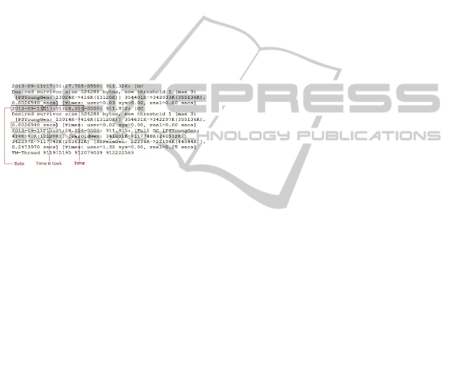
Figure 1: Garbage Collection logging output.
In this paper, we only consider minor collections
for young generations. The critical attributes of GC
logging output are the collection time when GC
happens – known as GC event time, and the duration
GC lasts – known as GC event duration. GC event
time includes the year, month, day, hour, minute,
second, and millisecond. GC event duration is the
time period in millisecond.
3.2 Latency Output
In trading-systems, latency is defined as the time the
exchange takes to react to the market. In general,
latency measures the delay between an action and a
response. Like GC log, the most useful attributes of
latency logging output are latency event ID, latency
event time, and latency event duration. Each latency
event has a specific event ID. Latency event time
and duration have the same format as GC.
3.3 Simulation Data
To protect sensitive business operations, we used
simulated data. Consequently, all the figures shown
in this paper are generated using this simulated data.
For the purposes of demonstrating the impact of GC
on application performance in terms of latency, we
have chosen to use Jetty (n.d.) web application
server as the server component. It was chosen
mainly due to its good performance characteristics
as well as ease of configuration. We create a custom
client using Java, which would retrieve JSP page
rendering the HTTP request from the server.
While dynamics of a web application server is
quite different from a matching engine of an
exchange, the fundamental approach of operation is
the same as that of exchange. The request is received
over the network connection, acted upon by the
server, and then a response is sent to the user. For
vast majority of Java applications the processing
stage will result in memory allocations, which will
lead to garbage collection. Our goal is to examine
the impact of those GCs on latency of responses to
requests that were made at that time.
Latency was measured by the client application
with nanosecond precision and each observation was
recorded for analysis.
4 VISUALIZATION DESIGN
By presenting a large number of GC and latency
events in a single view, it is not easy for users to
recognize the relations between GCs and latencies.
We design GCLViz to follow Shneiderman’s visual
Information Seeking Mantra: “overview first, zoom
and filter, then details-on-demand” (Shneiderman,
1999). In other words, in the exploratory data
analysis (EDA) of a data set, an analyst first obtains
an overview. This may reveal potentially interesting
patterns or certain subsets of the data that deserve
further investigation. The analyst then focuses on
one or more of these, inspecting the details of the
data. The goal of GCLViz is to provide an effective
visual representation that scales well with a large
number of events and allows the user to explore the
relation between GC and latency at a micro-level.
4.1 Overview
The three main synchronized parts of GCLViz,
shown in Figure 2, are the global-view, detail views
and a table-based view. The global-view provides an
overview of all of the events. The detail views which
includes a time-overlap-view, a correlation-circle-
view and scatter plots, shows the subset of events
selected from the global-view, clearly illustrating the
relationships between GC and latency. Interesting
events can be accessed through the table-based view
and highlighted within the global and detail views.
IVAPP2014-InternationalConferenceonInformationVisualizationTheoryandApplications
294
Figure 2: A screenshot of the GCLViz system. The global-view of the entire set of events on the left, the detail views,
including time overlap, correlation circle and scatter plot, of the events related to a selection of items on the right, and a
table-based view of interesting events on the bottom-right.
4.2 Global-view
The global-view in GCLViz is a 2D graph
representation for time series data with line graphs
and bar charts that provides a “big picture”
(Sekhavat and Hoeber, 2013) overview of both GC
and latency events and allows users to identify
interesting aspects within data. Multiple line graphs
or bar charts can be used or overlaid to show more
than two dimensions (x, y1, y2 …) (Kromesch and
Juhász, n.d.). In GCLViz, we use different colour
coding to distinguish each dimension. Each
dimension may be drawn using a different scale.
In global-view, there are seven dimensions: x
value always represents time variable, while six y
values are used to represent internal latency
duration, internal latency count (frequency of
occurrence), external latency duration, external
latency count, GC duration, and GC count. We use
three sets of channels: Yellow-green series are used
for encoding internal latency events, pink series are
used for external latency events, and blue series are
used for GC events. Dots represent GC and latency
events. Line graphs show the “event duration” while
bar charts present the “event count” over entire
timeline (24 hours). In addition, due to the large size
of the external latency data (about 200 events in a
second), the original data is down-sampled by a
factor of 10 when time period on the x-axis is larger
than one minute.
Interaction. Interaction is an important element in
any visualization system. Providing an interaction
for users to explore the data helps them to perceive
the relations within data. In GCLViz, basic
interaction is done with simple mouse and keyboard
operations. Users can select an event they wish to
investigate further by clicking on the data displayed
in the global-view.
When users select a specific data point in the
global-view, the corresponding event is highlighted
by a semi-transparent grey bar with a circle
displaying the event duration. Both the time-overlap-
view and correlation-circle-view are updated to
reflect the corresponding time when the event
happens, and the details that are related to that event
are shown in the information panel in the time-
overlap-view, as illustrated in Figure 2. Manual
zooming is performed by dragging the time sliders
of hour, minute, and second at the bottom of the
graphs. Figure 2 displays the graphs during the time
from 17:0:0 to 17:59:59. User can also enable or
hide any one or multiple graphs by checking or
unchecking the checkboxes on the top of the global-
view. For example, Figure 2 only shows the graphs
GCLViz:GarbageCollectionvs.LatencyVisualization
295
of external latency duration, GC duration and GC
count.
4.3 Time-overlap-View
Once users select events from the global-view that
they deem important, they can further explore the
relationships among these events, such as the latency
related to a specific GC and inspect details of
selected events, with the time-overlap-view. In the
time-overlap-view, we use both X-axis and Y-axis to
represent time and duration as well. All the events
start on the line where y = x, and end at the point (x
+ d, x), where d is the event duration. The durations
of events are drawn along x-axis by using the lines
with same color-code as the one in the global-view.
The end points of events are drawn by using dots.
Where the global-view displays the performance
over a twenty-four hour period; the time-overlap-
view provides a snapshot over a second as default.
This view can be magnified 1000 times to one
millisecond.
Figure 3 shows the time-overlap-view expanded
to 30 milliseconds after the user clicks an event in
the global-view. The chosen event is highlighted
with its detail information displayed in the
information panel. We can obviously see that most
of the events of external latency coloured with pink
that concentrate on the diagonal line have very short
durations (within nanoseconds). The only long
external latency starts at 9:3:42:931 and lasts 5.15
milliseconds. It happens right before a GC event
coloured with blue. This figure strongly
demonstrates the impact of GC on latency.
Interaction. Clicking a data point causes the
corresponding event to be highlighted with a semi-
transparent grey bar consisting of a rectangle topped
by a triangle. It highlights all the events that overlap
with the event selected. Meanwhile, the information
panel at the top-left of the time-overlap-view
displays the detail information of the chosen event,
including event ID, event starting time and event
duration. The user can look into the event in other
relative log files according to the event ID.
Pressing “+/-” keys on the keyboard will zoom
in/out. The starting point of the chosen event is
always centred in the time-overlap-view. It is
possible that the user cannot see the complete event
when the duration is longer than half of the time
period of current view. The “arrow” buttons on both
sides of the x-axis are used for shifting the whole
overlap view one millisecond forward or backward
to place the chosen event in a proper location. As the
time sliders in the global-view, the time sliders here
can allow the users to make the time-overlap-view
jump to a particular time point directly by dragging
them to that time.
Figure 3: Time-overlap-view when zooming in.
4.4 Correlation-Circle-View
The correlation-circle-view borrows the idea of
Circle View (Keim, 2004) technique, which is a
combination of hierarchical visualization techniques
(Shneiderman, 1992), such as tree maps and circular
layout techniques (Ankerst, 1996), such as Pie
Charts and Circle Segments. The main goal is to
compare continuous data over time in a limited
display space, in order to identify patterns,
exceptions and similarities in the data. The basic
idea of the correlation-circle-view display is to
visualize the change of correlation between GC
count and latency count over time.
We have two ways of counting the events: counts
per minute and counts per second. In this paper, we
only discuss the case when the events are counted
per second. For example, we have sixty samples for
one minute of data. We applied Pearson’s
correlation coefficient to the pair of the series of
numbers. The window size (length of time) for
calculating the linear correlation coefficient is set to
40 seconds as default. The correlations are
calculated from the beginning of both events of
latency and GC then shifted one second for each step
IVAPP2014-InternationalConferenceonInformationVisualizationTheoryandApplications
296
over the entire timeline to generate a correlation
coefficient value. To display a series of correlation
coefficient values over time in a limited display
space and provide users an effective view to observe
how the event count changes in a minute or hour, we
choose the circle view.
Figure 4: Correlation-circle-view.
Figure 4 shows an example structure of a single
circle view dividing a circle in 60 segments. Each
segment represents a correlation coefficient value.
Both the lengths of fans and opacity factors are
determined by the correlation coefficient values. Red
fans represent positive correlation values, while
green ones represent negative correlations. For
example, Figure 4 shows the change of correlation
between GC count and latency count during the 53
rd
minute at 5 pm with window size of 20 seconds. The
highlighting green fan presents that the correlation
value for the series of event count starting from
17:52:50 to 17:53:10 is -0.229.
From a perceptual point of view, it is easier to
compare segments, which are located very close to
each other. The eye of the data analyst can directly
compare neighbouring time slots or even
unconnected time slots.
Interaction. The arcs of segments can be
investigated as well. For example, clicking the 21
st
segment in Figure 5 causes it to be highlighted by a
semi-transparent grey fan with the time sliders
jumping to 17:52:21. Dragging the minute time
slider also causes the circle view to be updated to the
corresponding minute. The visualization works for
different window sizes by pressing “+/-” key. In
Figure 4 and 5, the window size is decreased to 20
seconds from the default value (40 seconds) by the
user. The correlation-circle-view must be updated
each time new parameter values are assigned. In
addition, other views are updated as well. A semi-
transparent red bar is drawn at 17:52:21 with the
width of window size (20 seconds) in the global-
view (Figure 5). The time period for displaying in
the time-overlap-view is updated to from 17:52:21 to
17:52:22.
Figure 5: A correlation coefficient value in the
Correlation-circle-view and its relative position in the
Global-view.
4.5 Scatter Plot
The scatter plot is another kind of correlation. The
more the data sets agree, the more the data tend to
concentrate in the vicinity of the identity line. Each
semi-transparent yellow dot represents a particular
period of one second. Figure 6 presents 3600 dots
for the period from 5 pm to 6 pm. During the period
of one second, we count the number of events and
calculate the average and maximum duration of
events.
A Grid of two-dimensional scatterplots is the
standard way of extending the scatter plot to higher
dimensions (Kromesch and Juhász, n.d.). Since each
data set has three dimensional data, a three by three
array of scatter plots is used to provide a
visualization of each dimension versus every other
dimension. This is useful for looking at all possible
two-way interactions or correlations between
dimensions. The nine scatter plots are GC count vs.
latency count, GC count vs. latency Avg duration,
GC count vs. latency Max duration, GC Avg
duration vs. latency count, GC Avg duration vs.
latency Avg duration, GC Avg duration vs. latency
Max duration, and GC Max duration vs. latency
GCLViz:GarbageCollectionvs.LatencyVisualization
297
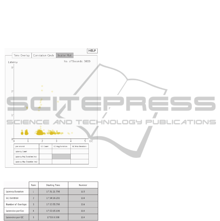
count, GC Max duration vs. latency Avg duration,
GC Max duration vs. latency Max duration. There
are three by three rectangles in a table for the users
to select one of nine scatter plots by pressing the left
mouse button inside of the corresponding rectangle.
Figure 6 shows the relation between GC average
duration and latency average duration in every
second.
Figure 6: One of the nice Scatter Plots.
Figure 7: Table-based View.
4.6 Table-based View
The table-based view (Sekhavat and Hoeber, 2013)
is useful for users to find interesting events. By
comparing GC and latency events, the table provides
top five interesting events for each of the five
categories: Latency Duration, GC Duration, Number
of Overlaps between GCs and Latencies, Number of
Latencies per Second, and Number of Latencies per
GC. Figure 7 indicates top five GC events with
largest number of latencies between them and the
following GCs. The table-based view is clickable.
All the views will be updated when users click the
event time in the table.
5 CONCLUSIONS AND FUTURE
WORK
In this paper we propose a new technique for the
visualization of GC vs. Latency. The goal of
GCLViz is to build a visualization system for the
exploration and analysis of the impact of GC on
latency and variability. Using simulated data rather
than actual data from the exchange company to
protect sensitive business operations, we
demonstrate that GCLViz does provide important
visualizations to show GC impacts on latencies. The
most important value of GCLViz is in its ability to
provide engineers information that can be used to
control and minimize the effects of GCs impacts on
system performance.
GCLViz was designed to follow Shneiderman’s
visual information seeking mantra of “overview
first, zoom and filter, then details on demand”.
GCLViz presents the GC and latency in multiple
synchronized views. The scale of displayed
information and layout were chosen to support
observed behaviour and allow users to expand
visualized data at a micro-level in detail views
including the time-overlap-view, the correlation-
circle-view and the scatter plots, that illustrate
relationships and further details on a subset of the
events, while still providing the relative position of
the subset of events in an overview. Interactive
highlighting makes exploring the events selected in
different views an effortless process. Finally, the
table-based view consisting of “interesting events” is
provided to help users find critical events quickly.
While there are a great number of sophisticated
tools available that focus on visualizing GC or
system performance, GCLViz offers two main
advantages over other tools in the field. It builds the
connections between GC and latency allowing users
to explore relationships between them; it develops a
2D time-overlap-view for visualizing data of which
both dimensions are time variables.
In the future, it would be very meaningful to
explore the behaviours of GCs by using different
type of collectors and compare their impacts on
latency. Besides the default garbage collector
(Parallel Collector) we use in our current method,
there are three additional collectors (Java SE 6
HotSpot Virtual Machine Garbage Collection
Tuning, n.d.): Serial Collector, Concurrent
Collector, and Garbage-First Collector. Each of
IVAPP2014-InternationalConferenceonInformationVisualizationTheoryandApplications
298

them is a generational collector which has been
implemented to emphasize the throughput of the
application or low garbage collection pause times. In
addition, there are different kinds of measurement of
latency as well. Visualizing multiple data sets in the
same view can be a big challenge just like
visualizing high dimensional data. We need to
develop more efficient visual layouts for visualizing
the large-scale time-based data. Finally, we plan to
integrate the data online searching into this
application tool rather than analysing the local data
offline, so that the visualization can be implemented
in real-time.
ACKNOWLEDGEMENTS
We would like to thank Professor Robert V. Kenyon
for his help in editing the paper and his advice on
how to organize the paper.
REFERENCES
Adamoli A., Jovic M., and Hauswirth M., 2010.
LagAlyzer: A Latency profile analysis and
Visualization tool. In ISPASS ’10, Proceedings of the
2010 IEEE International Symposium on Performance
Analysis of System and Software. IEEE.
Angelopoulos V., Parsons T., Murphy J., and O’Sullivan
P., 2012. GcLite: An Expert Tool for Analyzing
Garbage Collection Behavior. Proceedings of the 2012
Computer Software and Applications Conference
Workshops. 2012 IEEE 36
th
Annual, pp. 493-502.
Ankerst M., Keim D. A., and Kriegel H. –P., 1996. Circle
segments: A technique for visually exploring large
multidimensional data sets. In Visualization ’96, Hot
Topic Session, San Francisco, CA.
Auerbach J., Bacon D. F., Cheng P., Grove D., Biron B.,
Gracie C., McCloskey B., Micic A., and Sciampacone
R., 2008. Tax-and-Spend: Democratic Scheduling for
Real-time Garbage Collection. EMSOFT ’08,
Proceedings of the 8
th
ACM International Conference
on Embedded Software, Atlanta, GA, USA.
Brogaard J. A., 2010. High Frequency Trading and Its
Impact on Market Quality. Ph.D. Thesis. Northwestern
University, USA.
De Pauw W., Mitchell N., Robillard M., Sevitsky G., and
Srinivasan H., 2001. Drive-by analysis of running
programs. Proceedings of ICSE Workshop of Software
Visualization, International Conference on Software
Engineering, Toronto, Ontario, May 2001.
Garbage Collector Ergonomics, 2013. Retrieved from:
http://docs.oracle.com/javase/7/docs/technotes/guides/
vm/gc-ergonomics.html
Gregg B., 2010. Visualizing System Latency.
Communications of the ACM. vol. 53, no. 7, pp. 48-54.
IBM Monitoring and Diagnostic Tools for Java – Garbage
Collection and Memory Visualizer, 2013. Retrieved
from:
http://www.ibm.com/developerworks/java/jdk/tools/gc
mv/
Java SE 6 HotSpot Virtual Machine Garbage Collection
Tuning, 2013. Retrieved from:
http://www.oracle.com/technetwork/java/javase/gc-
tuning-6-140523.html#available_collectors
Java SE Monitoring and Management Guide, Using
JConsole, 2013. Retrieved from:
http://docs.oracle.com/javase/6/docs/technotes/guides/
management/jconsole.html
Jetty, 2013. Retrieved from: http://www.eclipse.org/jetty/
Keim D. A., Schneidewind J., and Sips M., 2004.
CircleView – A New Approach for Visualizing Time-
related Multidimensional Data Sets. In ACM Advanced
Visual Interfaces (AVI). Association for Computing
Machinery (ACM). ACM Press.
Kirilenko A. and Kyle A. S., 2011. The Flash Crash: The
Impact of High Frequency Trading on an Electronic
Market. Manuscript, U of Maryland, USA.
Kromesch S and Juhász S., 2013. High Dimensional Data
Visualization. Retrieved from:
http://citeseerx.ist.psu.edu/viewdoc/summary?doi=10.
1.1.108.3671
Lawrey P., Thompson M., Montgomery T. L., and Piper
A., 2013. Virtual Panel: Using Java in Low Latency
Environments. Retrieved from:
http://www.infoq.com/articles/low-latency-vp
Reiss S. P., 2003. Visualizing Java in Action. SoftVis ’03,
Proceedings of the 2003 ACM Symposium on Software
Visualization. pp. 57-65.
Reitbauer A., Enzenhofer K., Grabner A., Kopp M.,
Pierzchala S., and Wilson S, 2011. Java Enterprise
Performance, Compuware Corporation. Retrieved
from:
http://javabook.compuware.com/content/start.aspx
Tool Report: HPjmeter, 2002. Retrieved from:
http://www.javaperformancetuning.com/tools/hpjmete
r/index.shtml
Schreiber H., 2002. GCViewer. Retrieved from:
http://www.javaperformancetuning.com/tools/gcviewe
r/index.shtml
Sekhavat Y. A. and Hoeber O., 2013. Visualizing
Association Rules Using Linked Matrix, Graph, and
Detail Views. International Journal of Intelligence
Science, 3, 34-49.
Shneiderman B., 1999. The Eyes Have It: A Task by Data
Type Taxonomy for Information Visualizations.
Proceedings of the IEEE Symposium on Visual
Languages. Boulder, pp. 336-343.
Shneiderman, B., 1992. Tree visualization with tree-maps:
2-d space-filling approach. ACM Transactions on
Graphics (TOG), pp. 92–99.
GCLViz:GarbageCollectionvs.LatencyVisualization
299
