
Suggesting Visualisations for Published Data
Belgin Mutlu
1
, Patrick Hoefler
1
, Gerwald Tschinkel
1
, Eduardo Veas
1
, Vedran Sabol
1,3
, Florian
Stegmaier
2
and Michael Granitzer
2
1
Know-Center, Graz, Austria
2
University of Passau, Passau, Germany
3
Graz University of Technology, Graz, Austria
Keywords:
Linked Data, RDF Data Cube, Visualisation, Visual Mapping, Research Data.
Abstract:
Research papers are published in various digital libraries, which deploy their own meta-models and tech-
nologies to manage, query, and analyze scientific facts therein. Commonly they only consider the meta-data
provided with each article, but not the contents. Hence, reaching into the contents of publications is inherently
a tedious task. On top of that, scientific data within publications are hardcoded in a fixed format (e.g. tables).
So, even if one manages to get a glimpse of the data published in digital libraries, it is close to impossible
to carry out any analysis on them other than what was intended by the authors. More effective querying and
analysis methods are required to better understand scientific facts. In this paper, we present the web-based
CODE Visualisation Wizard, which provides visual analysis of scientific facts with emphasis on automating
the visualisation process, and present an experiment of its application. We also present the entire analytical
process and the corresponding tool chain, including components for extraction of scientific data from publica-
tions, an easy to use user interface for querying RDF knowledge bases, and a tool for semantic annotation of
scientific data sets.
1 INTRODUCTION
We are currently confronted with a continuous, mas-
sive increase of published content, and the applied
methods used by current digital libraries are not suf-
ficient anymore. They mainly expose the research
knowledge using domain-specific meta-models and
technologies, such as the widely used Dublin Core
meta-model (Powell et al., 2005). But these meta-
models mostly focus on structural attributes like title,
author or keywords, and rarely consider the content
of the publications. Hereby, the ability to effectively
find the desired information is limited due to weakly-
defined querying attributes. In addition, scientific data
or facts included in publications are unstructured or,
at best, in tabular format, so that once the information
is found, there is hardly a way to reuse it.
Our goal is to provide a tool to automatically ex-
tract data from scientific publications and propose
the appropriate means to visualise the facts and data
therein. Figure 1 illustrates the envisioned workflow
with a scenario, starting with extraction of data from
a publication to visualisation. The main concern of
this paper is the automated suggestion of visualisa-
tions appropriate for the data contained in a publi-
cation. Furthermore, we strictly focus on suggesting
only proper visual tools (e.g. visualisations that really
apply to the data), avoiding failure cases that render
the analysis process tedious. To do so, the CODE Vi-
sualisation Wizard
1
(Vis Wizard) (Mutlu et al., 2013)
relies on a prior extraction and organization of the un-
structured, scientific data in a publication into Linked
Open Data (LOD) by using the RDF Data Cube Vo-
cabulary
2
. The strength of LOD lies in its interlinking
structured data in a format that can be read and pro-
cessed by computers. The Vis Wizard then applies
semantic technologies to derive and propose visual
analysis tools.
In order to automate the process of generating and
proposing visual analysis tools, it is necessary to in-
tegrate visualisation aspects into the Semantic Web.
Our contribution is, on the one hand, a vocabulary,
1
CODE Visualisation Wizard: http://code.know-center.
tugraz.at/vis
2
RDF Data Cube Vocabulary: www.w3.org/TR/vocab-data-
cube/
267
Mutlu B., Hoefler P., Tschinkel G., Veas E., Sabol V., Stegmaier F. and Granitzer M..
Suggesting Visualisations for Published Data.
DOI: 10.5220/0004674902670275
In Proceedings of the 5th International Conference on Information Visualization Theory and Applications (IVAPP-2014), pages 267-275
ISBN: 978-989-758-005-5
Copyright
c
2014 SCITEPRESS (Science and Technology Publications, Lda.)

Figure 1: Visual analysis of published data: one scenario of application for automated extraction and visualisation of data. (a)
a pdf with a bunch of tables containing interesting data. (b) the UI to structure the extracted data from the pdf (c) visualisations
suggested for the current data, grayed-out options cannot be reified. (d) visual analysis UI allows to reassign mappings of
visual channels (e.g. axes, colors, sizes etc.) to data.
which describes the semantics of visualisations and
of their mapping to the corresponding data. On the
other hand, we introduce the process that drives the
automated visualisation workflow. After introducing
relevant work in Section 2, we summarise the com-
plete process in Section 3, carried out in the frame of
the EU funded CODE project (Stegmaier et al., 2012)
. Thereafter, in Section 4, we concentrate on the main
topic, our approach to automatically generating visu-
alisations. In Section 5 we give a brief summary of its
evaluation, and finally we conclude and outline some
important topics for the ongoing work in Section 7.
2 RELATED WORK
In this section, we overview of most relevant ap-
proaches with focus on methods for describing and
analyzing visualisations in general. We also review
related approaches on visualisation of structured data.
2.1 Semantics of Visualisations
The general method to describe and structure the
Linked Data is called the Resource Description
Framework
3
(RDF). Semantic description of visual-
isations using RDF is a new research topic and the
literature, up to now, offers just a few related works.
The most significant research (Dumontier et al., 2010)
comes from the biomedical domain, called the Statis-
tical Graph Ontology (SGO), and presents a new ap-
proach to manage statistical graph knowledge by se-
mantic annotation of graphs. Describing graphs se-
mantically has been recognized as a very effective
way for querying and analyzing research data visu-
ally (Voigt et al., 2013). Because of the tight coupling
between visualisations and statistical data achieved in
3
RDF: www.w3.org/RDF/
this way, the querying is considerably simplified and
the data can be directly mapped onto visualisations.
While SGO provides a sophisticated ground for
describing statistical graphs, some attribute are miss-
ing in this ontology to enable automated visualisation
like the attribute datatype, instantiation occurrence,
etc. (more details about this in Section 4.1). These
attributes may be useful to build a model that defines
the mapping between data and visualisations.
2.2 Visualization and Analysis of Papers
Close to our concept of analysing scientific facts con-
tained in research publications, Utopia Documents
(Attwood et al., 2010) developed a PDF reader to sim-
plify searches for relevant information. This intelli-
gent tool provides additional data (links to suitable
web resources and metadata) and methods to inter-
actively analyse the content of the evaluation results
contained in papers (in table to be exact). For the vi-
sualisation, the table content and figures are enriched
with provenance information. Visualizations are cre-
ated following a very common principle: columns are
statically mapped to axes of a scatterplot. There is
no vocabulary defining the structure of this data and,
therefore, no intermediate model which would allow
to make more sophisticated visualization mappings.
2.3 Visualisation of RDF Data Cubes
An approach which is very similar to our Vis Wizard
is realized within the scope of the CubeViz Frame-
work (Salas et al., 2012). This framework supports
the visualisation and visual querying for statistical
data sets, stored in form of the RDF Data Cube. How-
ever, in contrast to our approach, there is no support
for automated suggestions of possible visualisations
and also no support for large cubes (i.e. cubes hav-
ing varying number of dimensions and multiple mea-
IVAPP2014-InternationalConferenceonInformationVisualizationTheoryandApplications
268

sures). Furthermore, the framework does not rely on
semantic description of charts and it offers just few
very ordinary chart types.
3 WORKFLOW OVERVIEW
3.1 The CODE Platform
The CODE project
4
offers a platform to structure re-
search data and release them as Linked Data (Bizer
et al., 2009). Linked Data describes methods to pub-
lish and to interlink structured data (meta-data) on
the World Wide Web. The intent of these methods
is to connect data with semantic technologies, mak-
ing them automatically readable by computers. In the
CODE project, Linked Data act as a basis to publish
and to interlink research data (Seifert et al., 2013),
thereby strongly focusing on their content and not
only on structural attributes.
Figure 1 shows the CODE approach to organize
and analyze research publications. To bring published
data to the hands of the user in an intuitive man-
ner, CODE envisions a workflow with the following
major steps: (a) Data Extraction, (b) Integration and
Aggregation, and (c) Analysis and (d)Visualisation.
Automation of this workflow is essential for ana-
lysts who have to integrate huge amounts of research
knowledge in short time. For instance, the first two
steps deal with the automated extraction and integra-
tion of the research knowledge into a common meta-
model (in further text, vocabulary - e.g. from the
unstructured text stored in the PDF format, to struc-
tured LOD in RDF), while the last step offers the au-
tomated support for visualising that knowledge. Sec-
tion 4 looks further at the process to suggest visuali-
sations.
3.2 Visualisation Workflow
Consider the following scenario: While looking at
a publication, Jane feels overwhelmed with numbers
spread across tables throughout the pages. To make
sense of these data, she quickly exports it to the
CODE visual analysis tools. Before visualizing the
data, Jane has to specify the dimensions and measures
(in further text, RDF Data Cube Components) of the
data. The Vis Wizard then suggests appropriate visu-
alisations, which Jane can then fine-tune to her liking.
Figure 1 shows how the above scenario is realised
with CODE components. The first step, extracting
the data, is automated by the CODE PDF Extractor
4
CODE: code-research.eu/
(Klampfl et al., 2013) , which extracts tables from
scientific publications. In the second step, export-
ing the data in an appropriate format the CODE Data
Extractor (Schlegel et al., 2013) is used to semanti-
cally annotate the table (i.e. specify dimensions and
measures, and their types), producing an RDF Data
Cube. We chose the RDF Data Cube Vocabulary
(RDF-DCV) because it was developed by the W3C
to represent statistical data (e.g. the research results
from tables in a publication) (Salas et al., 2012).
Once a data set is available in the RDF Data Cube
format it is passed to the Vis Wizard. In this third
step, mapping the data onto visualisations, a map-
ping algorithm uses the semantic descriptions of vi-
sual components and the semantic annotations of the
data to suggest visualisations, suitable for that partic-
ular data set. The user only needs to choose a visuali-
sations by pressing one of the enabled buttons and the
chosen visualisation will automatically generated and
displayed. The fourth step, visualising the data set,
allows the user to modify the mapping of visual chan-
nels (i.e. visual attributes such as axes, size or colour
of visual items, etc.) to the structured data. The user
has the option to re-adjust how the data columns are
mapped to the visual channels, whereby only mean-
ingful mappings are permitted. It is also possible to
generate additional visualisations for the same data
set, which are displayed within the same browser win-
dow, empowering the user to analyse different aspects
of a heterogeneous data set in a combined view.
3.3 The Data Representation
The RDF-DCV represents data as a collection of so
called observations, each consisting of a set of dimen-
sions and measures. Dimensions identify the obser-
vation, measures are related to concrete values. For
example: in the dataset for the PAN
5
scientific chal-
lenge, that evaluates software for uncovering plagia-
rism developed by different teams. The RDF-DCV
includes a collection of observations with dimensions
describing the teams and with concrete values for the
challenge result (Figure 2 shows a sample visualisa-
tion).
Therefore, using the RDF-DCV, one such obser-
vation is created for each of the statistical values in a
publication. The format guarantees a uniform repre-
sentation for all (unstructured) statistics, thereby en-
abling the Vis Wizard to access data in a standard way
defined by the RDF Data Cube specification.
5
PAN: http://pan.webis.de/
SuggestingVisualisationsforPublishedData
269
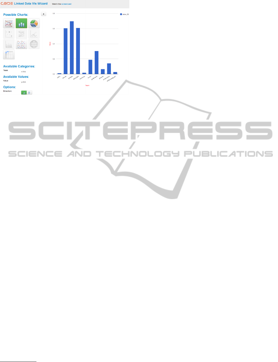
Figure 2: The automatically generated visualisation of PAN
Data with Team as dimension and with a Challenge Result
as measure.
4 AUTOMATED
VISUALISATIONS
Once the data are extracted, the Vis Wizard under-
takes the complex task of suggesting only the appro-
priate visualisations. To do so, it relies on semantic
descriptions of visualisations in terms of visual chan-
nels and mappings, supplemented with a process for
semantic mapping.
Figure 3 shows the layered architecture of the
process to automate the suggestion of visualisations.
Similar to the common vocabulary used in CODE to
structure heterogeneous data as Linked Data, we de-
fine a common vocabulary to describe and integrate
visualisations in the aforementioned CODE work-
flow. In the following, we describe involved vocab-
ularies and their relevance to research data and the
visualisation process.
4.1 Describing Visualisations
To support the process of mapping visualisations to
data described in RDF-DCV, we developed a Vi-
sual Analytics Vocabulary (VA Vocabulary
6
) that de-
scribes visualisations semantically as an OWL
7
ontol-
ogy. Our semantic description strictly focuses on de-
scribing the visual encoding process, hence we rep-
resent visualisations in terms of their visual chan-
nels (Bertin, 1983). However, instead of pursuing a
thorough specification encompassing all known facts
about visual perception as (Voigt et al., 2012), we
concentrate on pragmatic, simple facts that will aid
6
VA Vocabulary: code-research.eu/ontology/visual-
analytics
7
Web Ontology Language: www.w3.org/TR/owl-features/
the sensible mapping (e.g. (Mackinlay, 1986)), ex-
tending the description to many different types of vi-
sualisations. Thus, we have separated our VA Vo-
cabulary into two parts: (1) the model of an abstract
visualisation (i.e. an abstract visualisation type) that
captures only the commonalities shared between all
concrete visualisations, and (2) concrete visualisa-
tion models, which capture just specific information.
Concrete visualisations refine the abstract visualisa-
tion model depending on their type. The abstract vi-
sualisation model specifies most important structural
components that any concrete visualisation may have.
These are:
• Name: Identification for a visualisation.
• Visual Channel: A container for data, which
have to be visualised. It contains structural rules
required to correctly map statistical data to vi-
sualisation. For example, a visual channel for a
bar chart is refined to represent its x-axis and
y-axis.
• Description: A collection of non-mandatory
components (e.g. textual description or image
such as SVG figure for a concrete visualisation).
The difference between concrete visualisations
lies in their reification of visual channels. For ex-
ample, a bar chart has only two visual channels,
x-axis and y-axis. According to their type defini-
tion, y-axis always represents a numeric (e.g. dec-
imal, float, integer, etc.), whereby x-axis supports
more types (e.g., categorical, string). Further, this vi-
sualization will be suggested only if both visual chan-
nels are provided and have data (we say here, they are
instantiated). In this case, both visual channels are
mandatory for the bar chart. In contrast, parallel co-
ordinates, require at least one x-axis and additional
instances of that visual channel are optional, a char-
acteristic shared by tabular visualisation and the scat-
terplot matrix.
To capture such differences in our VA Vocabulary,
we characterize visual channels with the following at-
tributes:
• Datatype: Defines a set of primitive datatypes
that a visual channel can support.
• Occurrence: Defines the cardinality of a visual
channel (i.e. how many instances are allowed for
the concrete visual channel).
• Persistence: Defines whether a visual channel
is mandatory part of the concrete visualisation or
not.
The occurrence attribute identifies whether a vi-
sual channel can be instantiated only once (e.g. bar
IVAPP2014-InternationalConferenceonInformationVisualizationTheoryandApplications
270

RDF Cube Datasets
RDF Cube Datasets
Suggested Visualisations
Suggested Visualisations
Suggested Mapping
Suggested Mapping
Generated Visualisations
Generated Visualisations
RDF Data Cube Vocabulary
Visual Analytics Vocabulary Visual Analytics Vocabulary Visualisation Technology
(1) Dataset Query
(2) Visualisation Suggestion
(3) Mapping Suggestion (4) Visualisation Generation
Dataset
1
x-Axis
Country
y-Axis Value
Mapping Vocabularies by common datatypes Mapping by code generators
VOCABULARIES MAPPINGVISUALISATION PROCESS
Figure 3: Main parts of the Visualisation Wizard: automated visualisation process (bottom), vocabularies (middle) and map-
ping vocabularies (top).
chart x-axis and y-axis, see Figure 2) or multi-
ple times (e.g. parallel coordinates x-axis). There
are two different values for this attribute: one and
many. The occurrence many is used for visualising
high-dimensional RDF Data Cubes. In contrast, the
occurrence one defines a fixed cardinality.
The persistence attribute helps define more com-
plex cases. For example, a visualisation with three
mandatory and two optional visual channels. Hereby,
the case with the parallel coordinates can be alterna-
tively defined as follows: one mandatory visual chan-
nel with the occurrence one, and another one, which
has an occurrence many and no persistence.
4.2 Suggesting Visualisations
The mapping between both mentioned vocabularies,
the RDF Data Cube and the VA Vocabulary, is a re-
lation from dimensions and measures in the former to
the corresponding visual channels of a visualisation in
the latter. This relation is valid only if the datatypes
of the cube components and visual channels are com-
patible. Datatype compatibility in our context means
having exactly the same primitive datatypes, both
conforming to the XSD datatype definitions
8
. Beyond
datatype compatibility, a valid mapping needs to ac-
count for structural compatibility, since visualisations
from the VA Vocabulary may have fixed or varying
number of visual channels. To clarify this, let us con-
sider the bar chart from the Figure 2. It has two visual
channels, x-axis and y-axis, and can visualise data
only if both channels are instantiated. That means, it
can plot the RDF Data Cubes with exactly one dimen-
8
XSD Datatypes: www.w3.org/TR/2001/REC-xmlschema-
2-20010502/
sion and one measure. The additional requirement is
that both visual channels support datatypes, which are
compatible to datatypes of the RDF Data Cube model.
Visualisations with optional visual channels sup-
port different structures of the RDF Data Cube model
(i.e. number of dimensions and measures). From
these observations, we derive the following require-
ments for a valid mapping:
• Structural Compatibility: The instantiation of
dimensions and measures in the RDF Data Cube
is unbounded. That is, we can define observations
with arbitrary dimensions and measures. There-
fore, possible instantiation patterns (i.e. in the for-
mat dimension:measure) for each observation are:
(1) 1:1, (2) 1:n, (3) n:1 and (4) n:n. In order to
find a valid mapping, we have to find in the VA
Vocabulary visualisations with the same instantia-
tion patterns. Not all visualisations have the same
structural definition as a RDF Data Cube; there-
fore not all visualisations are able to display arbi-
trary Cubes. Thus, only those visualisations with
the instantiation patterns that match the observa-
tions of the RDF Data Cube are candidates for the
valid mapping. This is called structural compati-
bility in our context.
• Datatype Compatibility: The structural compat-
ibility is not sufficient to claim the correctness of
the mapping. Therefore, in addition to the struc-
tural compatibility, the visual channels and related
RDF Data Cube components have to be compati-
ble regarding their datatypes.
If for a given RDF Cube model at least one
visualisation does match both requirements above,
there is a valid mapping and the RDF Data Cube can
be visualised. The following pseudo-code shows the
SuggestingVisualisationsforPublishedData
271

mapping algorithm.
Data: RDF Data Cube
Result: set(mapping suggestions)
get visualisation candidates;
get observation components;
while visualisation candidates exist do
instantiate visual channels;
generate all combinations for datatypes of
visual channels;
while datatype combinations exist do
map combination to instantiated visual
channels;
pack mapping configuration;
if ( ((occurrence matches) and
(persistence matches)) and (type
matches) ) then
add to mapping suggestion set;
else
throw invalid mapping
configuration;
Algorithm 1: Simplified algorithm for determining
feasible mapping suggestions.
The attributes of visual channels form the basis
to prove both types of the compatibility. For a given
RDF Data Cube, the algorithm returns either a list
of visualisation candidates and concrete mappings be-
tween data dimensions, measures and visual channels,
or nothing. According to the algorithm above, we
first get all concrete visualisations from the reposi-
tory and observation components from the RDF Data
Cube. For each visualisation candidate, we instantiate
its visual channels according to the structure of the
observations (i.e. according to the number of exist-
ing dimensions and measures within an observation).
This means, we produce the structure, which is simi-
lar to the one of the observations. Hereby, we achieve
the structural compatibility between both models, but
it needs to be proved. In the next step, we gener-
ate all combinations of the form visual channel →
datatype and pack those combinations as a mapping
configuration. The mapping configurations are candi-
dates for a valid mapping. In the last step, we verify
each of these mapping configurations. First, the struc-
tural compatibility is verified by checking the occur-
rence and persistence attributes of the visual channels.
Based on these attributes, we identify whether a visual
channel is missing or not allowed. The mapping con-
figurations which pass this step, satisfy the structural
compatibility requirement and are forwarded to type
checking, where datatypes of the visual channels are
compared with the datatypes of the observations. Fi-
nally, only those mapping configurations, which pass
this last verification step, are considered valid sugges-
tions.
5 PRELIMINARY EVALUATION
We performed a preliminary evaluation, principally
to identify usability gaps, but also to explore the re-
action to recommended visualisations as well as the
mapping suggestions. Instead of following the com-
plete workflow from extraction to visualisation, we
concentrated on the latter part. Thus we used datasets
that had been previously structured as RDF-DC. This
also insured the independence from other services and
components of the CODE workflow, offering a more
controlled evaluation environment.
During the experiment, participants were mainly
exposed to the Query Wizard and the Vis Wizard.
The Query Wizard (H
¨
ofler et al., 2013) aims to help
users select relevant data from Linked Data reposito-
ries, and is one of the components for visual analy-
sis inside of the CODE platform. The user only per-
forms a keyword search in the CODE Semantic Web
endpoints and gets the resulting data presented in an
easy-to-use web-based interface.
5.1 Procedure
The evaluation procedure started with a demonstra-
tion of the Vis Wizard. Three different example
datasets were visualized, each with incremental com-
plexity: one dataset with one dimension and one mea-
sure, one dataset with two dimensions and one mea-
sure, and the last one with three dimensions and one
measure. During the demonstration the user received
a description on how a visualisation would be sug-
gested. We also introduced the fact that the Vis Wiz-
ard proposes a visualisation with a default mapping,
and described how to set a new mapping.
After this demonstration, users were presented
with one of ten datasets randomly chosen from the
Query Wizard to visualize it and answered evalua-
tion questions based on a simple analysis task. Every
one of these datasets collects data from the European
Union (EU), referring different statistics to funding
amounts per country. The datasets were constrained
to two dimensions and one measure (country, year,
and funding, respectively), which corresponds with
our mid-level complexity in the initial demonstrator.
The task was chosen to let the participants get a feel-
ing of using the interfaces to obtain data from these
massive repositories. Thus, the task was to analyze
the funding amounts distributed over countries and
IVAPP2014-InternationalConferenceonInformationVisualizationTheoryandApplications
272
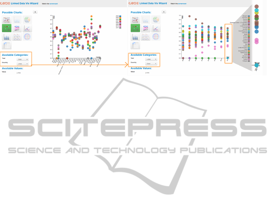
Figure 4: The result of the second Task of the evaluation.
find the country that was assigned the largest amount
in 2010.
The next task was to figure out the funding re-
ceived by countries in 2010, in ascending order, from
lowest to largest. This simple task had particular im-
plications, since it forced participants to interact with
the mappings for a given visualisation to figure out
the results.
5.2 Participants
The heuristic evaluation was performed by ten IT ex-
perts: 8 males and 2 females. Some of the participants
were experienced in the visualisation of Linked Data
whereas the others had little or no experience in this
area. As our Vis Wizard suggests all possible visuali-
sations for a given dataset, and participants were free
to choose different ones, we did not collect any quan-
titative measures. We did, however collect subjective
feedback towards the overall usage of the Vis Wizard,
and the appreciation of interacting with mappings.
5.3 Results
The results of this preliminary evaluation are as fol-
lows:
• All participants found the Vis Wizard easy to use
after a short introduction. They especially liked
the aesthetic of the website, according to their
opinion there is neither too much nor too little in-
formation, buttons or icons on the website.
• The user perception was very good concerning the
limitations on selecting invalid mappings, since
the Vis Wizard only allowed the selection of sug-
gested and valid visualisation combinations.
• The collection of the charts was sufficient for all
users.
• The first mapping done by the server was not al-
ways satisfactory by the users. However, the abil-
ity to easily set a new mapping variant changed
this.
• Sometimes there was too much data which has
been visualized so that the identification of the
data was difficult. This is the reason why the user
prefers to have the option to take only a part the
data in order to have a clear visual representation.
• The user also wanted to have the option to zoom,
to filter and to select the data on the visualisations.
During the first task of finding the country which
received the largest funding in 2010, users interacted
for example with parallel coordinates or scatterplot
matrix. For the second task, one example solution
was to select a time based visualisation and organize
the mappings so that year was on the x-axis. As a
result, country data is distributed across the other axis
(see Figure 4).
From our preliminary evaluation, we argue that
automating the visualisations for statistical data can
be very beneficial for target user group (i.e. re-
searchers, students, etc.). In order to cover many
query scenarios, it is necessary to complement
the visualisation-based approach with the traditional
query such as a tabular one, as shown in this evalua-
tion.
6 DISCUSSION
We have described a full analytical process, going
from unstructured data in publications, through ex-
traction and structuring of the data, to visual anal-
ysis. We also leverage the wealth of information
present in the Linked Open Data Cloud, by making
it easily searchable and accessible for visual analysis.
We covered a tool-chain instantiating every stage of
this workflow. It is available through our website or
through tools integrated by our partners (e.g. Mende-
SuggestingVisualisationsforPublishedData
273

ley desktop
9
). The motivation was to visualize scien-
tific data from publications. However, our tools are
not constrained to the scientific domain, they can also
be deployed in any other domain that requires extract-
ing data from published text, such as governmental
reports. Many institutions require manuals for main-
tenance and finding the threshold numbers, for exam-
ple, for a calibration procedure, is always a tedious
task. The application scenarios for the technology we
propose in this paper span numerous areas, both sci-
entific and industrial. Although we have numerous
datasets from published Open Data (e.g., EU Open
Data), ad-hoc analysis of arbitrary publications is lim-
ited by the data extraction process (precision 79%, re-
call 76%, on ICDAR dataset
10
). For visual analysis,
the Vis Wizard can combine visualizations in a single
view, but it cannot yet suggest sensible combinations,
and interaction across views is limited.
7 CONCLUSIONS
Organizing and analyzing research publications using
current technologies of digital libraries remains a te-
dious task. The continuous increase of the published
content drives a need to find more effective solutions
to manage that content.
In this paper, we have outlined and instrumented
a workflow, whereby the research data has to traverse
several stages, starting from the original and unstruc-
tured text to its final structured form and visualisa-
tion. The essential aspect of the this approach is the
automated support for this workflow. Automating the
visualisations allows users to easily find and to ana-
lyze research data. In this context, we have developed
a common vocabulary for defining the visualisations
semantically. Further, in order to identify the match-
ing visualisations for given research data, we have de-
fined a mapping of this vocabulary to the existing vo-
cabulary of that data. Based on these vocabularies and
their mapping, we are able to automatically suggest
visualisations.
The development of the Vis Wizard will continue
throughout the rest of the year and includes the on-
going topic, visualisation refinement. In further the
user should have the possibility to aggregate, to filter
and to select the data for the visualisations. These re-
finements will depend on the visualisation features to
serve users with intelligent processing options.
9
Mendeley: www.mendeley.com/
10
ICDAR: dag.cvc.uab.es/icdar2013competition/
ACKNOWLEDGEMENTS
This work is partially funded by the EC 7th Frame-
work projects CODE (grant 296150) and EEXCESS
(grant 600601). The Know-Center GmbH is funded
within the Austrian COMET Program Competence
Centers for Excellent Technologies of the Aus-
trian Federal Ministry of Transport, Innovation and
Technology, the Austrian Federal Ministry of Econ-
omy, Family and Youth and by the State of Styria.
COMET is managed by the Austrian Research Pro-
motion Agency (FFG).
REFERENCES
Attwood, T. K. et al. (2010). Utopia documents: linking
scholarly literature with research data. Bioinformatics,
26(18).
Bertin, J. (1983). Semiology of graphics. University of Wis-
consin Press.
Bizer, C. et al. (2009). Linked data - the story so far. Int. J.
Semantic Web Inf. Syst., 5(3):1–22.
Dumontier, M. et al. (2010). Modeling and querying graph-
ical representations of statistical data. Web Semant.,
8(2-3):241–254.
H
¨
ofler, P. et al. (2013). Linked data query wizard: A tabular
interface for the semantic web. In ESWC (Satellite
Events), pages 173–177.
Klampfl, S. et al. (2013). An unsupervised machine learning
approach to body text and table of contents extraction
from digital scientific articles. In International Con-
ference on Theory and Practice of Digital Libraries
2013, Valetta, Malta.
Mackinlay, J. (1986). Automating the design of graphical
presentations of relational information. ACM Trans.
Graph., 5(2):110–141.
Mutlu, B. et al. (2013). Automated visualization support for
linked research data. In I-Semantics 2013.
Powell, A. et al. (2005). Dublin core metadata initia-
tive - abstract model. White paper, Eduserv Founda-
tion, UK, KMR Group, CID, NADA, KTH, Sweden,
DCMI.
Salas, P. et al. (2012). Publishing statistical data on the web.
In Semantic Computing (ICSC), 2012 IEEE Sixth In-
ternational Conference on, pages 285–292.
Schlegel, K. et al. (2013). Trusted facts: Triplifying primary
research data enriched with provenance infoamtion. In
ESWC 2013.
Seifert, C. et al. (2013). Crowdsourcing fact extrac-
tion from scientific literature. In Workshop on
Human-Computer Interaction and Knowledge Dis-
covery, Maribor, Slovenia. Springer.
Stegmaier, F. et al. (2012). Unleashing semantics of re-
search data. In Second Workshop on Big Data Bench-
marking, Pune, India.
IVAPP2014-InternationalConferenceonInformationVisualizationTheoryandApplications
274

Voigt, M. et al. (2012). Context-aware recommendation of
visulization components. In The Fourth International
Conference on Information, Process, and Knowldege
Management.
Voigt, M. et al. (2013). Capturing and reusing empirical vi-
sualization knowledge. In 1st International Workshop
on User-Adaptive Visualization.
SuggestingVisualisationsforPublishedData
275
