
E-MAIL VISUALISATION
A Comparative Usability Evaluation
Saad Alharbi and Dimitrios Rigas
Department of Computing, University of Bradford, BD7 1DP , Bradford, U.K.
Keywords: Effectiveness, Efficiency, E-mail, Experiment, Information hiding, Usability, Visualisation.
Abstract: As the number of e-mail accounts and messages grow rapidly, traditional e-mail clients that are used
nowadays have become difficult to use. Therefore, this paper shows how the usability of e-mail clients can
be improved using information visualisation. An experimental e-mail visualisation tool was developed in
order to organise e-mail messages in the inbox. It visualises messages based on the date of receiving
messages with senders’ e-mail addresses. An experiment was carried out to test whether information
visualisation could significantly enhance the usability of e-mail clients. The performance of 30 users was
observed in a standard e-mail client and the proposed prototype. The results showed that information
visualisation could significantly improve the effectiveness and the efficiency of e-mail clients.
1 INTRODUCTION
E-mail is the most widely used application
nowadays and it can be the reason for buying a
personal computer (Whittaker, Bellotti, & Moody,
2005). It is used everyday in our lives and has
become the application that users spend much of
their time using. Therefore, the number of e-mail
messages increases rapidly. University of California
stated that about 31 billion e-mail messages have
been sent in 2002 and this number might be doubled
in 2006 (Frau, Roberts, & Boukhelifa). In another
study, it has been shown that the average user gets
around 49 e-mail messages a day while high volume
users can get more than hundred (S. Rohall, Gruen,
Moody, & Kellerman, 2001). Gwizdka stated that
there were 89.1 billion e-mail accounts worldwide in
2002 which is 67% more than 1999 (Gwizdka,
2002). Users usually leave their e-mail messages in
the inbox for different purposes such as managing
appointments and to-do list. Therefore, e-mail
inboxes have become cluttered and difficult to use.
The usability of e-mail clients has not been
considered significantly at present. Therefore, this
paper describes how the usability of e-mail can be
enhanced using information visualisation. It shows
an e-mail visualisation tool which visualises e-mail
messages based on the date of receiving messages
and groups them according to senders’ e-mail
addresses. An experiment was carried out in order to
test whether the information visualisation can
improve the usability of e-mail clients. It compares
users’ performance in a well-known traditional e-
mail client (Microsoft Outlook) with the proposed
graphical e-mail prototype. The usability was
measured in this paper by considering the efficiency
and the effectiveness of each e-mail version.
Efficiency was measured by calculating the time
taken for accomplishing the experimental tasks
where the effectiveness was measured by calculating
the percentage of tasks completed successfully.
2 RELATED WORK
As the number of e-mail accounts and messages
grow rapidly, traditional e-mail clients that are used
nowadays have become difficult to use. Therefore,
more usable email clients that help users browsing
email messages easily are needed. Many studies
have been performed in the last few years in order to
enhance the usability of e-mail clients. Using folders
has been proposed to be the way of organising
messages in the inbox (Duchenaut & Bellotti, 2001).
It has shown that folders have many problems such
as long nesting and they might not be used over time
(Rigas, Yu, Klearhou, & Mistry, 2001; Whittaker &
Sidner, 1996). Folders are inadequate especially
when the high volume e-mail users use them as well
as some users having difficulties generating
319
Alharbi S. and Rigas D. (2008).
E-MAIL VISUALISATION - A Comparative Usability Evaluation.
In Proceedings of the Tenth International Conference on Enterprise Information Systems - HCI, pages 319-324
DOI: 10.5220/0001676003190324
Copyright
c
SciTePress

appropriate folders label (S. L. Rohall, 2002).
Filtering and sorting features in e-mail clients were
found difficult to use for organising messages
(Duchenaut & Bellotti, 2001). Auto classification
has been proposed also to organise messages but it
was proven as error prone (S. Rohall, Gruen,
Moody, & Kellerman, 2001).
Many studies used information visualisation for
enhancing the usability of e-mail clients based on
many factors. The date of receiving e-mail messages
was used in many studies as the main visualisation
factor. Yiu and colleagues visualised e-mail
messages based on the time of receiving messages
(Yiu, Baecker, Silver, & Long, 1997). E-mail
messages were displayed as dots and organised on
X, Y axes where time was presented along the X-
axis and the senders on Y-axis. The properties of
messages (e.g. status and subject) in this
visualisation were hidden as well as it has not been
evaluated in term of usability. “MailView” is an e-
mail tool which visualises e-mail messages
depending on the time of receiving messages and
presents them as glyphs chronologically (Frau,
Roberts, & Boukhelifa). One of the most important
advantages of this tool is that it presents the details
of the e-mail messages in separate layer. But there
was also no usability evaluation results given.
Sudarsky and Hjelsvold developed a tool that
visualised the e-mail inbox depending on a
hierarchal nature of domain names in e-mail
addresses such as COM and EDU (Sudarsky &
Hjelsvold, 2002). This approach contains two basic
views hierarchal view, which is a tree generated
from the domain names, and temporal view which
presents the e-mail messages. The result of the tool
evaluation showed a significant improved
performance as well as improved overall preferences
(Sudarsky & Hjelsvold, 2002). Therefore, in our
point of view the hierarchal e-mail visualisation is
an effective way but users will face difficulties
remembering the domain names.
The relationships between e-mail messages
(message threads) were also used for visualising e-
mail archives. Venolia and Neustaedter pointed out
that e-mail clients will be more useful if
conversation threads were used as the main display
of e-mail clients (Venolia & Neustaedter, 2003).
They presented a mixed-model visualisation that
presents sequence of e-mail messages and reply
relationships among the messages of conversation.
The users’ understanding of message threads was
tested and the result showed they were able to
understand them. Even though this technique has
shown understanding by users the usability of this
technique has not yet been tested. Rohall and
colleagues visualised e-mail archives using the
relationships between the senders of e-mail
messages (S. Rohall, Gruen, Moody, & Kellerman,
2001; S. L. Rohall, 2002). Messages were displayed
as connected tree in different colours to show the
relationships between them. For example, an e-mail
message that coloured purple is from someone
outside the recipient’s work.
As shown above most of the visualisation
techniques used in e-mail enhancement depend on
thread conversation, social network and temporal
views. Viegas and colleagues developed a tool
called “TheMail” for visulising e-mail archive but, it
used different visualisation techniques which relied
on the content of e-mail messages (Viegas, Golder,
& Donath, 2006). This tool presents a series of
keywords in columns arranged along a timeline each
keyword was shown in different colour. The size of
keywords depends on their frequency and
distinctiveness. Keywords are displayed in this tool
textually which could lead to difficulties in
understanding the e-mail inbox. The content of e-
mail messages was also used for visualising e-mail
archives by using self-organising maps. Here similar
e-mails are located close to each other (Nürnberger
& Detyniecki, 2006).
As it is shown most of the above studies have not
tested whether the information visualisation
improved the usability of e-mail clients. In addition,
it was inferred that message threads is a useful
feature for presenting the messages history. But it
might lead to usability problems when it is used as
the main factor of visualising e-mail inboxes
especially with high volume of e-mail messages.
Also, hierarchal visualisation was shown a very
effective way for organising e-mail archives.
Therefore, this paper presents an e-mail tool which
visualises messages based on the date of receiving
messages with a hierarchal view of e-mail addresses
and evaluates its usability.
3 E-MAIL VISUALISATION
An e-mail visualisation tool was developed in order
to test whether information visualisation can
improve the usability of e-mail clients. Therefore,
apart from displaying messages it does not offer any
of the e-mail functions such as sending e-mail
messages. E-mail messages are visualised in this
tool based on the date of receiving messages and
senders’ e-mail addresses. Figure 1 shows the inbox
in this tool is divided into 3 parts
ICEIS 2008 - International Conference on Enterprise Information Systems
320
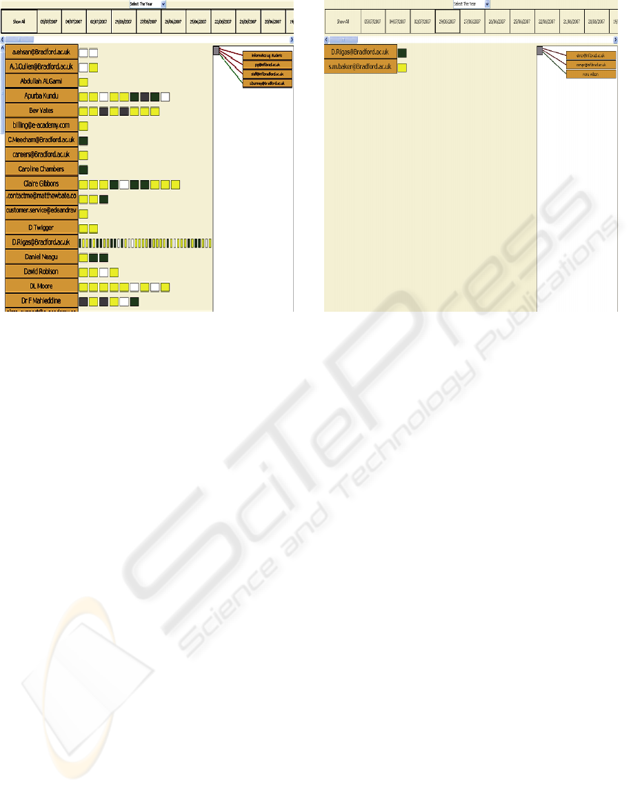
Figure 1: Screenshot of the mail inbox.
dateline, main view and temporal view. The top part
of the inbox is the dateline which presents all the
dates that contain e-mail messages in chronological
order. A drop down menu that contains the previous
years was added in order to minimise the number of
presented dates and to reduce the scrolling
operations. All messages in the inbox are presented
as squares in the main view. Where they are
classified based on the alphabetically ordered list of
e-mail senders in the left side of the inbox. The size
of presented squares depends on the number of e-
mail messages sent by the e-mail sender. Moreover,
as the number of e-mail messages sent by a sender
increases the size of presented square will be
smaller. Rather than displaying the status (New,
Read, Replied, Forwarded) of e-mail messages
textually it is displayed here by colours. The unread
(New) e-mail messages are displayed in yellow
whereas the read (Opened) messages are displayed
in white. The e-mail messages that sent as reply are
displayed in green and those that sent as forward are
displayed in grey. Subject, attachment and priority
were hidden in order to reduce the graphical
complexity in the main view. However, they can be
displayed with the content of the e-mail message by
clicking on the e-mail message in the main view.
The number of the displayed messages and
addresses in the main view can be reduced by
selecting the required date from the dateline (see
Figure2).
Figure 2: Screenshot of the inbox after selecting a date.
The recipients of an e-mail message can be
shown in the temporal view by moving the mouse
cursor over its icon in the main view. Rather than
using the traditional textual way of displaying the
recipients (TO, CC) of an e-mail message they are
presented using colours. Where all e-mail addresses
connected by green lines represent received the e-
mail message as carbon copy (CC) and those who
received it as normal messages (TO) their e-mail
addresses are connected by red lines.
4 EXPERIMENTAL DESIGN
An experiment was designed to test if the
information visualisation can enhance the usability
of e-mail clients. This was conducted by performing
a comparative usability study between one of the
well-known e-mail clients, Outlook Express, and our
visualisation prototype. Thirty postgraduate students
from the Department of Computing at the University
of Bradford were asked to participate in the
experiment. The experiment was two-condition
within-subjects design therefore each user was asked
to perform the experimental tasks in the standard e-
mail and the visualisation tool. Users were free to
use any of the functions that offered by Outlook
Express such as sorting e-mail messages and
searching for an e-mail message whereas they were
not able to use these functions in our prototype. In
order to avoid transfer of learning affects, the order
of the conditions was varied between users (counter-
balanced) (Dix, 2004). Meaning that, 15 users
E-MAIL VISUALISATION - A Comparative Usability Evaluation
321
started the experiment using the standard e-mail
clients and the other started by using our prototype.
A Five minuets demonstration was given to all users
before performing each condition.
Two usability metrics were selected to measure
the usability of both experimental conditions
efficiency and effectiveness. Efficiency was
measured by calculating the time taken to
accomplish each task. The effectiveness of computer
software can be measured by knowing whether the
required tasks could be accomplished successfully
(Jordan, 1998). Therefore, the percentage of users
who complete all tasks and the percentage of tasks
completed by all users were selected to measure the
effectiveness of each experimental condition. The
main hypothesis of this experiment is that
visualising e-mail messages should enhance the
usability of e-mail clients. Therefore, e-mail
visualisation tool should result in an overall
reduction in time taken to complete the tasks. Also,
it should result in an overall increase in both the
percentage of completed tasks and the percentage of
users who completed all tasks.
5 EXPERIMENTAL TASKS
Users were asked to perform 10 tasks in each
experimental condition in each task they had to
locate an e-mail message with the provided relevant
information such as the date of receiving, the
sender’s e-mail address and subject. In order to test
the experimental email tool in various conditions,
the experimental tasks were in three different
complexity levels easy tasks (3 tasks), medium tasks
(4 tasks) and difficult tasks (3 tasks). The location of
e-mail messages in the inbox were considered when
designing the easy tasks so users do not need to
perform scrolling and searching operations to find an
e-mail message. The number of given email message
information was considered when designing the
medium tasks as well as whether it can be seen
directly in the inbox. Therefore, users occasionally
needed to open e-mail messages in the medium task
in order to know whether it is the required one or
not. For example, in one of the medium tasks users
were asked to find an e-mail message by the
attachment name with the date of receiving. In the
difficult tasks, users were mainly asked to find e-
mail messages by asking them about the recipients
(TO, CC) of the e-mail message beside other
information such as the sender’s e-mail address.
6 RESULTS
The performance of users in each condition was
observed and filled in an evaluation form. This form
contains the time taken for completing each task and
whether each task was completed successfully. The
effectiveness and efficiency were analysed
independently as shown below.
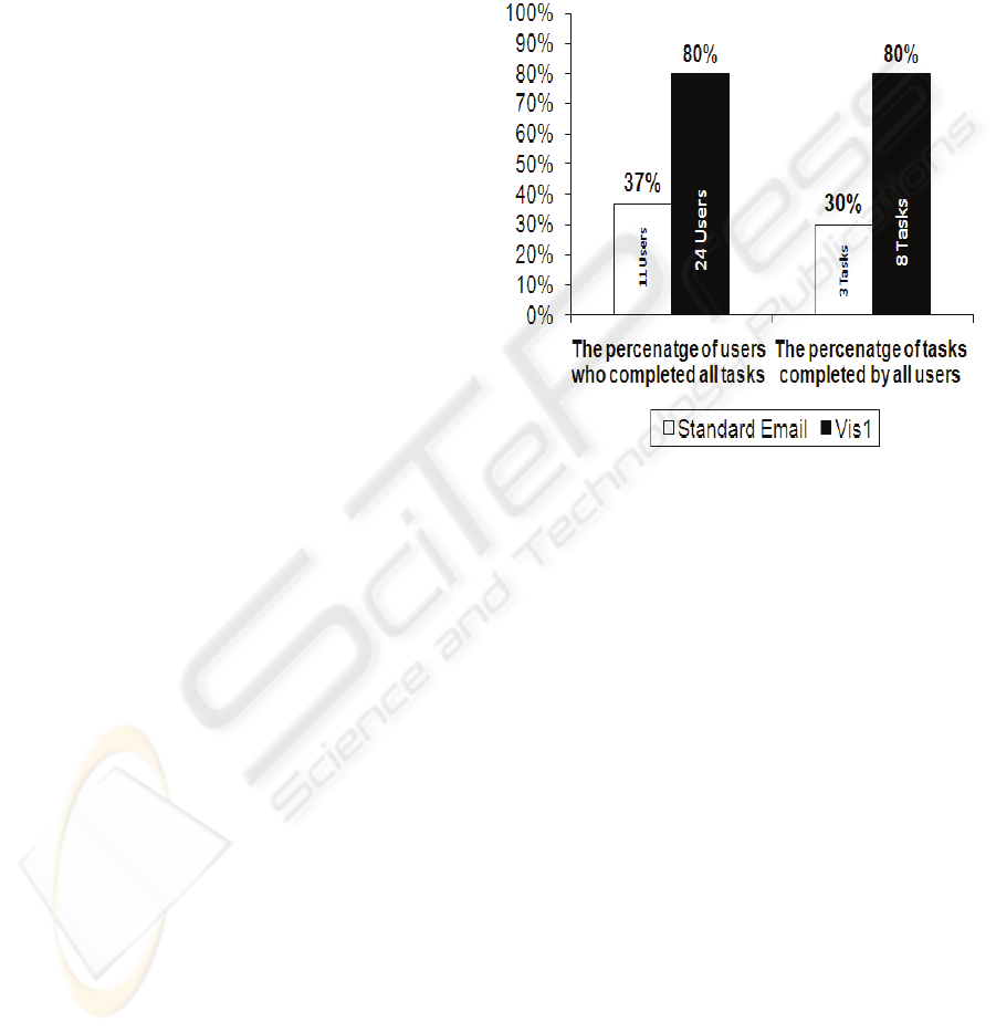
Figure 3: Users (%) who successfully completed all task
and tasks (%) completed by all users.
6.1 Effectiveness Results
The number of users who successfully completed all
tasks was calculated to produce an overall
percentage of users who successfully completed all
tasks. Also, the number of completed tasks
successfully by all users was calculated to produce
an overall percentage of completed tasks in each
experimental condition. Figure 3 shows the
percentage of users who successfully completed all
tasks and the percentage of tasks completed by all
users. It shows that the percentage of users who
completed all tasks successfully in the visualised e-
mail is greater than in the standard e-mail. Also, it
shows higher percentage of completed tasks in the
visualised e-mail. Chi-Square was used to test the
significance in the effectiveness data. The results
indicated that the percentage of users who completed
all tasks in the experimental condition is
significantly higher than in the standard email (X
2
=
15.8, df= 1, cv=3.84, p<0.05). In addition, It showed
a significant difference in the
ICEIS 2008 - International Conference on Enterprise Information Systems
322
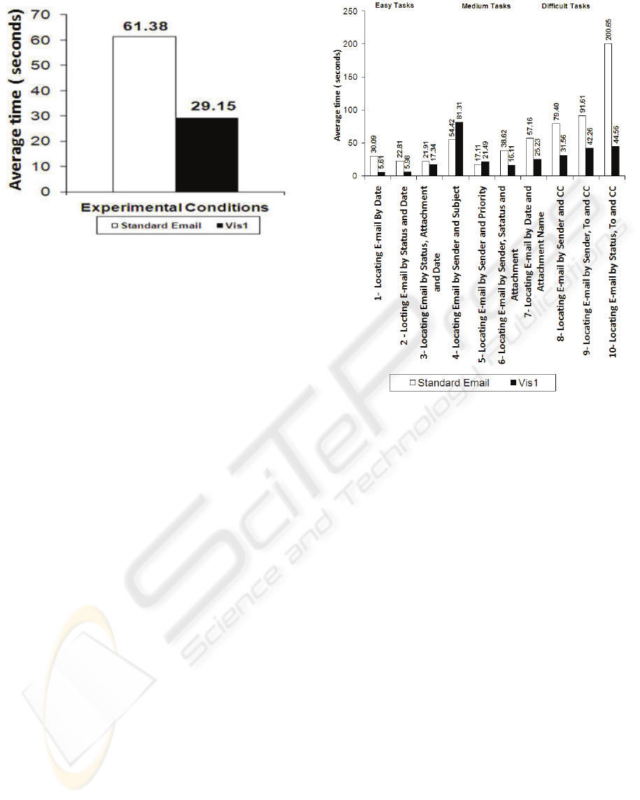
Figure 4: The overall time taken to complete the tasks.
number of completed tasks by all users in the
experimental condtion (X
2
= 5.05, df= 1, cv=3.84,
p<0.05) when compared to the standard email.
Thus, visualising email messages such as in the
proposed email tool could improve the effectiveness
of email clients in terms of number of tasks
completed successfully and number of users who
completed all tasks.
6.2 Efficiency Results
As mentioned earlier, time taken for completing
each task was selected to measure the efficiency of
each experimental condition. Therefore, it was
added together to produce a total time in each
experimental condition. The average time for
completing all tasks was calculated in each condition
in order to compare the difference between them.
Figure 4 shows the overall time taken to complete
experimental tasks in the e-mail visualisation
prototype, which is denoted in the graph by Vis1, is
lower than in the standard e-mail. Because the
experiment has two-conditions and the obtained data
is quantitative, t-test was used to test the difference
in time between the experimental conditions
(Sanders & Smidt, 2000). It showed an extreme
significant reduction in the time taken for
completing tasks in the visualised e-mail (t
58
=8.4,
p< 0.000).
A detailed analysis was performed based on the
complexity level of the tasks. Figure 5 shows that
the time taken for completing each task in both
conditions. It shows reduced time for completing the
easy tasks in the visualization prototype. The
average time taken to complete easy tasks in the
proposed email is 9.64 (standard deviation 7.19)
Figure 5: Time taken to complete each experimental task.
seconds where it is 24.94 (standard deviation 15.25)
seconds in the standard email. In the first two
medium tasks, users were asked to find e-mail
messages by the subject and priority respectively. As
these are hidden in our prototype, users took longer
time to perform these tasks than in the standard e-
mail. The average time taken to complete medium
tasks in the standard email is 41.83 (standard
deviation 69.65) seconds where it is slightly lower in
the proposed email 36.06 (standard deviation 27.39)
seconds. The average time for completing difficult
tasks in the standard email was 123.89 (standard
deviation 79.93) seconds where it was reduced to
39.64 seconds (standard deviation 12.77) in the
proposed email visualisation. This is because of the
recipients (TO, CC) of the e-mail messages are
directly displayed to the users in the temporal view.
7 DISCUSSION
The results showed time taken to complete tasks was
dramatically reduced in the e-mail visualisation
prototype. Also, the percentage of users who
successfully completed all tasks and the percentage
of tasks completed by all users were significantly
increased in the e-mail visualisation prototype.
E-MAIL VISUALISATION - A Comparative Usability Evaluation
323

Therefore, it confirmed the hypothesis that
information visualisation significantly improves the
usability of e-mail clients. The detailed analysis
showed that the main reasons of e-mail visualisation
tool being more efficient than the standard e-mail is
dividing the mail inbox into sections as well as using
colours for presenting information. The dateline in
the visualized e-mail was found very useful for
grouping e-mail messages because it significantly
reduced the time taken to complete easy tasks.
The results showed that the temporal view is a
very useful feature because it significantly reduced
the time taken for completing difficult tasks.
Therefore, rather than displaying the recipients (TO,
CC) on the temporal view only other information
can also be displayed on it such as the subject and
attachment.
Using colours for presenting the status of e-mail
messages significantly reduced the time taken for
completing most tasks. Therefore, colours can also
be used for presenting more information such as the
priority of e-mail messages.
The results showed that information hiding could
negatively affect the usability of e-mail clients. It
affected the performance of users when performing
medium tasks.
8 CONCLUSIONS
As e-mail is used daily in our lives and the number
of e-mail messages grows rapidly, traditional e-mail
clients have become difficult to use. Therefore, this
paper proposed an e-mail visualisation tool in order
to organise e-mail messages in the inbox. This tool
visualises messages based on the date of receiving
messages with a hierarchical view of e-mail
addresses. An experiment was designed in order to
test whether information visualisation could enhance
the usability of e-mail clients. The performance of
users was compared in a standard e-mail client with
our prototype. The results showed that the e-mail
visualisation tool could significantly improve the
usability of e-mail clients. Information hiding was
shown negatively affecting the usability of e-mail
clients. Therefore, further experiments will be
carried out to evaluate the effect of integrating the
auditory feedback (e.g., speech and non-speech
sounds) in the email visualisation. In these
experiments, some of the email data will be
communicated aurally.
REFERENCES
Dix, A. J. (2004). Human-computer interaction (3rd ed.).
New York; London: Prentice-Hall.
Duchenaut, N., & Bellotti, V. (2001). Email as habitat.
Interactions, 8(5), 30-38.
Frau, S., Roberts, J. C., & Boukhelifa, N. Dynamic
Coordinated Email Visualization. WSCG05, 187–193.
Gwizdka, J. (2002). Reinventing the inbox: supporting the
management of pending tasks in email. Conference on
Human Factors in Computing Systems, 550-551.
Jordan, P. W. (1998). An introduction to usability.
London: Taylor & Francis.
Nürnberger, A., & Detyniecki, M. (2006). Externally
Growing Self-Organizing Maps and Its Application to
E-mail Database Visualization and Exploration.
Applied Soft Computing, 6(4), 357-371.
Rigas, D., Yu, H., Klearhou, K., & Mistry, S. (2001).
Designing Information Systems with Audio-Visual
Synergy: Empirical Results of Browsing E-Mail Data.
Panhellenic Conference on Human-Computer
Interaction: Advances on Human-Computer
Interaction,, 960-7620.
Rohall, S., Gruen, D., Moody, P., & Kellerman, S. (2001).
Email Visualizations to Aid Communications. IEEE
Symposium on Information Visualization (InfoVis).
Rohall, S. L. (2002). Redesigning Email for the 21
stCentury Workshop Position Paper. CSCW 2002
Workshop: Redesigning Email for the 21st Century.
New Orleans, LA.
Sanders, D. H., & Smidt, R. K. (2000). Statistics : a first
course (6th ed.). London: McGraw-Hill.
Sudarsky, S., & Hjelsvold, R. (2002). Visualizing
electronic mail. Information Visualisation, 2002.
Proceedings. Sixth International Conference on, 3-9.
Venolia, G. D., & Neustaedter, C. (2003). Understanding
sequence and reply relationships within email
conversations: a mixed-model visualization.
Proceedings of the conference on Human factors in
computing systems, 361-368.
Viegas, F. B., Golder, S., & Donath, J. (2006). Visualizing
email content: Portraying relationships from
conversational histories, Montreal, QC, Canada.
Whittaker, S., Bellotti, V., & Moody, P. (2005). Revisiting
and Reinventing Email. Special Issue of Human-
Computer Interaction, 20(1).
Whittaker, S., & Sidner, C. (1996). Email Overload:
Exploring Personal Information Management of
Email.
Yiu, K., Baecker, R., Silver, N., & Long, B. (1997). A
time-based interface for electronic mail and task
management. Proc. HCI International'97, 2, 19-22.
ICEIS 2008 - International Conference on Enterprise Information Systems
324
